By Pascal Edouard, MD, PhD, @PascalEdouard42 and Laurent Navarro, Ing, PhD, @LaurentNavarro5
Tables, numbers, values and data… This is just one aspect of epidemiology, and specifically for this blog: sports injury epidemiology. Yes, it can be a repelling aspect. But, we can’t deny that data are fundamental to understand the extent of an injury problem, and are also the first step toward sports injury prevention[1]. Used and presented ineffectively the impact of data can be inversely proportional to their abundance. A challenge we commonly see researchers face is how to present a very large database, detailing sports injuries across many parameters, in an easy-to-interpret way.
“A table is my go-to”
One way to exhaustively present data is using a table. But, tables can become too big, incomprehensible and meaningless (see the examples in the studies by Edouard et al.[2,3]). When this happens, the reader may find it difficult to distinguish the relevant findings, and instead find themselves drowning in the masses of values (e.g. what are the injuries with higher rates or higher severity? What are the sex-related differences in rates?). In some cases, tables are not appropriate to show crossings between data; parameters are mainly presented separately (e.g. injury location are not combined with injury type).
We recommend that authors find a compromise between exhaustive vs. meaningful data by:
1) presenting scientific, exhaustive and rigorous data/results, while simultaneously
2) presenting these data/results in an easy-to-read way.
What about figures?
You could try using figures! Figures should easily show the main findings, and ideally, also show details about some specific parameters. But keep in mind that “Graphical excellence is what gives the viewer the greatest number of ideas in the shortest time with the least ink in the smallest space” [4].
In sports injury epidemiology, figures usually present one or two parameters,[5] or (rarely) three parameters.[6] Figure 1A represents two parameters (athlete’s sex and injury location) while 1B represents three parameters (athlete’s sex, injury location and severity).
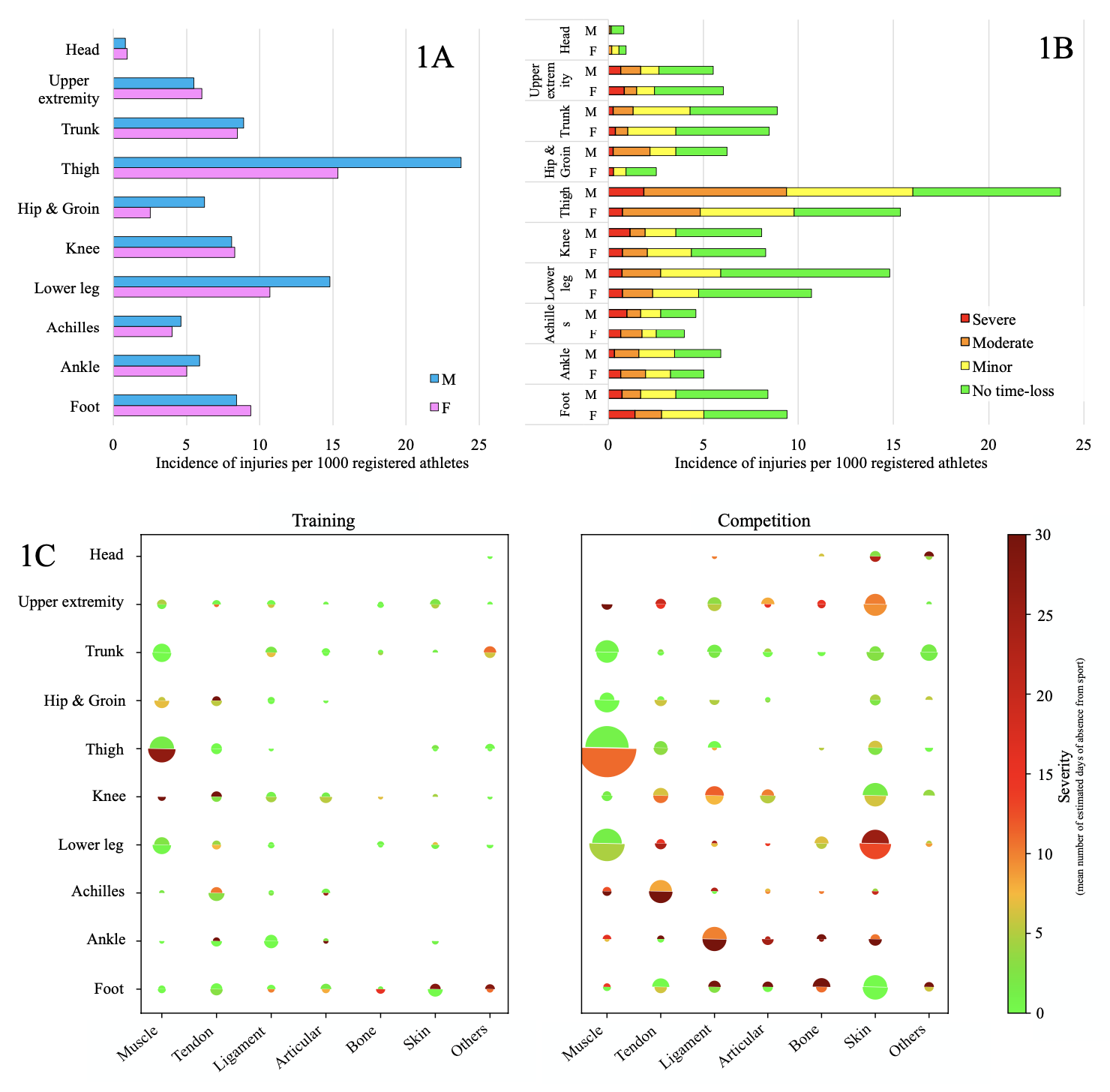
You’ll notice in Figure 1C that the injury description includes several parameters (e.g. location, type, cause, severity, sex, sports, circumstances) and the injury problem is presented with more than two or three parameters. By presenting more parameters, this shows crossings between data (for example injury location, type and severity, in addition to stratification by sex and circumstances). Such data representation allows for an immediate clear view of the problem, after quickly observing the figure.
A recent article from Edouard et al.[7] achieved just this. Figures in the article displayed injury characteristics according to disciplines during major international athletics championships. Figure 4 in the article[7] combined five parameters: athletics discipline, athlete’s sex, injury location, injury type and injury severity.
Making your figures more appealing to your audience
This isn’t out of your reach. If you want to achieve a similar outcome, we suggest that you:
1) ask yourself … What are the main findings? What are the results of analyses and What is relevant to the audience and should be shown?
2) reflect about the structure of the figure and make sure you present the most important number of parameters,
3) create the figure by using suitable graphic/ data visualisation tools (e.g. colors, sizes, 3D…) that match the data type (e.g. continuous values, classes, binary values…) and what you want to show,
4) keep it simple and easy-to-read for your readers
Here’s an example for you:
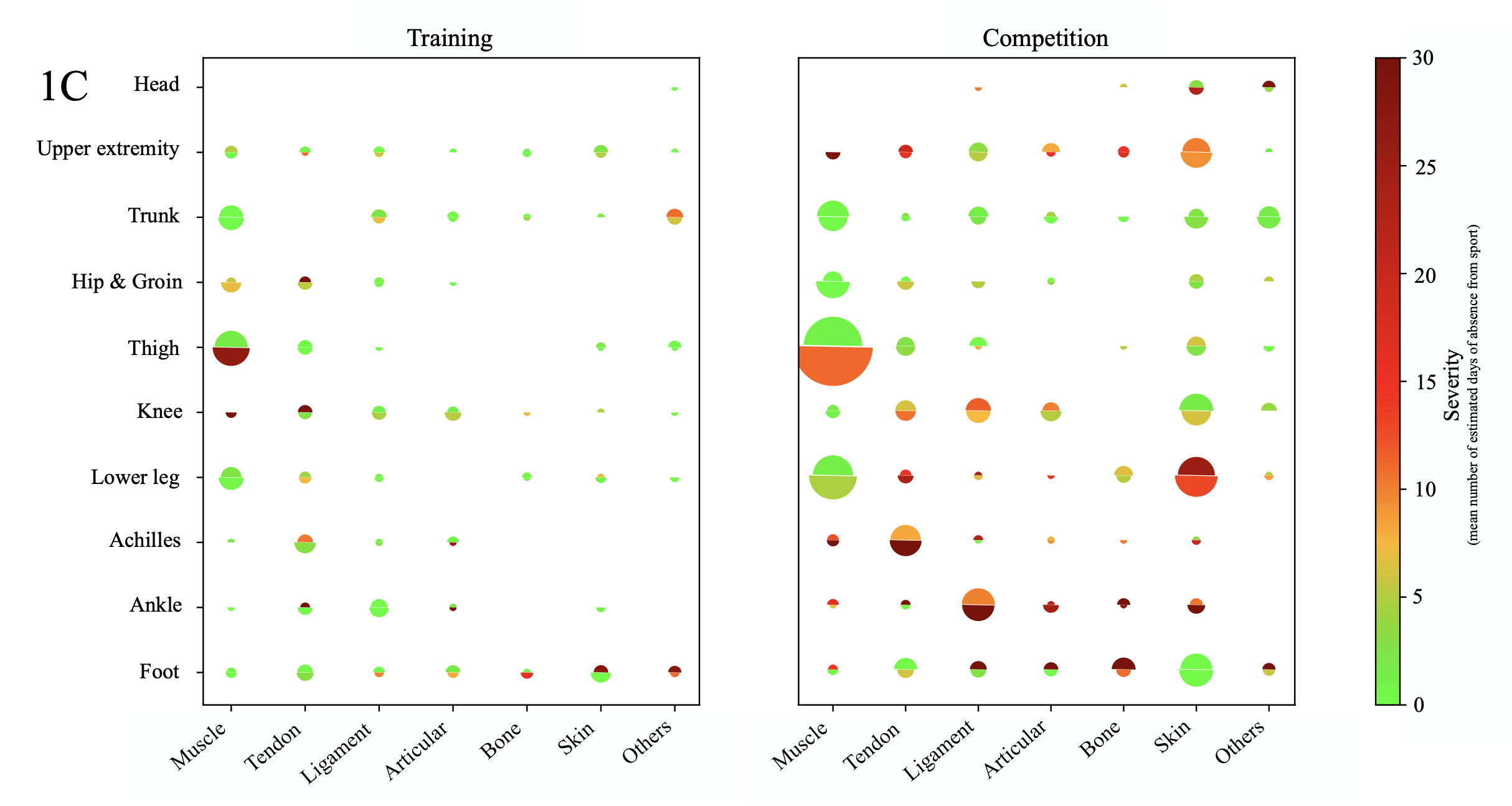
In the example, we have proposed that Figure 1C presents five parameters. By doing so, we can quickly see the 1) most common injuries with area of the half-discs (bigger half-discs: thigh and lower leg muscles injuries), 2) most severe injuries with color (more claret half-discs: Achilles tendon, ankle ligament, lower leg skin injuries), 3) sex-related differences in injury incidence and severity (comparisons of half-discs sizes), 4) differences between training vs.competition injuries.
Figure 1C presents more information than Figures 1A and 1B while remaining easy-to-read. But such an innovative figure can also present some limitations caused by the data and/or technical issues. By representing injury incidence using the size of a half-disc is relevant to easily see major and less important injuries in terms of incidence, however, quantitative comparison is more difficult since eyes are not familiar to analyze area variations. This is why it is important to adapt the graphical tools (a) to the data type, but also (b) while giving focus to what needs to be highlighted in the figure.
More appealing figures create a clearer message
In this blog, we felt the need to highlight the need to improve figures in sports injury epidemiology. Data assist us to understand the problems arising from an athlete’s injury. It helps medical, technical and research teams to know the extent of the injury problem and assists them to develop injury prevention programs. If data are presented in a meaningless way their impact may be underestimated.
Our message to you: when you present your data, don’t shoot yourself in the foot. Use the right tools to improve the impact of data-related messages!
***
Pascal Edouard, MD, PhD, IOC Diploma Sports Physician, is an assistant professor, a sports medicine physician at the University-Hospital of Saint-Etienne, and a researcher at the University of Lyon (Inter‐university Laboratory of Human Movement Science EA 7424), France. His main research interests include sports injury and illness prevention, especially in athletics.
Laurent Navarro, Ing, PhD, is an assistant professor at Mines Saint-Etienne and at the University of Lyon (INSERM, U 1059 Sainbiose), France. His current research interests include medical signal and image processing, data representation, and A.I. for health.
References
1 van Mechelen W, Hlobil H, Kemper HCG. Incidence, severity, aetiology and prevention of sports injuries. A review of concepts. Sports Med 1992;14:82–99.http://www.ncbi.nlm.nih.gov/pubmed/1509229 (accessed 8 Nov 2016).
2 Edouard P, Feddermann-Demont N, Alonso JM, et al. Sex differences in injury during top-level international athletics championships: surveillance data from 14 championships between 2007 and 2014. Br J Sports Med2015;49:472–7. doi:10.1136/bjsports-2014-094316
3 Edouard P, Branco P, Alonso J-M. Muscle injury is the principal injury type and hamstring muscle injury is the first injury diagnosis during top-level international athletics championships between 2007 and 2015. Br J Sports Med2016;50:619–30. doi:10.1136/bjsports-2015-095559
4 Tufte ER. The Visual Display of Quantitative Information. Second Edi. Graphics Press USA 2001.
5 Soligard T, Steffen K, Palmer D, et al. Sports injury and illness incidence in the Rio de Janeiro 2016 Olympic Summer Games: A prospective study of 11274 athletes from 207 countries. Br J Sports Med 2017;51:1265–71. doi:10.1136/bjsports-2017-097956
6 Carey DL, Blanch P, Ong KL, et al. Training loads and injury risk in Australian football – Differing acute: Chronic workload ratios influence match injury risk. Br J Sports Med 2017;51:1215–20. doi:10.1136/bjsports-2016-096309
7 Edouard P, Navarro L, Branco P, et al. Injury frequency and characteristics (location, type, cause and severity) differed significantly among athletics (‘track and field’) disciplines during 14 international championships (2007-2018): implications for medical service planning. Br J Sports Med 2019;:Nov 13. pii: bjsports-2019-100717. doi: 10.1136/bj.
8 Timpka T, Alonso J-M, Jacobsson J, et al. Injury and illness definitions and data collection procedures for use in epidemiological studies in Athletics (track and field): consensus statement. Br J Sports Med 2014;48:483–90. doi:10.1136/bjsports-2013-093241