By Chris Oliver @cyclingsurgeon, Hilary Scott @thehilsarealive and Andrew Murray @docandrewmurray
Many industries use infographics: business, politics, food, finance, and healthcare, including physical activity promotion. Statistically, the most successful infographics, in terms of number of ‘shares’ on social media, contain an average of 396 words (1) and a combination of data visualisations (e.g. bar graphs, line graphs, pie charts) and illustrations. 396 words may seem like an inadequate amount of text for many researchers to convey their findings comprehensively, but the saying “a picture tells a thousand words” comes to mind. Three days after learning new information, we are likely to remember up to 6.5 times more through learning from an infographic than reading text alone (2).
However the impact and accuracy of existing infographics is highly variable. Many are published on social media once or twice, then quickly forgotten. Successful infographics should be shared and re-shared again and again on social media to build campaign impact and increase audience reach. The more people who see an infographic, the more who can talk about and share it’s important message. As healthcare professionals and researchers we are good at creating content, but perhaps we could gain by making the information engaging, widely seen and sticky, like Dr Mike Evans hit video 23.5 hour (worth a watch it if you haven’t seen it).
Interestingly in the UK we devise and publish physical activity policies and infographics, yet our people are not physically active adults compared with other European countries (3). An infographic designed by the UK’s Chief Medical Officers (CMOs) was launched in 2015 to accompany the physical activity guidelines document ‘Start Active, Stay Active’, first published in 2011 (4).
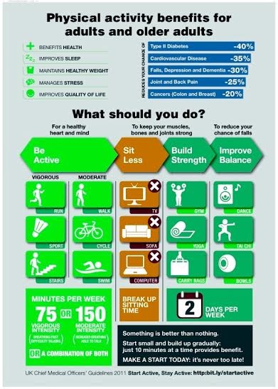
This infographic is an excellent example of what works: transmitting a message and engaging the reader through a three-step process of ‘raising awareness’, ‘changing and challenging attitudes’ and providing a ‘call to action’ for individuals to change their behaviour and become more physically active (5).
Health infographics are designed to stimulate the following responses from readers – ‘attention, comprehension, recall and adherence’ (6). The design of the CMOs’ infographic was set out in clear terms, allowing members of the public to understand its message without requiring explanation from health professionals as it did not contain complex medical terminology. Easy to understand content is recommended when designing any infographic as this will likely increase the sharing of knowledge among researchers, practitioners and lay people. Infographics have potential to make information more accessible across a diversity of populations.
A successful infographic gets people talking about its message and sharing it more widely
An infographic succeeds if it both attracts people’s attention and they can comprehend the presentation of information. Even better if it encourages them to consider behaviour change themselves, and / or share the messages with their networks. Infographics can build a bridge between lay people and health professionals, and they can clarify important ‘take-home messages’ and provide direction for heal promoting behaviours.
In short, infographics are a powerful tool for communicating key messages clearly, changing attitudes, and even challenging people to change their mindset and/or behaviours. In consideration of research with impact, perhaps each research paper should produce an infographic!
*****************
Chris Oliver @cyclingsurgeon is a Honorary Professor of Physical Activity for Health at the University of Edinburgh, and a Consultant in Trauma and Orthopaedics.
Hilary Scott (@thehilsarealive) is a third year BSc Applied Sport and Exercise Science student at Robert Gordon University in Aberdeen. She recently completed a six week placement at the Physical Activity for Health Research Centre at the University of Edinburgh and researched the use of infographics in communicating important messages about physical activity.
Dr Andrew Murray (@docandrewmurray) thinks regular physical activity is the best thing we can do for our, and our children’s health. He is a Sports and Exercise Medicine consultant and PhD student at the University of Edinburgh, amongst other roles
REFERENCES
- Ahmad, I. What Makes Infographics Go Viral [Infographic]. [blog]. 2016 Jan 1 [cited 2016 Jan 11]. Available from: http://www.socialmediatoday.com/social-business/what-makes-infographics-go-viral-infographic.
- Krum R. Cool Infographics: Effective Communication With Data Visualization and Design. Hoboken, NJ: Wiley; 2013.
- Murphy, M. and Cavill, N. Do physical activity infographics, report cards and policies influence behaviour? The Sport and Exercise Scientist, 2015; Winter 2015(46).
- Great Britain. Department of Health. Start Active, Stay Active: A report on physical activity from the four home countries’ Chief Medical Officers. London: Department of Health; 2011.
- Bauman, A. and Chau, J. The Role of Media in Promoting Physical Activity. Journal of Physical Activity and Health, 2009; 6(Suppl2), S196-S210.
- Houts, P.S. et al. The role of pictures in improving health communication: A review of research on attention, comprehension, recall, and adherence. Patient Education and Counselling, 2006; 61(2).