 NICE guidelines, produced by the National Institute for Health and Care Excellence, are detailed, and sometimes lengthy documents. They are an attempt to summarise all available evidence on a health topic, supplemented by expert opinion where evidence is not available.
The BMJ has recently been publishing quite a few summaries of these NICE guidelines, aiming to provide doctors with more accessible, easy to use resources. I’ve been making a few infographics too – mostly static ones that people can tear out and stick on their consulting room wall, or print from the website.
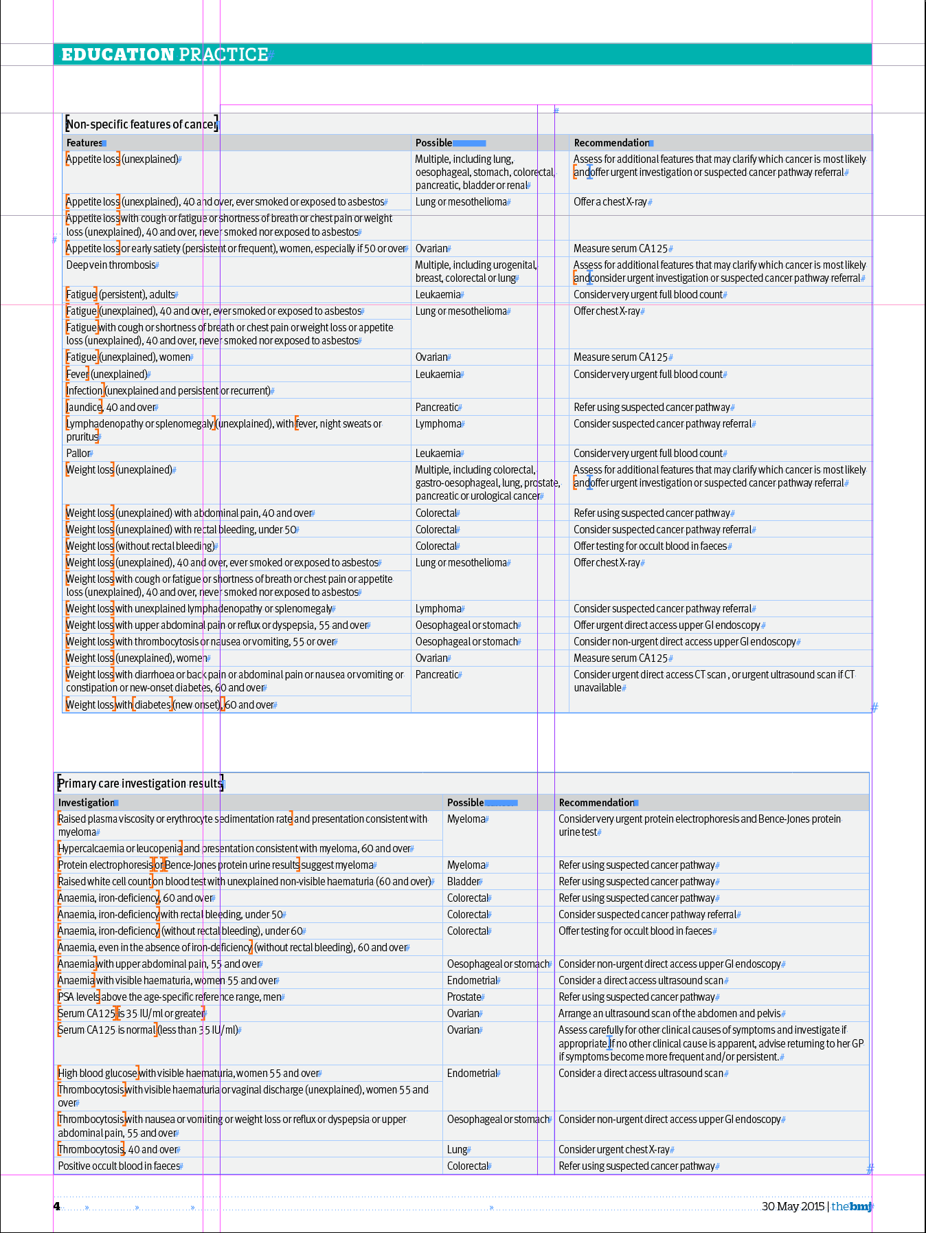
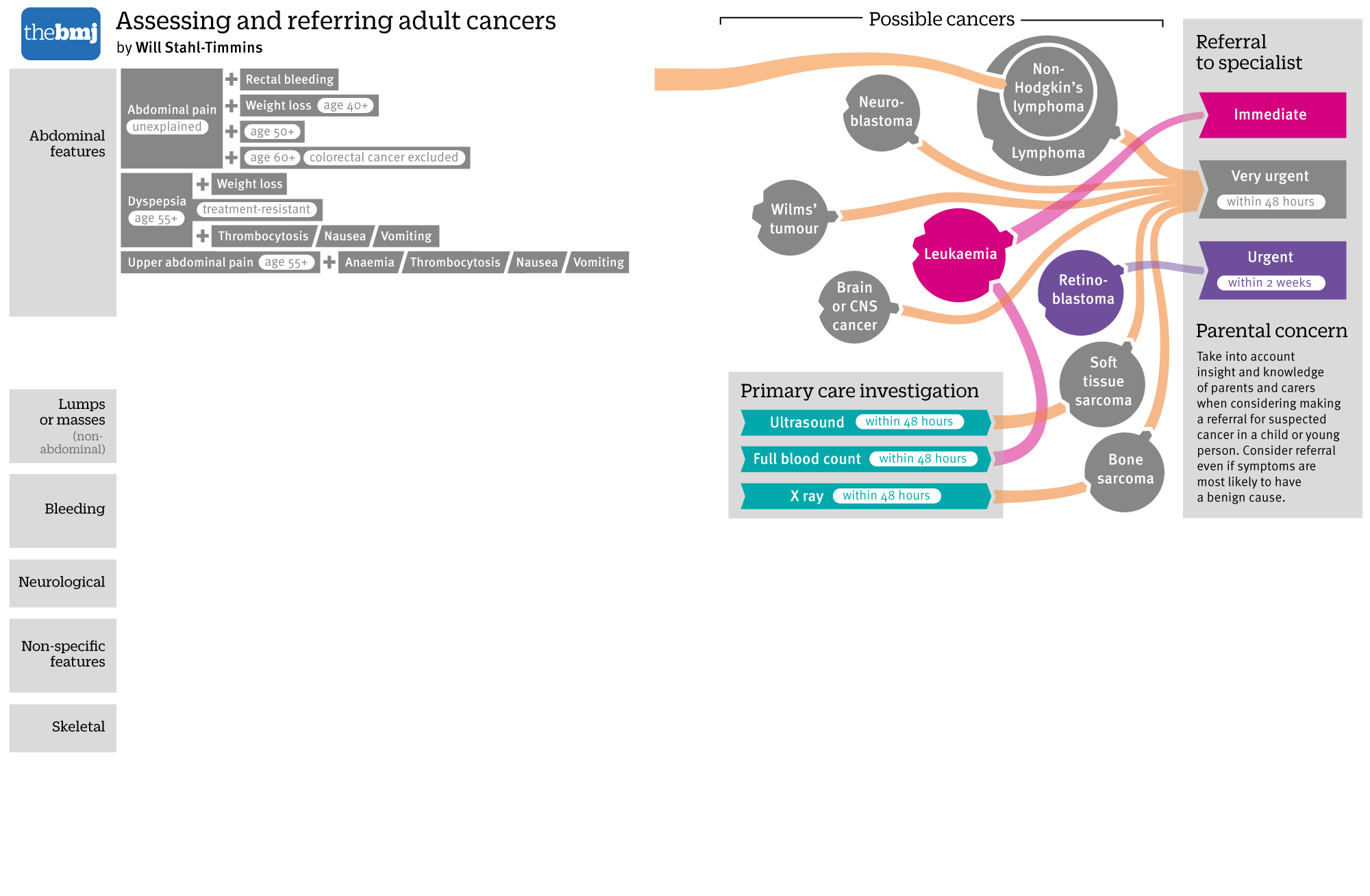
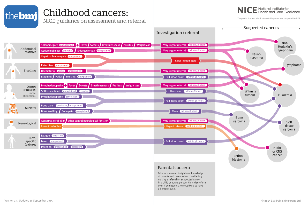
One of the first ones I worked on was a bit special. The NICE guidelines on referral of suspected cancer were updated earlier this year, and I was asked to take a look at the tabulated data and try and turn it into something more visually appealing. I was presented with this (on a Wednesday evening) – a series of tables detailing the advice on what to do when children present with some key symptoms:

My timescale was that I needed to get a graphic designed, checked and on page for print by the end of the following Tuesday (just under a week).
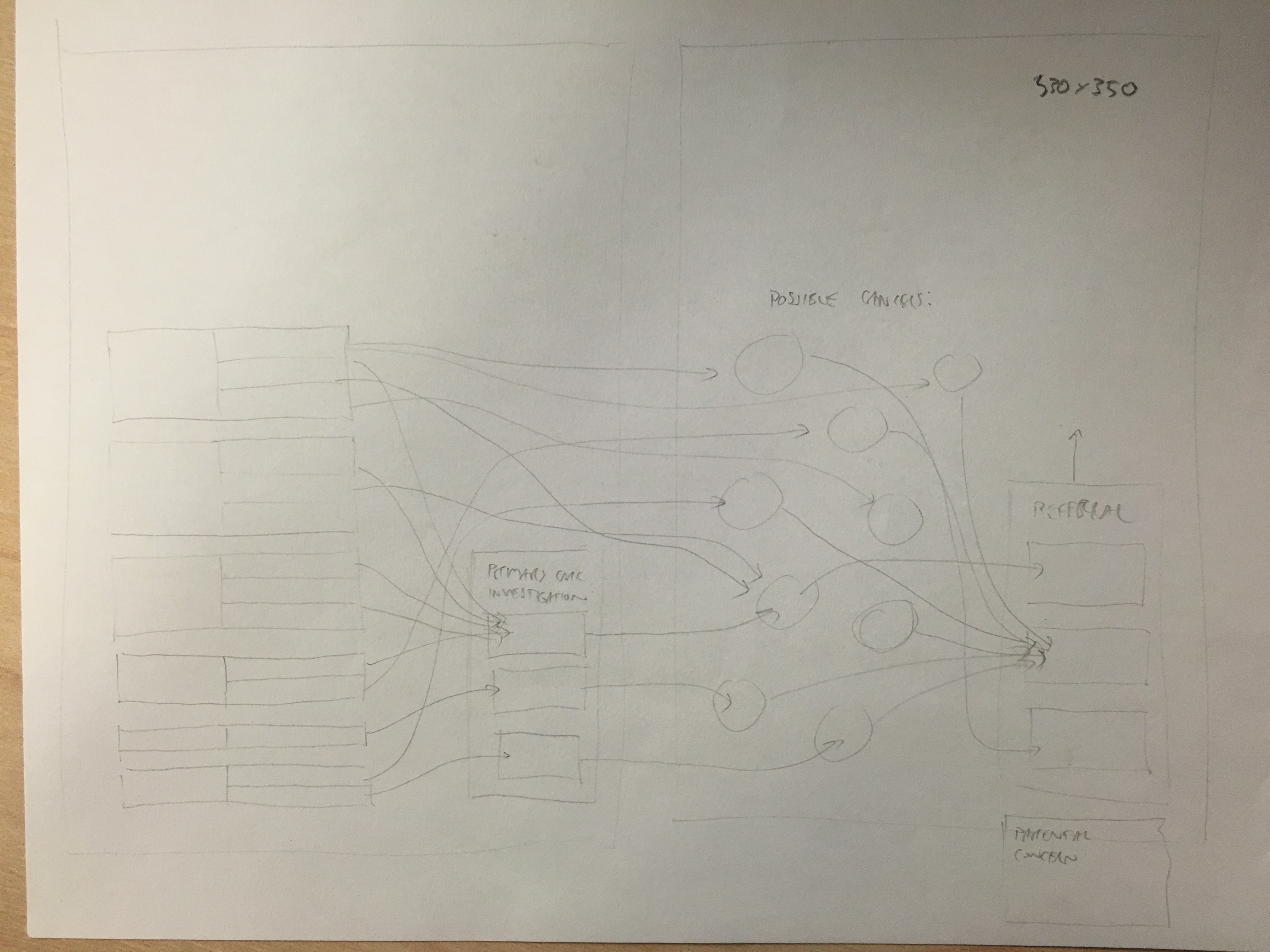
As always, my starting point was a sheet of A3 paper and a pencil – trying to make sense of the data, which cancers and symptoms appeared multiple times across different tables, how many different recommendations there were…
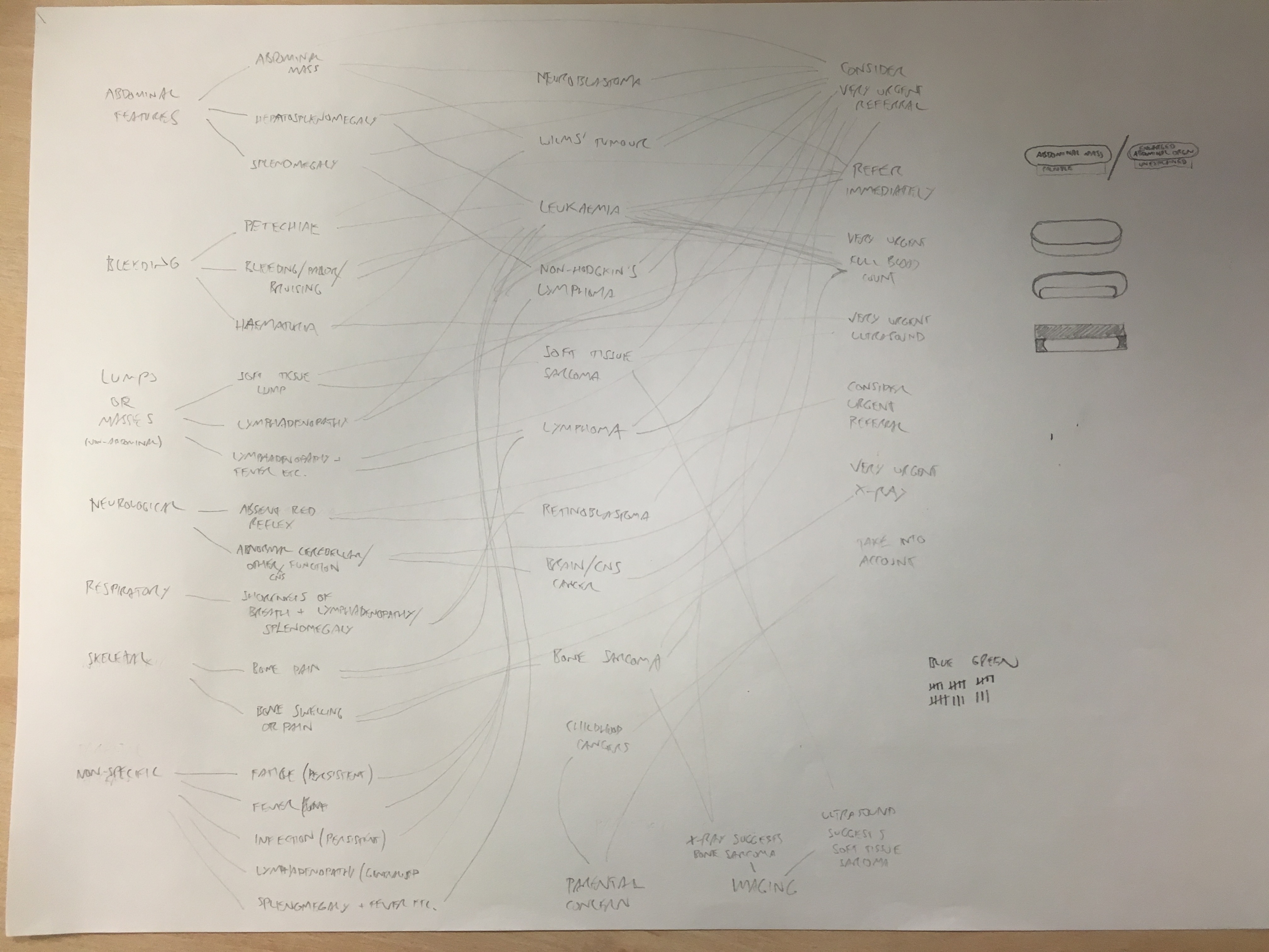
I realised that NICE were recommending that some symptoms should be investigated in primary care (in a doctor’s surgery for example), and that the results of these tests were picked up in table 9 – so I decided I needed four sections: symptoms, investigations, cancers and referral. I would arrange the presenting symptoms, show which investigations would be appropriate, and then which kind of suspected cancer those symptoms / investigations would indicate. Then (luckily) each cancer needed the same speed of referral, so I could link to the appropriate one.
Initially, I wanted a portrait layout on a singe page (the print issue of The BMJ is a bit smaller than A4 size):
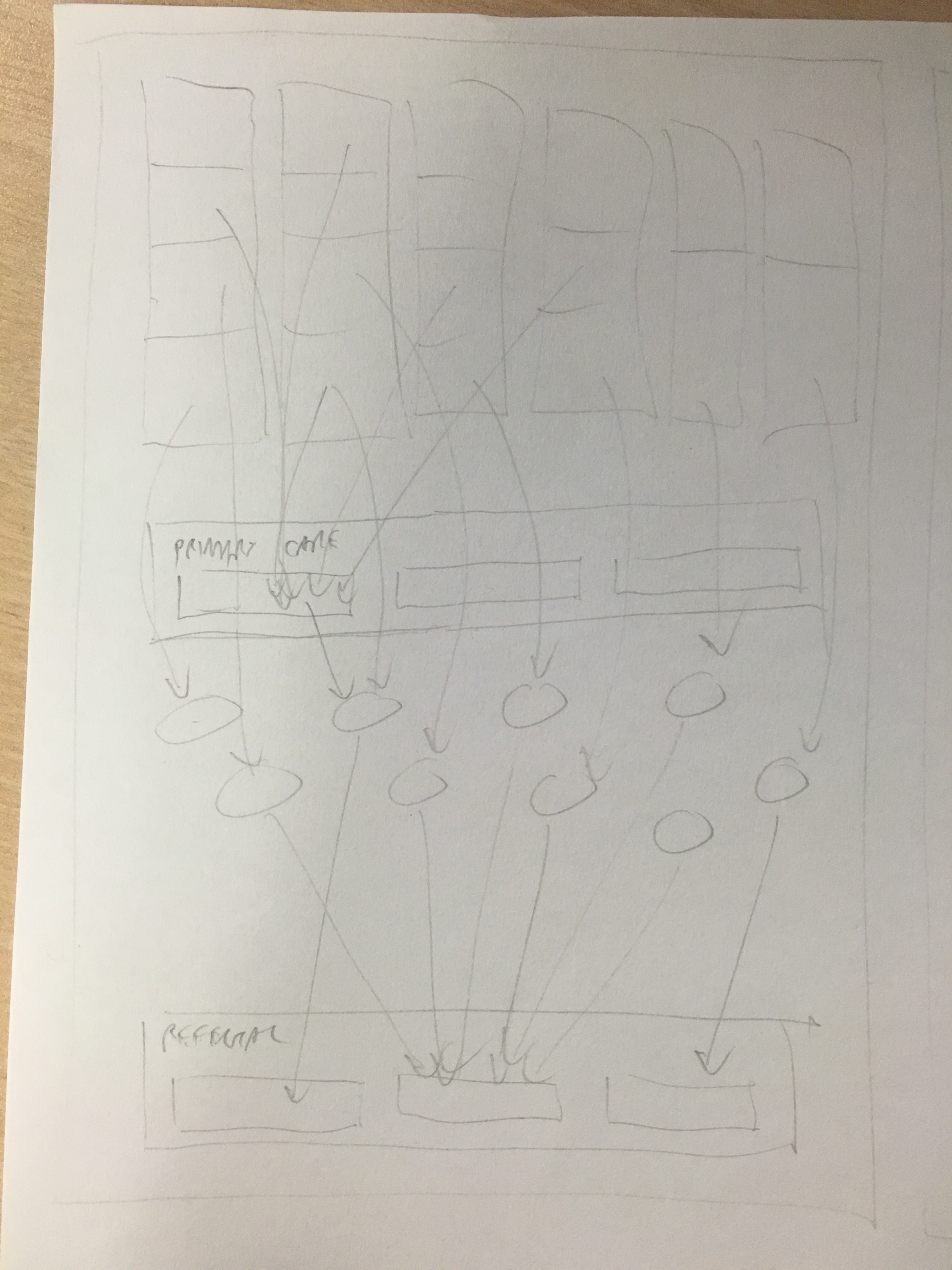
This vertical layout proved problematic though. I had the symptoms to look for at the top of the page. Some of these linked to primary care investigations in the row below that, but other symptoms are directly referred, so these would have to cross over this row, which looked a bit messy. Also, the 19 or so sets of symptoms to look for would have to be stacked on top of each other, making it hard to link them to the cancers below.
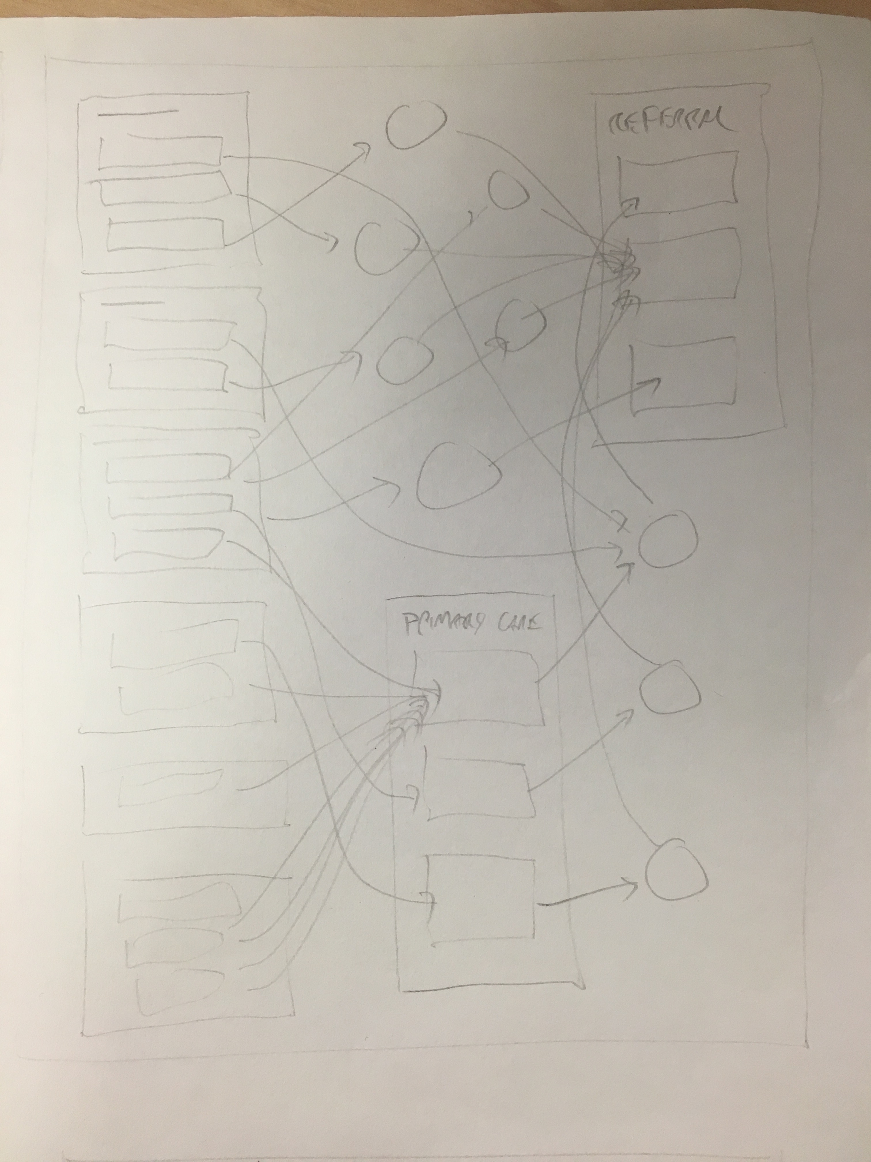
A horizontal flow across the page was much better in terms of linking the symptoms to the cancers, and avoiding crossing over the primary care investigations box, but it felt pretty cramped, and I was worried there wouldn’t be enough space for the symptoms on the left:
I don’t normally like to run my graphics across two pages. It makes them harder to tear out, and doesn’t work so well online (most mouse wheels scroll down, not across…) However, for this one, it really did seem to need the width:
This sketch was actually pretty close to what I ended up doing. I normally like to try a few different approaches but this time I was pretty confident that the idea would work, and time was short.
I started out thinking that I would use mostly horizontal linking lines, with diagonal sections in the middle to account for height differences:
However, it quickly became clear that following individual lines would become tricky – even with different colours. I first tried a variable width stroke, with the lines starting off thick then narrowing towards their destination:
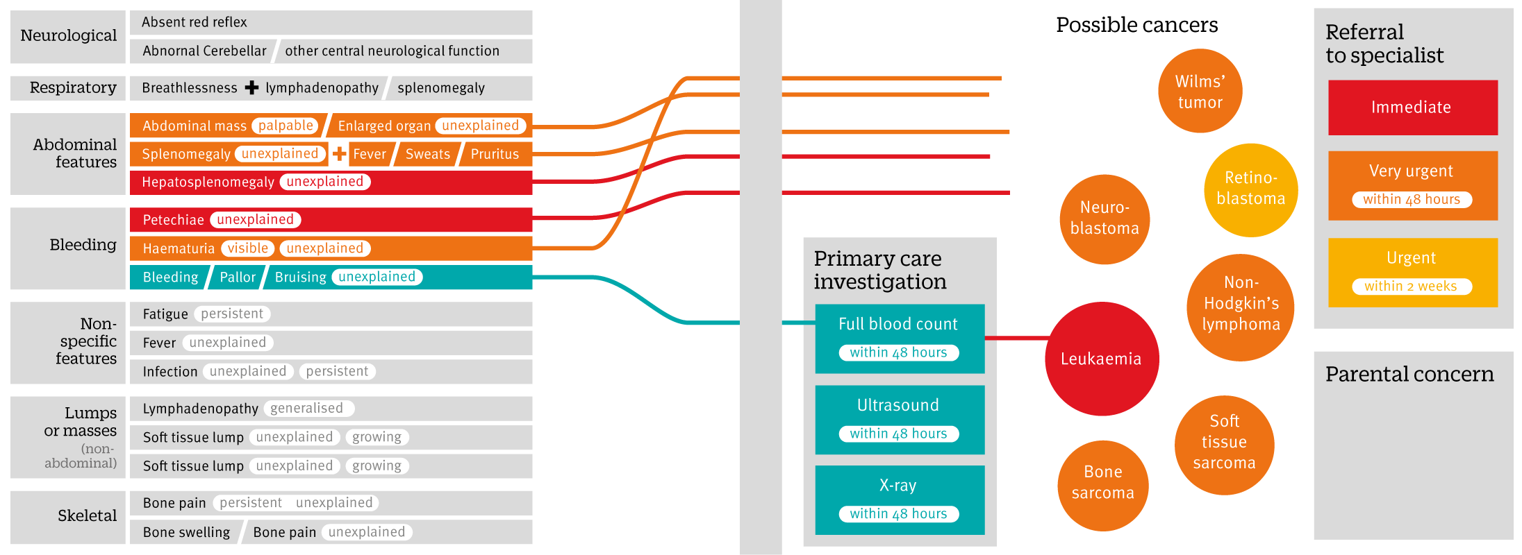
This helped a little, but I still felt the centre of the page was going to become quite busy, and the possibility for confusion was too great. In the end, curved link lines seemed easier to follow:
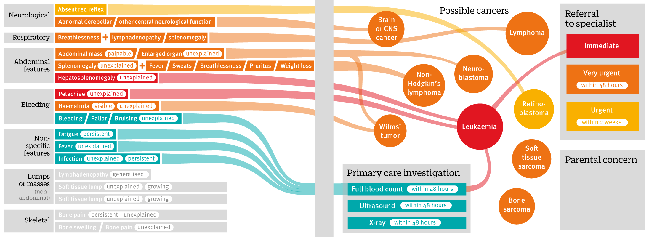
I also added directional arrows from symptoms through the cancers into referral speeds. This was particularly important for leukaemia, which can be diagnosed from some symptoms directly, but also from investigations. I also switched around the colours a bit:
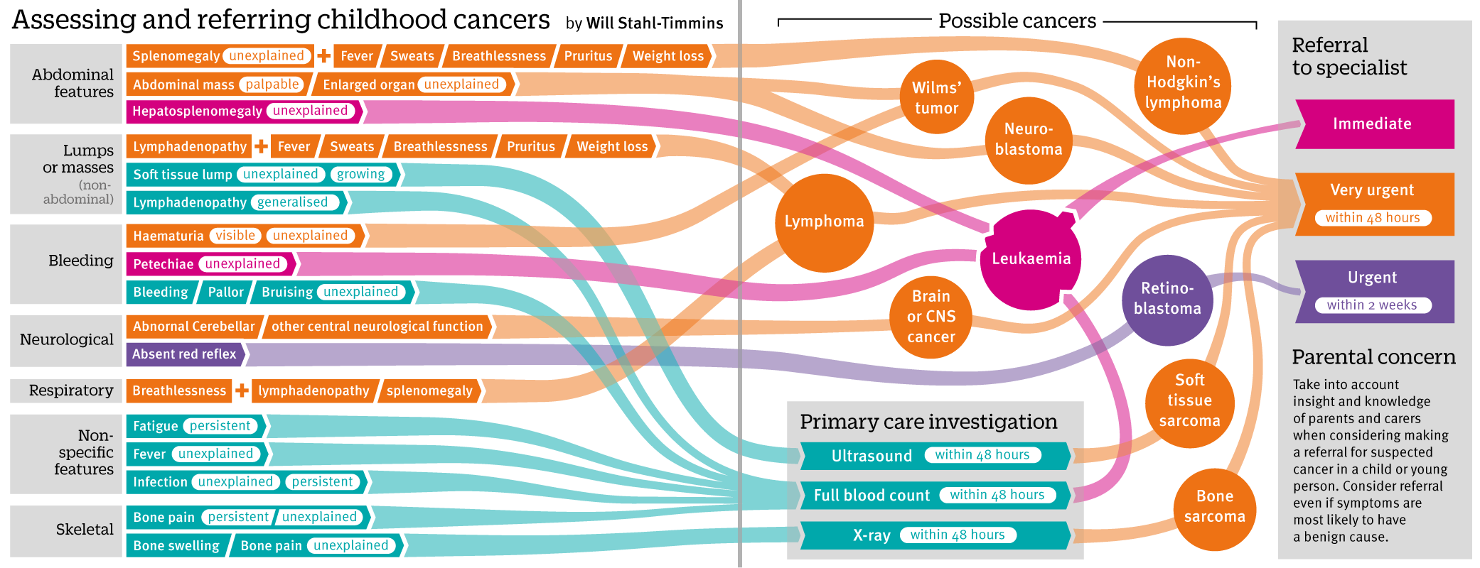
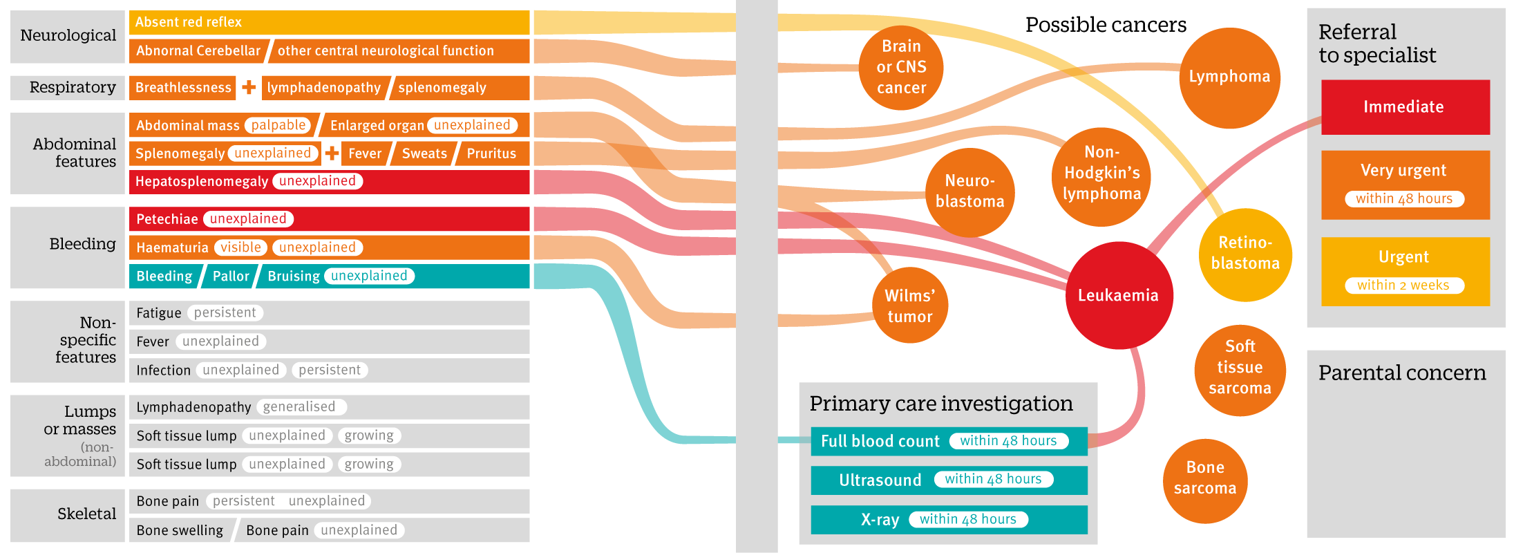
This version went to the article’s authors for checking. One of their suggestions was to move the two kinds of lymphoma closer to each other, since non-hodgkin’s lymphoma is also a type of lymphoma (or, rather specifically not one type of lymphoma). I decided therefore to have one circle within the other (particularly since the referral pathway was conveniently similar for both).
This was the version that appeared in the print journal and online here: http://www.bmj.com/content/350/bmj.h3036
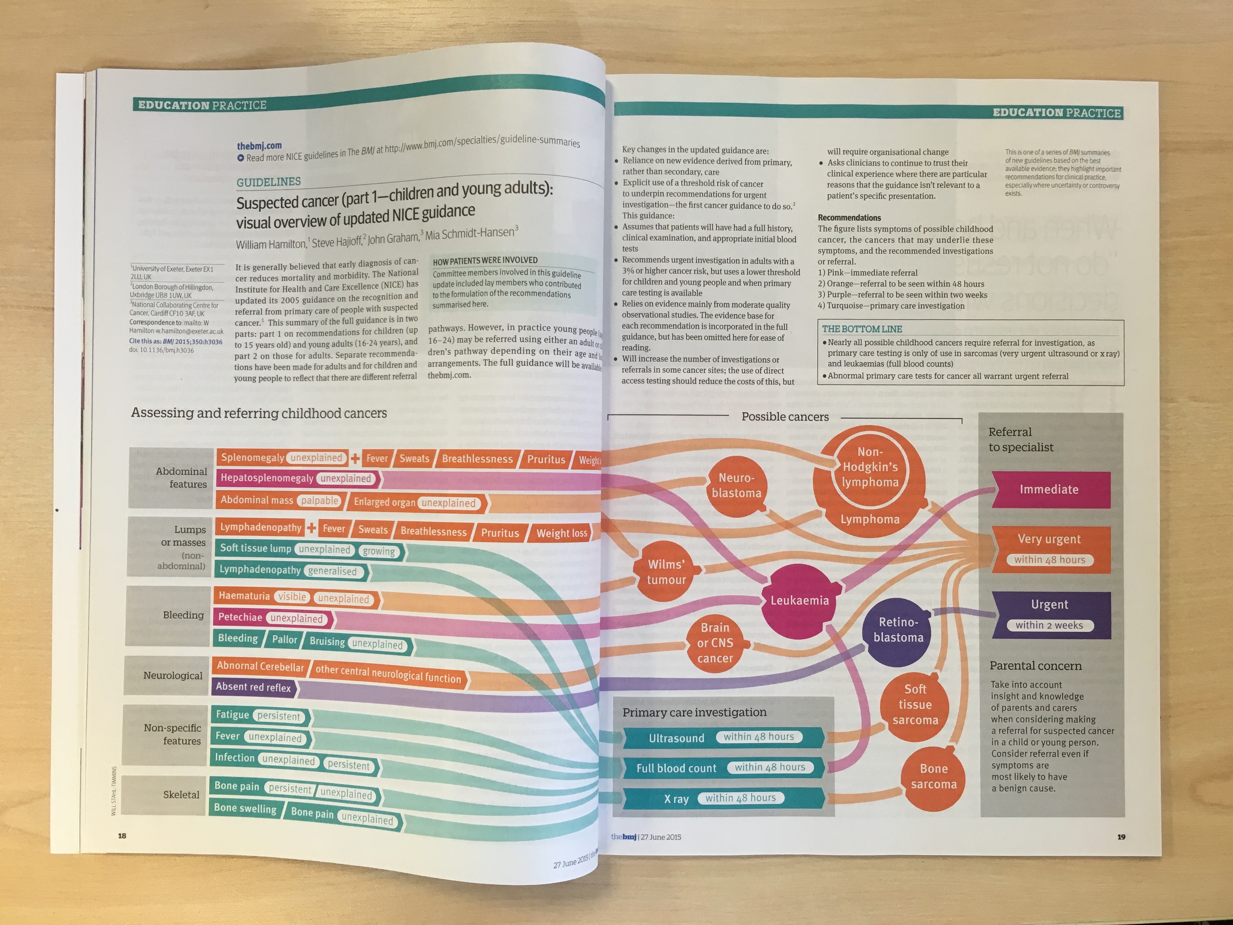
In fact, it ended up being picked up for the cover of that week’s issue (my first graphic on the cover – so proud!).

So there we are. Job done, pats on the back all round. Hurray, etc.
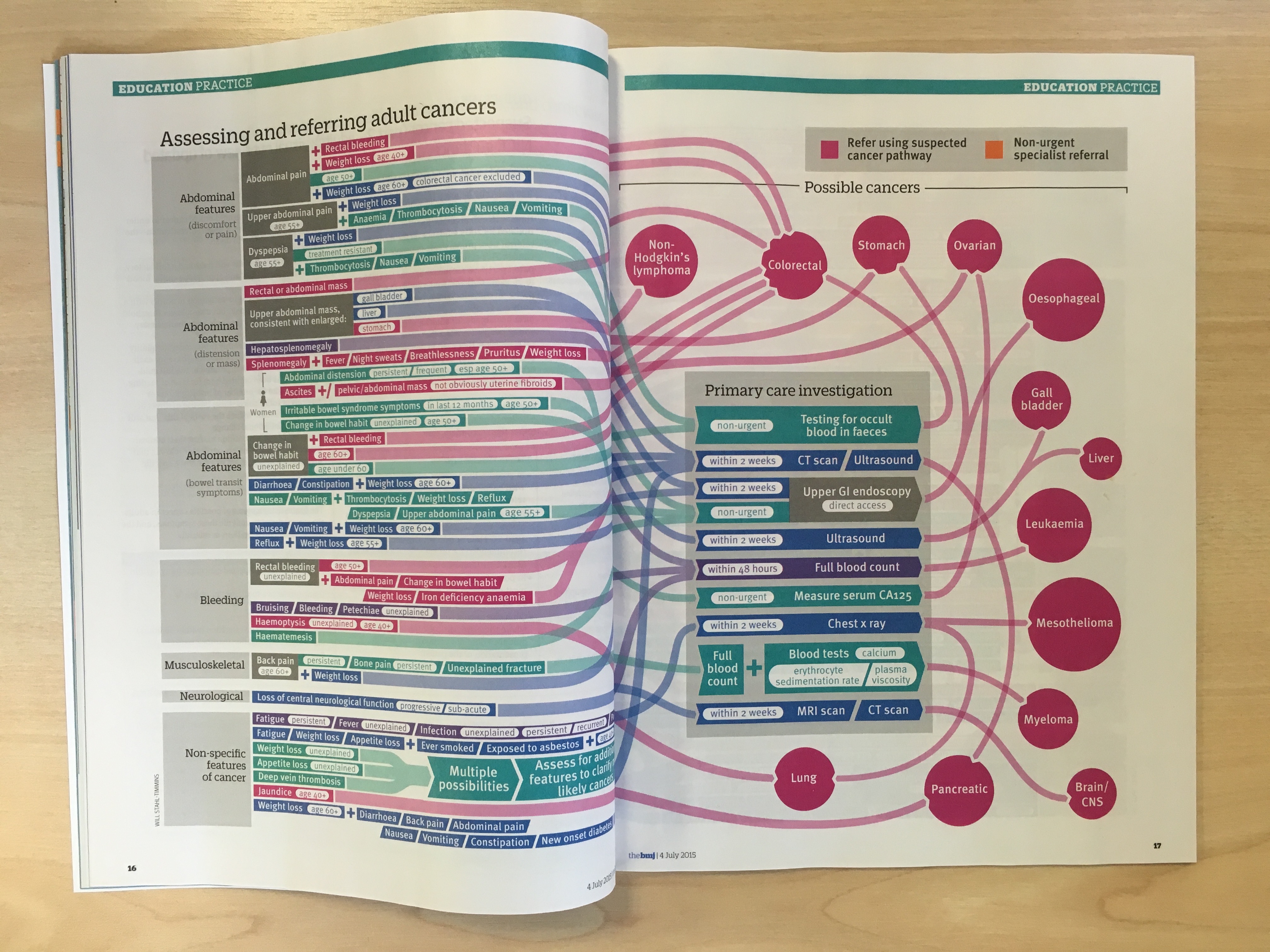
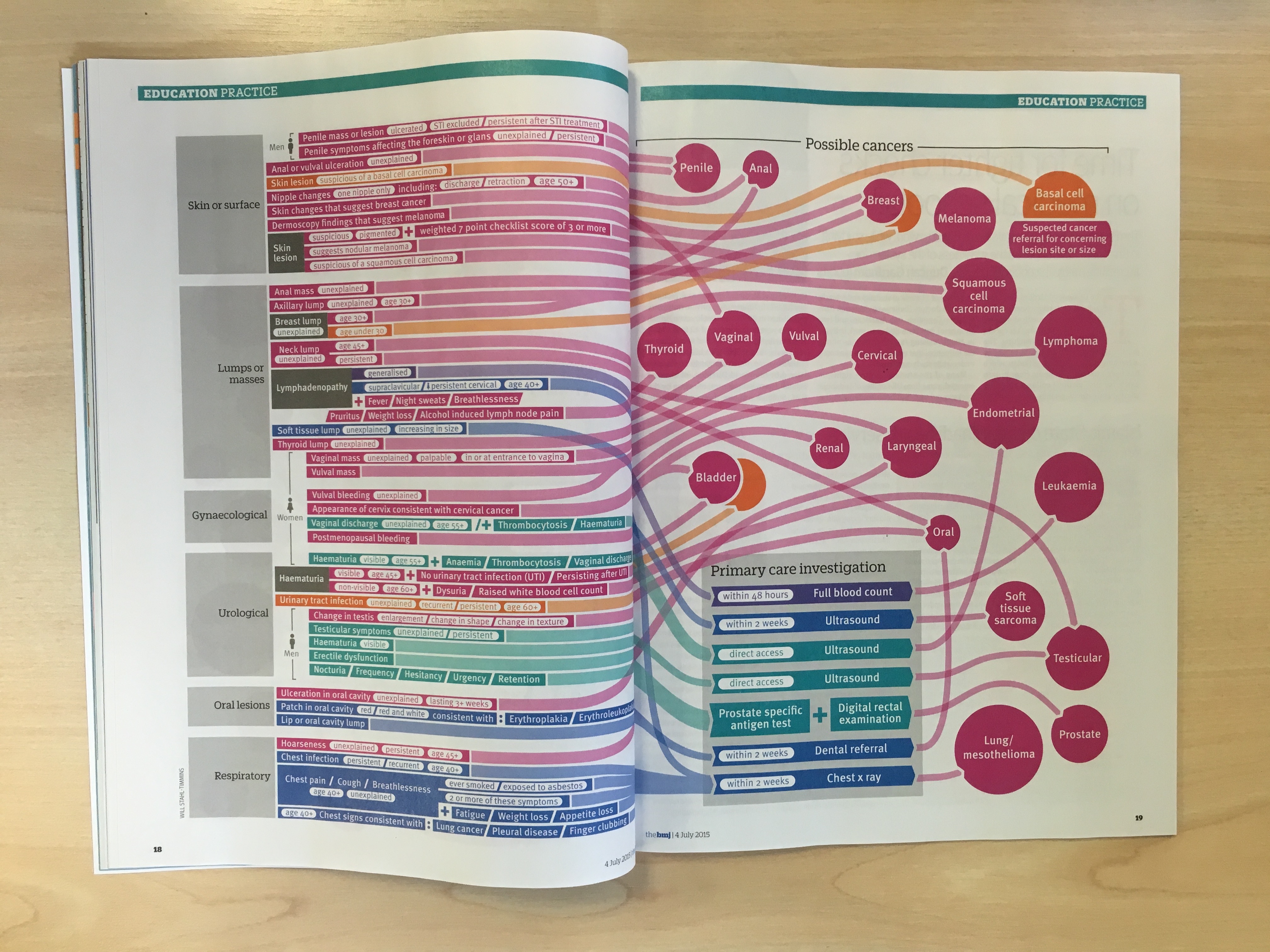
Well, at least until the next morning, when I was sent the next set of guidance – on adult cancers. The childhood cancers that I’d just finished had 19 sets of presenting symptoms. The adult cancers had 95!
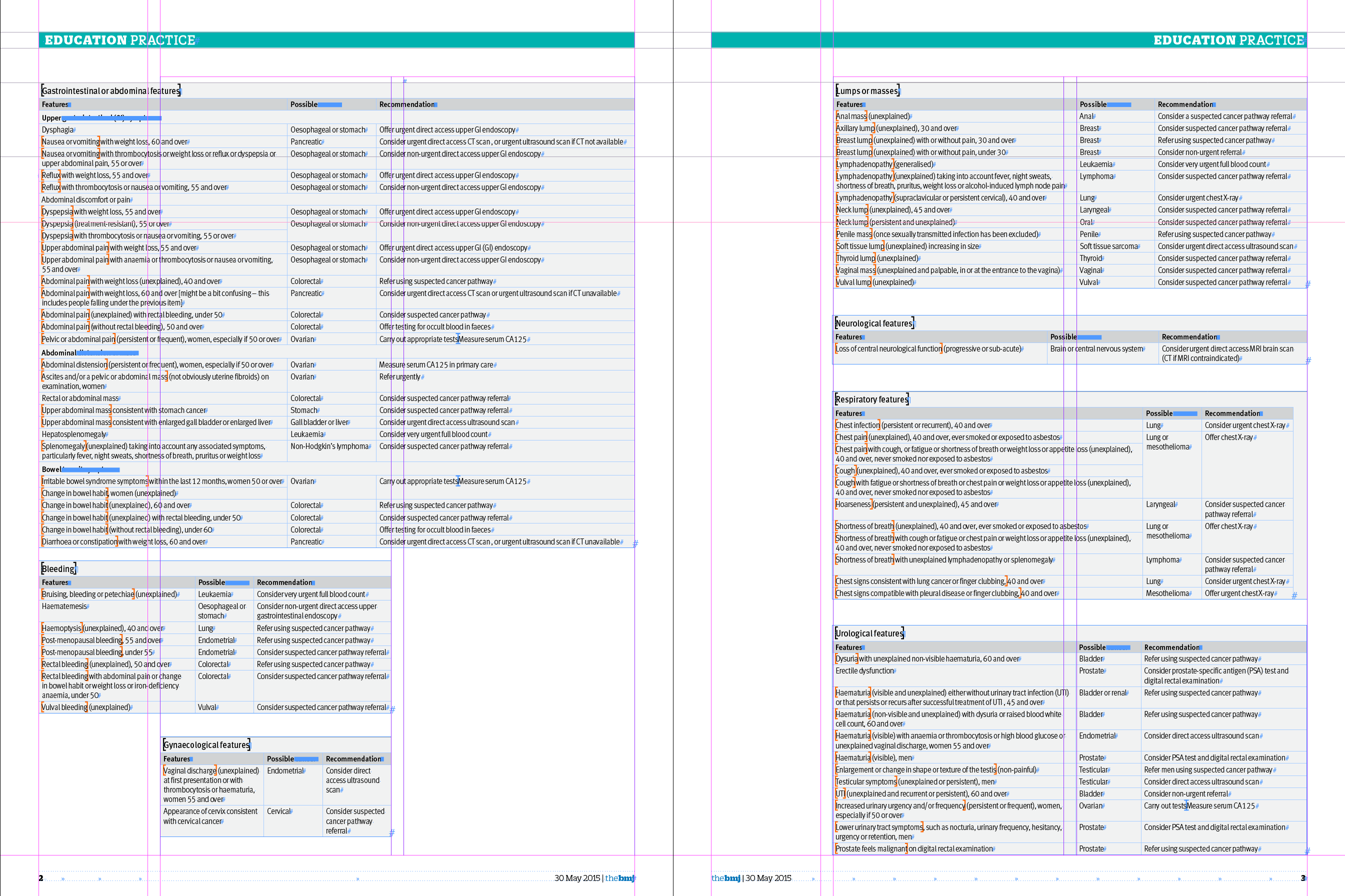
And this was only the 9 tables that would fit on those pages – there were another 2 large ones as well…
In hindsight, perhaps the wisest thing would have been to just admit defeat at this point, and say this kind of graphic wouldn’t scale to this level very well. Or at all. And then I was CCed on an email from one of the authors, Willie Hamilton, in which I read this:
“My suspicion is that it would be almost impossible to do this for adults – we’d end up with a Gordian knot in multiple dimensions, but if Will can take up the challenge, I’m very happy.”
Why did I think it was a good idea to try something that an author thought would be “almost impossible”? Who can say. Perhaps I’m just too stubborn to admit defeat. I had another 4 working days to produce a graphic more than four times the size, and it was “almost impossible”. How could I refuse?
Of course, Having done one graphic with similar information gave me a head start this time. I wanted them to be pretty similar, so that someone familiar with one would be able to use the other.
My first job was to find out whether I could fit the symptoms all on one double page spread…
After the first table was on the page, it was pretty clear that this wasn’t going to happen.
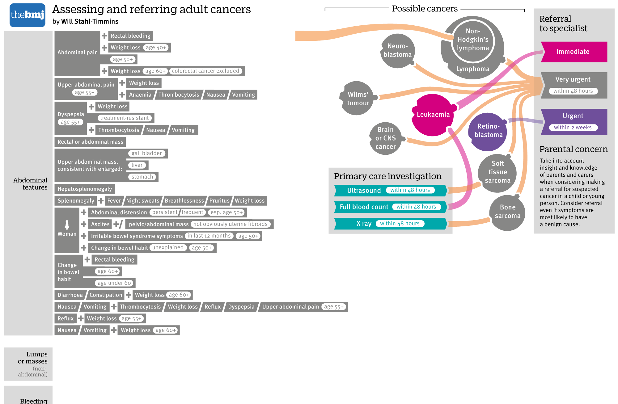
I squeezed and I squashed the symptoms up vertically as much as I could, and reduced the type size as much as I was comfortable with:

But it was still nowhere near. I did the rest of the symptoms, and it took up roughly double the height of a 2 page spread.
If I could have made this into a poster, this would have worked quite well. I considered having the symptoms down the centre of the page, and the cancers to either side, but because each cancer is linked from different sets of symptoms, this wouldn’t have worked neatly (or at all, given the number of cancers I was going to be adding on.
At this stage I decided that it wasn’t going to work in print. I told the print team that it would take up at least 4 pages, and waited for them to let me off the hook.
That didn’t work out quite as planned. They gave me the four pages without so much as a whimper, so it was on to adding the cancers for me. I would need a box for primary care investigations on each spread.
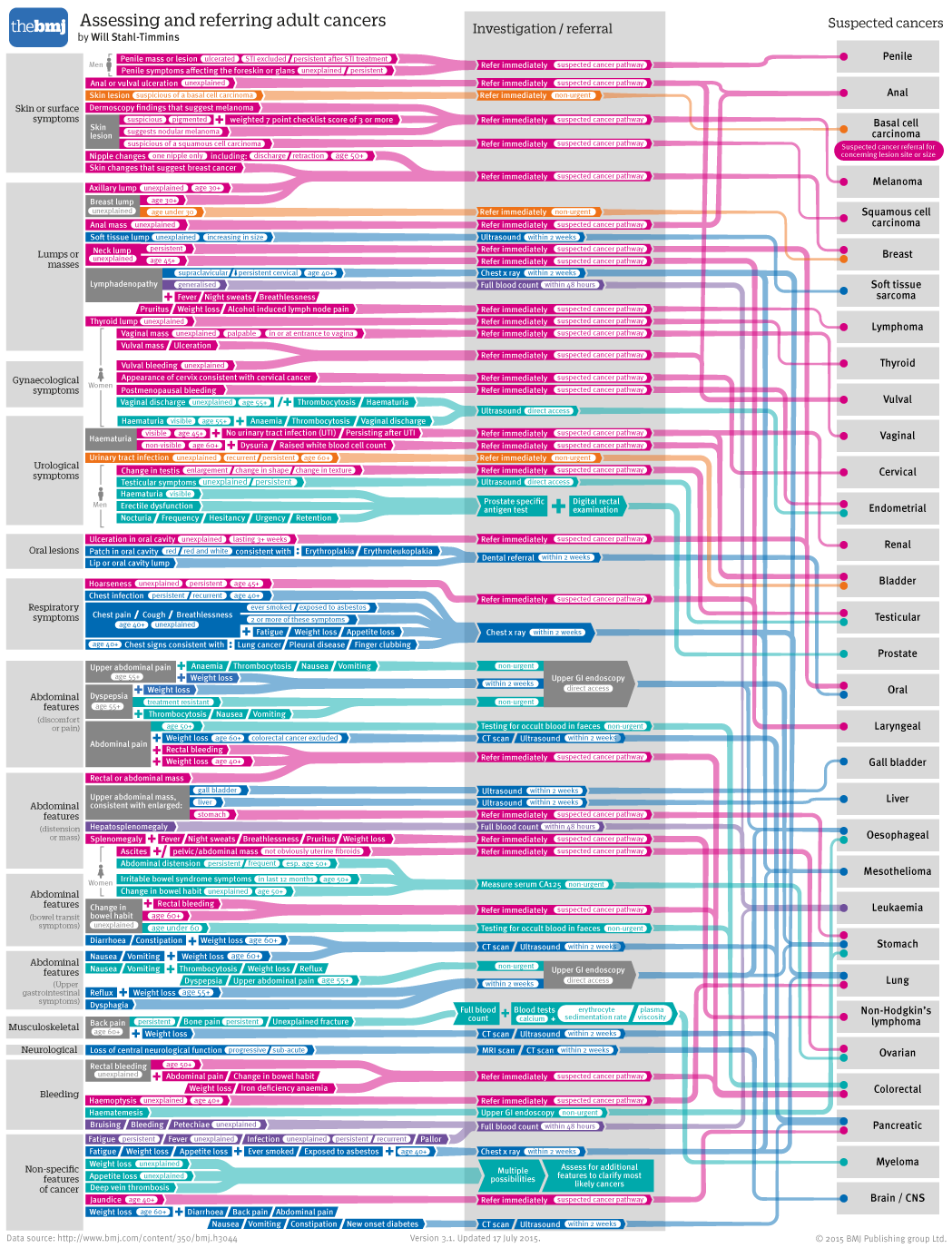
I quickly realised that I was going to need more than one colour for the interventions in primary care – otherwise there was going to be a huge and confusing turquoise waterfall to contend with. I decided to use a green / blue palette for interventions, and a red / orange palette for the cancer referrals. At this stage I wasn’t too worried about the appearance of the lines, I just wanted to get the connections right so I could see what I was dealing with.
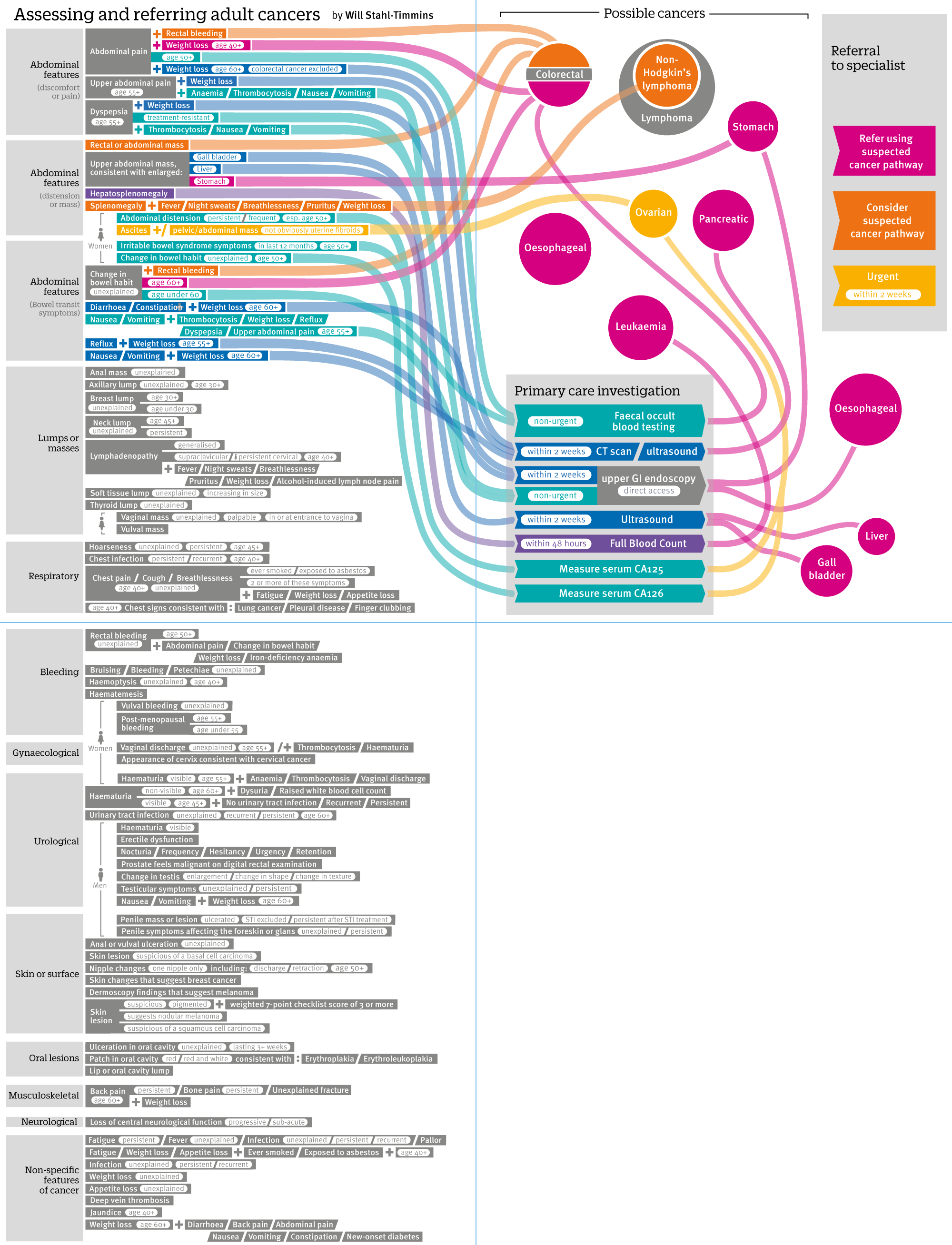
I soon realised that to fit all of the adult cancers, I would have to take out the cancer referral “endpoints” and instead rely on colour alone for the speed of referral. I never take this decision lightly, I like to reinforce the use of colour in some way in case of colourblind readers. I always try and avoid using both red and green anyway, but there are many different types of colourblindness, so I like to use colour to reinforce a message rather than being the only way of getting to it. However, there was no way round it here.
Eventually, I managed to squeeze all the symptoms, investigations and cancers on the two spreads. I moved the two investigation boxes to the vertical centre of the page, to avoid the blue waterfalls as much as possible.

From here it was a long hard slog to clean everything up. Some cancers were replicated on both spreads. I reorganised categories, swapping them between the spreads to reduce this as much as possible. In consultation with the summary article’s authors, we agreed to reduce the number of categories, since they wanted most cancer referrals to use the 2-week clinic anyway.
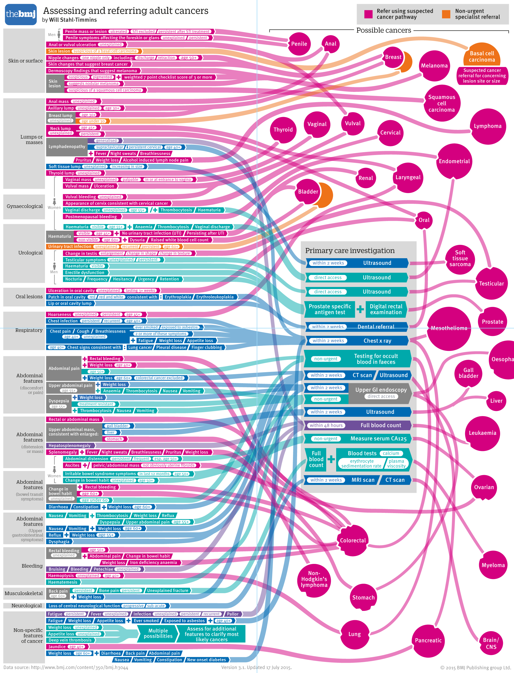
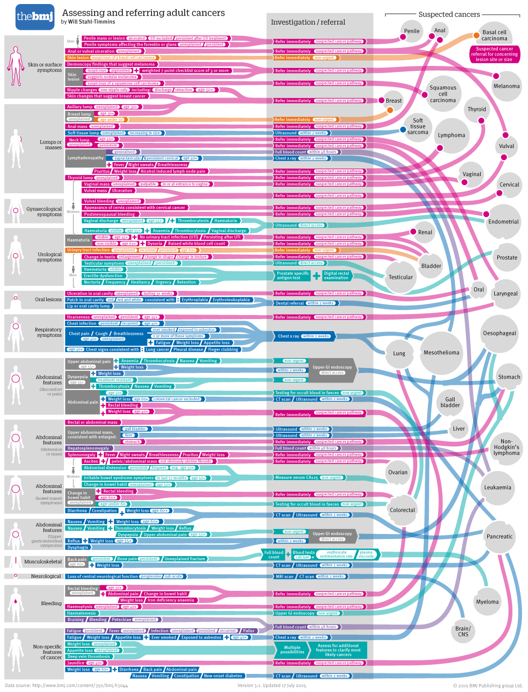
I’m going to skip ahead about 30 versions, because the endless tweaking would make for very boring reading. In the end, we ended up with this:
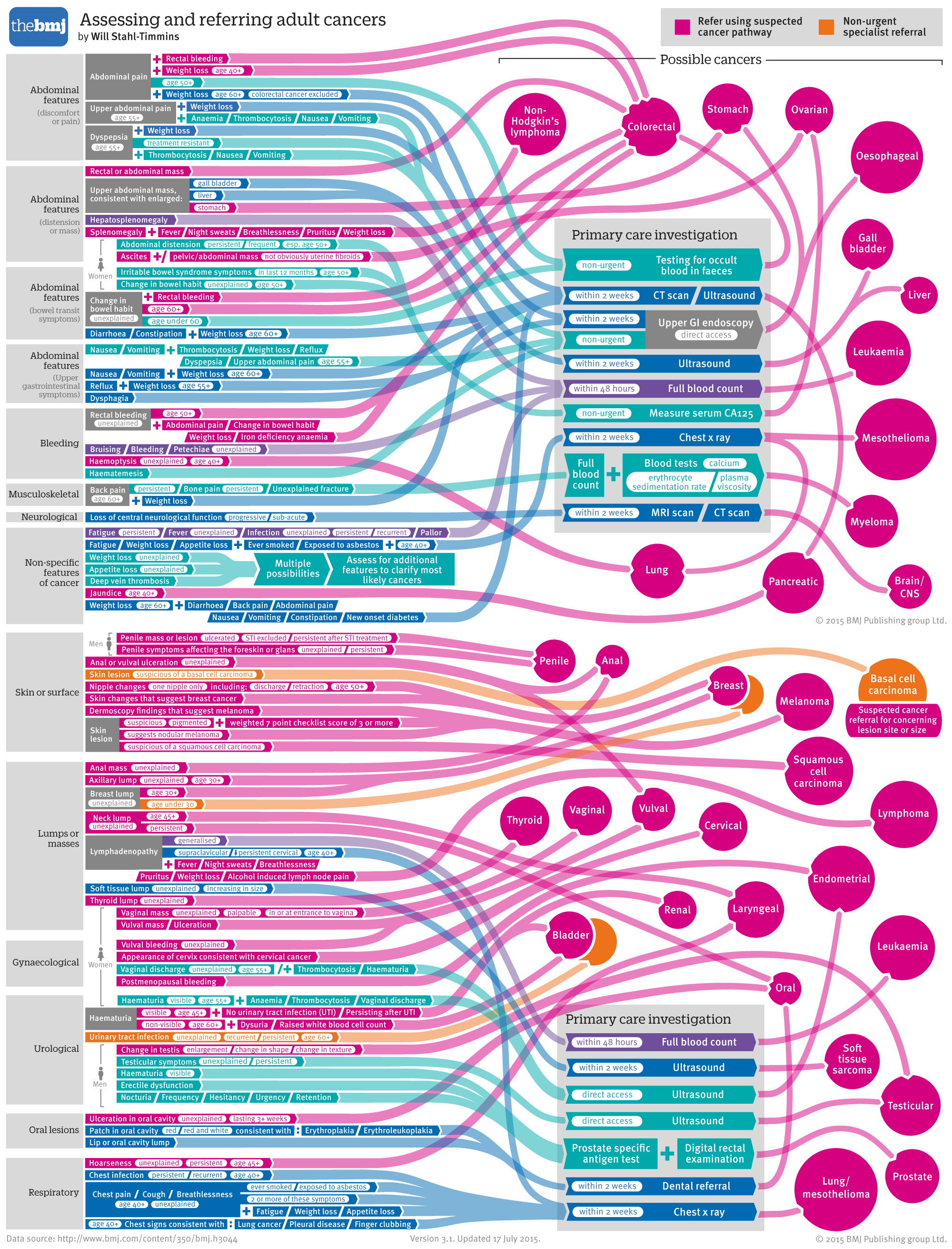
One tricky decision was how to represent cancers that had multiple different referral speeds. The reduction to two colour categories helped this issue, but there were still two cancers for which this was an issue. In the end I used two overlapping circles, with only the top one labelled.
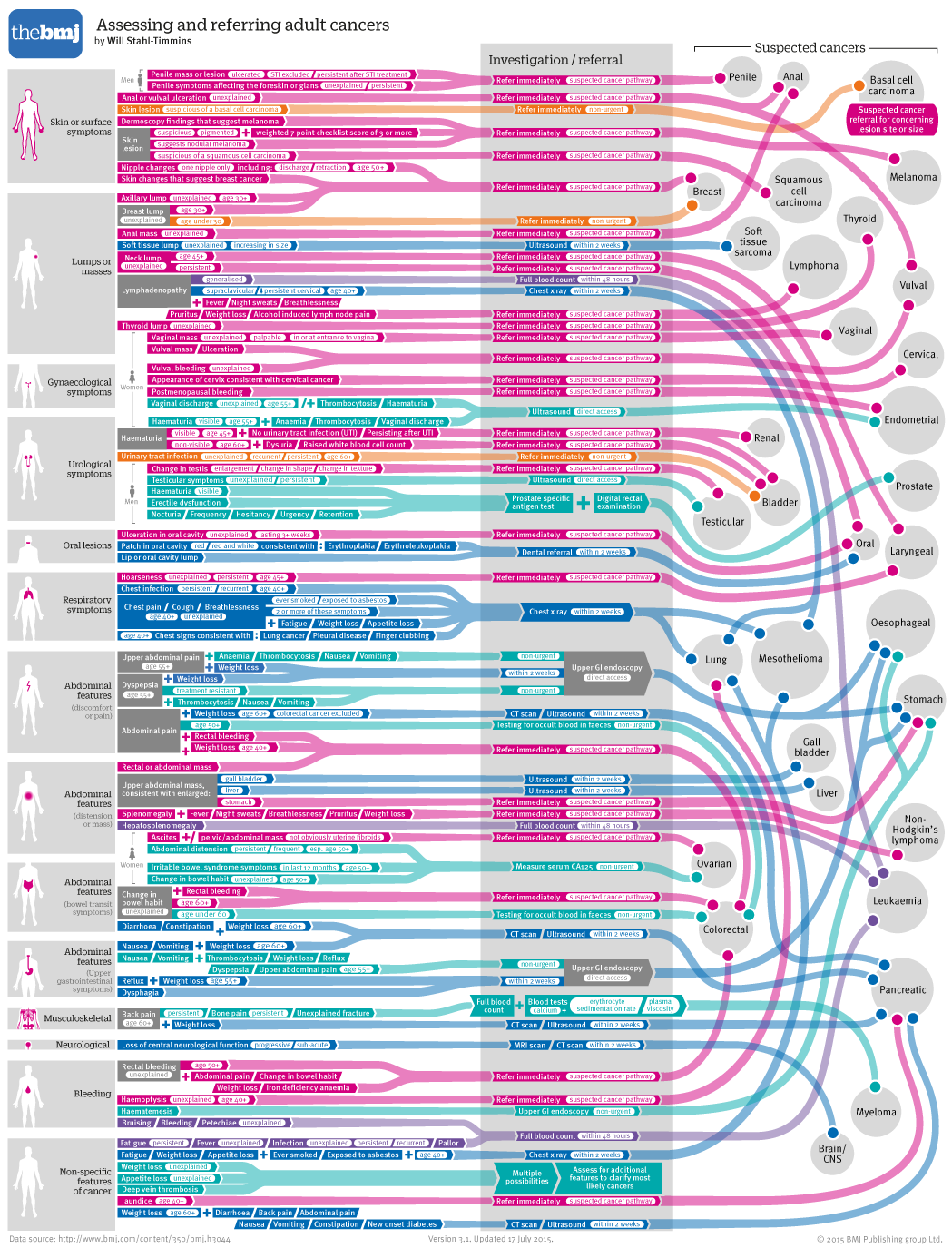
I wasn’t nearly as happy with this as the childhood cancers graphic. I felt it was shoehorning the information into a format that was designed for far fewer connections. It looked rather spaghetti-like, and was difficult to follow. It relied on colour perception for vital information. However, it was a challenging brief, and despite these issues it was just about usable, and probably nicer to look at than a huge block of tables, so it went up online:
http://www.bmj.com/content/350/bmj.h3044 and in print:
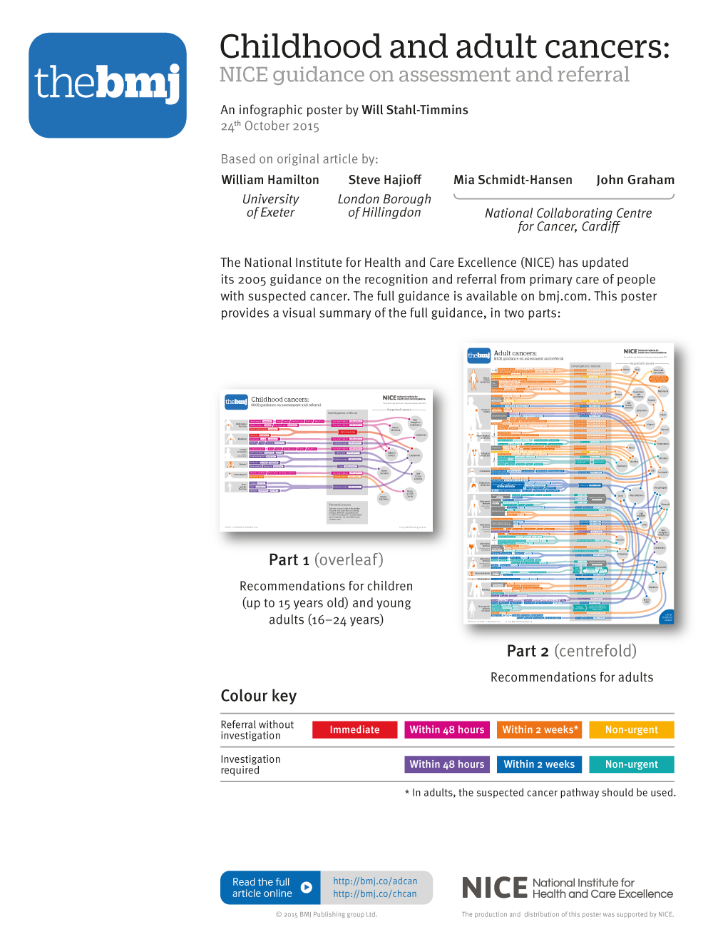
However, I couldn’t let go of the feeling that it would have made a much better poster. Luckily, I was given the chance to revisit the project a couple of months later, thanks to our publisher who negotiated a deal with NICE to fund some A2 poster inserts for the journal.
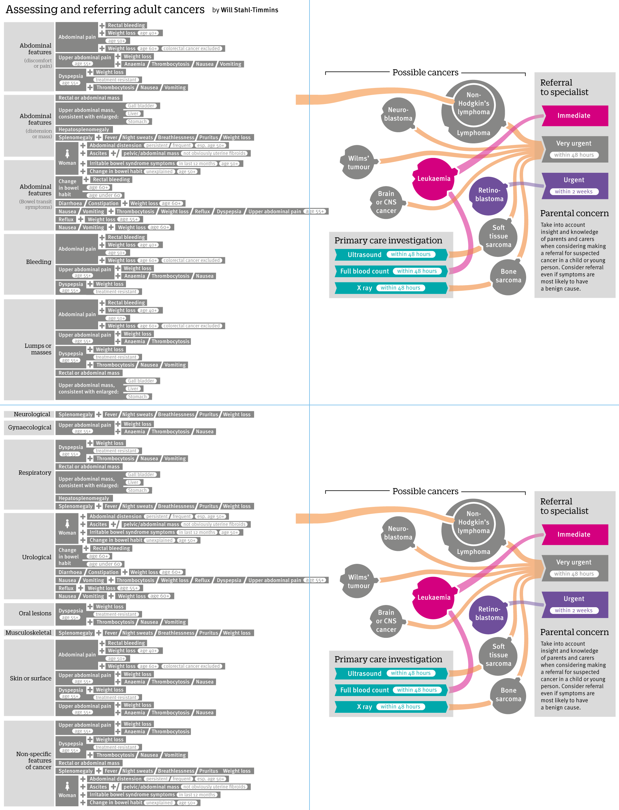
I knew that the data would be much easier to present in poster format – there would be no need for duplicated cancers on the two spreads. Also, having longer to work on the graphic gave me time to address some of my other issues with the design: The reliance on colour, the jumbled lines and the awkward split-colour cancers.
My initial instinct was to try a landscape version, starting in the centre with the investigations going left, and the immediate referrals going right:

It turns out instincts can be so very wrong. This caused all sorts of headaches. Most of the cancers would end up at the bottom, so huge long lines would be needed. The central start wasn’t very natural-feeling either. All the colours would be grouped together so it would be hard to follow lines. I started again, trying the portrait format from before, but stripping out the duplicated cancers, and joining together the two investigation boxes:
It was at this point I made probably the most important change to the graphic. I was still bothered about the reliance on a colour key. There were too many overlapping lines. I felt those cancers that needed investigation had clearer instructions given in those boxes. In the end, I wondered if it would be possible to fit everything on if I went back to each set of symptoms having a specific instruction, as they did in the original tables:
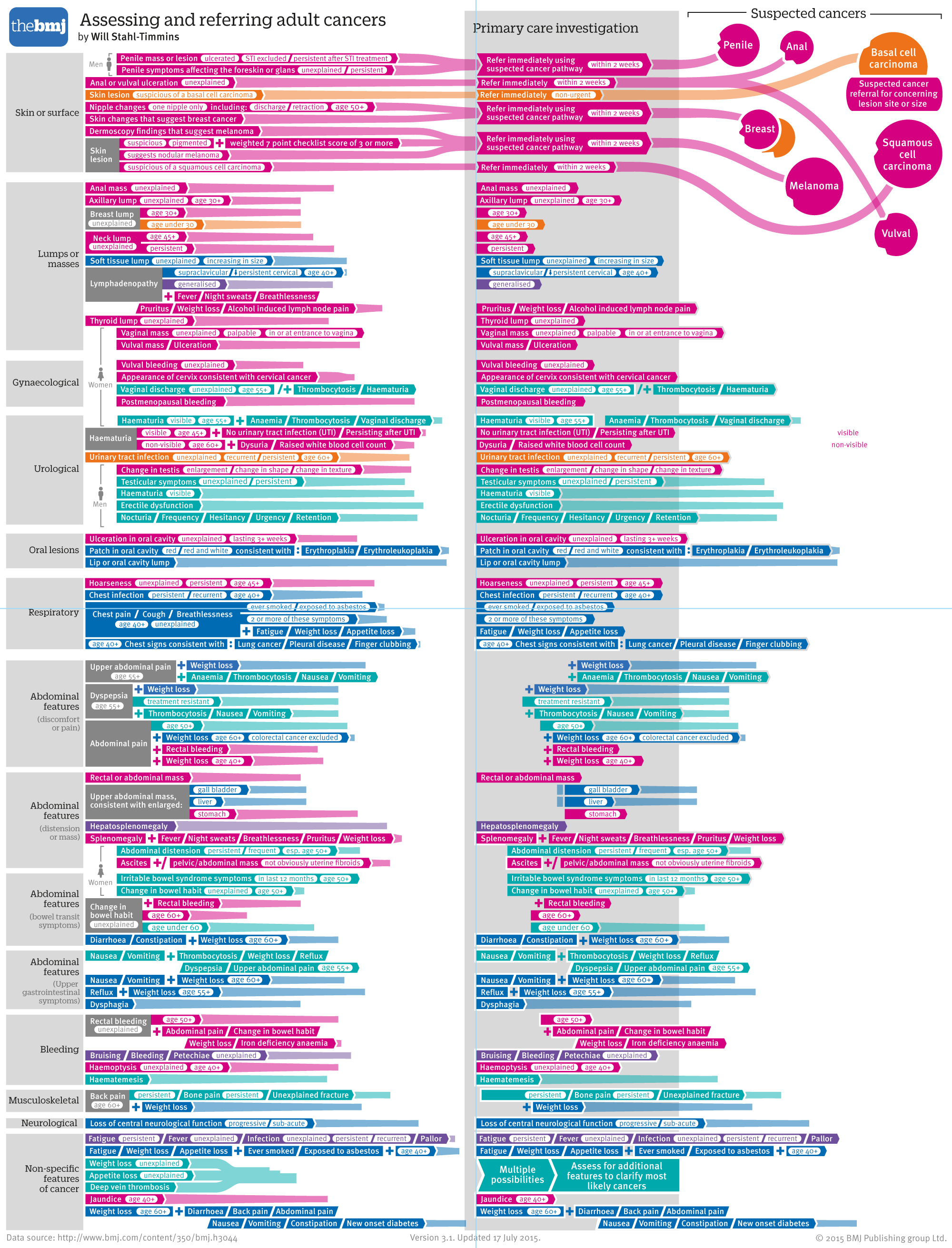
I knew that some sets of symptoms would be near each other and lead to the same type of cancer and recommendation. I hoped that I could do the whole left hand side without any lines crossing, and then lay out all the cancers just once down the right hand side. I was worried as I went down the page that there wouldn’t be room, but it turned out that things spaced out a bit further down:
I was still worried about the overlapping lines, even though there were far fewer. I wondered whether a circle was the right representation for the cancers, since the longer names resulted in quite a bit of unused space. Also, I wanted a better way to deal with the dual-colour cancers. I tried making a long list of cancers on the right, with multiple coloured blobs on each showing the different kinds of referral. However, the overlapping lines became extremely confusing:
I wondered if it might be easier to follow straight lines. It wasn’t:
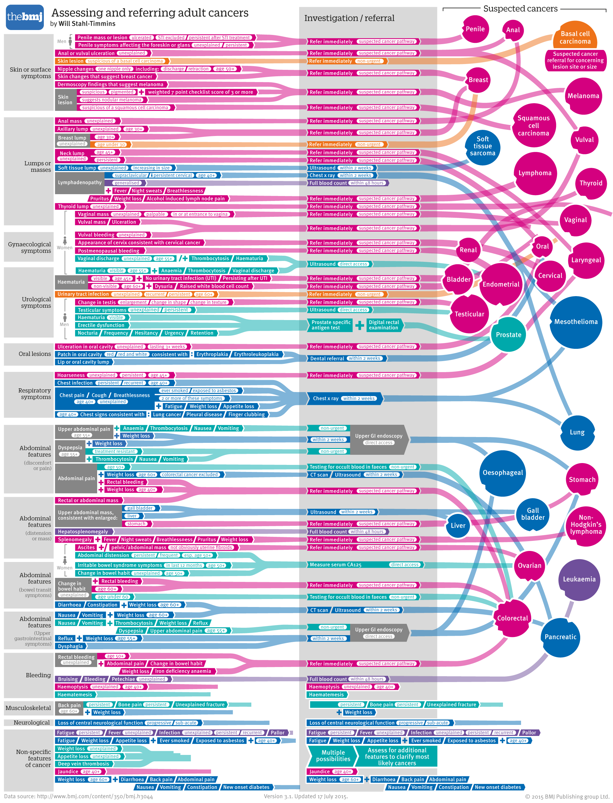
So I went back to the circles, but this time grey ones with small coloured circles attached to show the referral types, which seemed to work better. I could attach them in blank spots, so the larger circles didn’t seem so much like wasted space either.
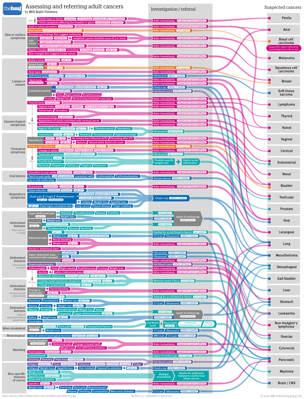
You’ll notice that I managed to find space on the left to squeeze in some images which I thought might help to identify the different categories, by highlighting body parts. The circles I chose weren’t immediately obvious, however.
I chose instead to use images of the relevant organ systems / body locations, which worked a bit better, especially when I scaled the body sizes to an appropriate level for the different areas (skipping ahead here to the final version, after lots of editing, approval and other administrative things):
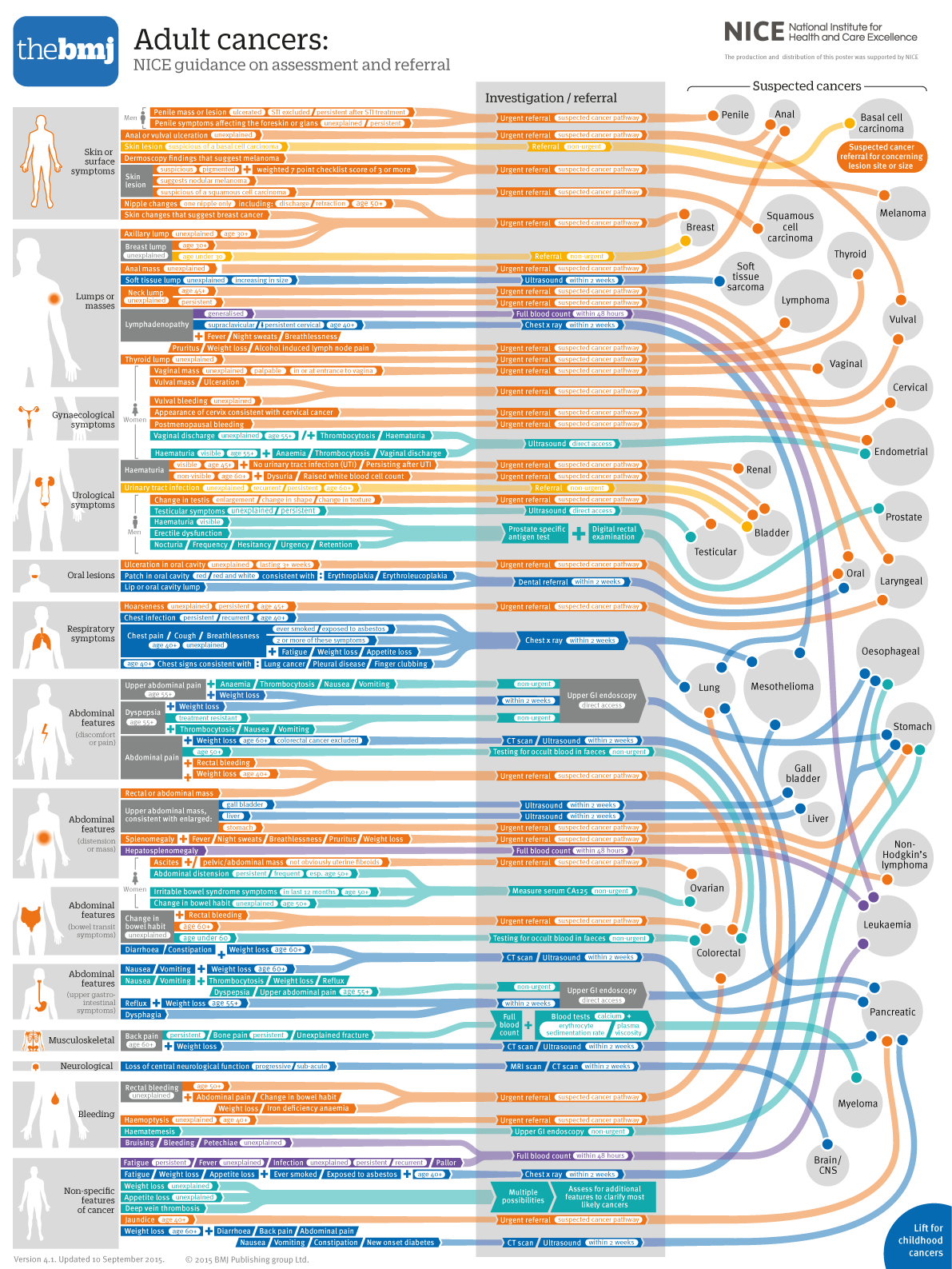
The dramatic colour change is because I needed a standard set of colours across both childhood and adult cancers (we printed a new version of the childhood cancers on the other side of the poster):
Childhood cancers tend to be more urgent, so I used more urgent reds and pinks for this side of the poster. The colour scheme was actually peripheral now, since the referral speed is given in text in the central grey column which, as I mention above, is just how I like it. It gives people with full colour vision a short-cut, but isn’t essential for understanding the diagram. The colour key appeared on the front of the folded poster, but I’m assuming people won’t need to refer to it much (which is good, since it might well be stuck to some people’s walls):
The one problem with this project is that we were left with a very large and detailed graphic, which needs to be printed at A2 size to be usable. Since the earlier two versions can be printed at A3 size, they are the ones we’ve kept up on the website. We’ve actually been contacted by some CCGs (clinical commissioning groups), who have ordered a few hundred posters each to send to all of their GPs, which I was very happy about. It really does need to be printed out big to be usable, so this is a compromise I felt we had to make.
All in all, I’m extremely pleased that I had a chance to revisit the graphic and update it. I feel that I was able to address some serious flaws in the initial design, and I hope it proves useful in the consulting room. Onto the next “almost impossible” project, I think…
Will Stahl-Timmins is interactive data visualisation designer, The BMJ. Twitter: @will_s_t
Competing interests: None declared.