![]() A year ago today the BMJ’s new website went live. We launched with an explanatory video and a dedicated email address for you, our readers, to provide feedback. This blog is a summary of the many changes—some big, some small—that we’ve made over the last 12 months.
A year ago today the BMJ’s new website went live. We launched with an explanatory video and a dedicated email address for you, our readers, to provide feedback. This blog is a summary of the many changes—some big, some small—that we’ve made over the last 12 months.
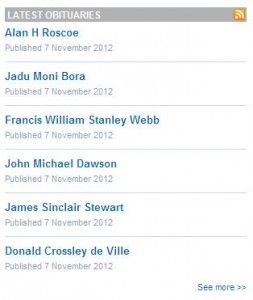
 Our first email was from a reader who could not locate obituaries. He had a point. Obituaries are very popular, particularly with UK readers, and although the latest ones display on our print table of contents (and a similar one showing all articles posted online in the last seven days) they did not have a presence on the homepage or any of our five channels—research, education, news, comment, and multimedia. They now have their own slot on the comment channel (see left). In 2013 we hope to make it easier for readers to submit obituaries online.
Our second email was from a reader who could not see the latest article “rapid responses” on bmj.com’s homepage. These are also very popular with readers. We quickly provided a link in the top right hand corner of the page. Before the end of the year we hope to have a feed of the latest responses showing here. There is a longer feed of latest responses on all article pages. We plan to move this to the same top right hand corner slot by the end of the year.
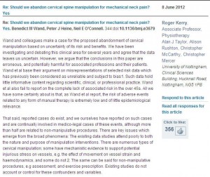
We have made a second change to rapid responses. In November 2011 we introduced the ability to “like” or  “unlike” rapid responses. We were surprised how many readers chose to do this, but felt that perfectly good and well argued responses were attracting negative votes, presumably because readers did not agree with the point of view expressed. We were worried that this might put people off submitting responses, so we removed negative voting (see right). We also felt this was more consistent with how other social media websites work. On Facebook, for instance, you cannot “unlike” a post.
Quite a few readers wanted to see who had written observation columns and views and reviews. We also had a request to include the series title on practice articles on the education channel. Both of these are now added.
In June we blocked the site to undertake a reader survey. We had more than 2000 responses. Your feedback was broadly positive, but many of you felt the site was a little cluttered, particularly the homepage.
Next month we will be removing some elements from the homepage that are not getting many clicks. These are mainly links to other BMJ Group products lower down the homepage. We wanted the new bmj.com to showcase other BMJ Group products—BMJ Careers, our specialty journals, BMJ Learning modules, and BMJ Masterclasses.
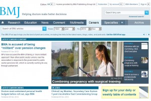
![]() You will still find links to these on other pages, and they can all be accessed from a new BMJ Group global navigation bar (see above), which went live a few months ago. And in the case of Careers, we introduced a new careers channel on the main navigation bar last month. This new channel (see below) pulls in the latest careers news articles and features, and the latest UK and international jobs.
You will still find links to these on other pages, and they can all be accessed from a new BMJ Group global navigation bar (see above), which went live a few months ago. And in the case of Careers, we introduced a new careers channel on the main navigation bar last month. This new channel (see below) pulls in the latest careers news articles and features, and the latest UK and international jobs.
 One thing we didn’t manage to include for launch in November last year was the ability for readers to sign up for alerts if an article attracts rapid responses, corrections, or is cited. Some readers noticed this, and we finally got this facility live again during the summer.
Finally, perhaps the main change we’ve made this year is the launch of online editions of BMJ USA and BMJ India. Lots of international news sites target their homepages to different countries or regions. We went one step further. Our four main content channels—research, news, education, and comment—now promote articles of particular relevance to readers in those countries. So a US reader’s default view of bmj.com is the US edition (see the US news channel, below), but he or she can also flick to the international. UK, or India versions. We know our readers are interested in healthcare from other countries, so we also provide feeds of articles of international relevance on these channels. We also launched a UK edition, which enables us to promote articles about the NHS and BMA that we know have limited appeal outside the British Isles. One advantage of these country windows is the ability to display which articles are popular in those countries, so they all have feeds showing “most read/shared in the UK/US/India.”
In many ways our UK, US, and India editions are experiments. If they prove to be popular with readers we may consider other “country windows.”
We now have a roadmap listing what we will be doing in the next 12 months, so now is the time to let us know. So far our priorities are launching a fully mobile optimised version of bmj.com, and a big project to improve the site’s speed. It is not as fast as we would like it to be, and we need to work out what things are causing this.
The online BMJ is your site, not ours, and we really appreciate your feedback. In 2012 we also launched a tablet app for institutional customers, a dedicated website for the London 2012 Olympics, and extended our open data campaign by launching a new site listing correspondence aimed at getting the pharma company Roche and other stakeholders to publish negative trial results relating to Tamiflu. What else would you like us to do? Reply to this blog or respond via our Facebook page or @bmj_latest Twitter feed.
David Payne is editor, bmj.com

