 As part of The BMJ‘s mission to make health information more available to our readers, I am employed to create infographics, often interactive, for our website (and sometimes the print journal too). Earlier this year, I worked on The BMJ‘s investigation into the sugar industry and its links to UK government advisory bodies. This development blog explains how I co-created the graphic with investigative journalist Jonathan Gornall.
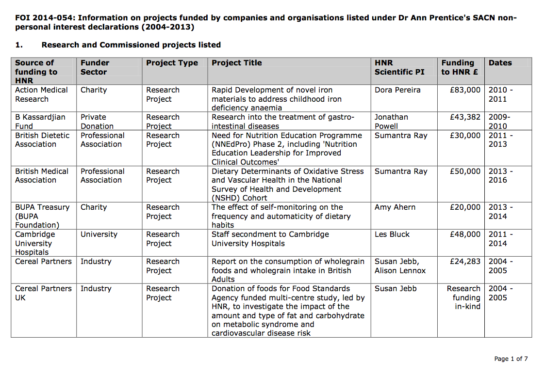
The project started, as so many projects do, with several long tables of data—in this case Freedom of Information Act requests, and publicly declared conflict of interest statements from different organisations:
I initially began to explore a force directed node diagram to try and see an overview of these complex links between organisations and individuals. I first tried a d3 layout, by d3noob.
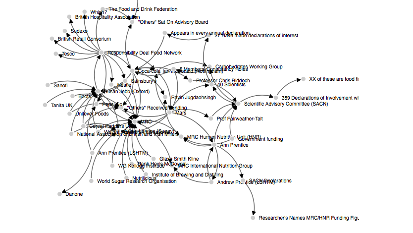
This version started to reveal important hubs, like the Medical Research Council and Susan Jebb, but it wasn’t easy to see the detail beyond this. I edited the code, to freeze the dots in place when they were dropped, allowing me more control:
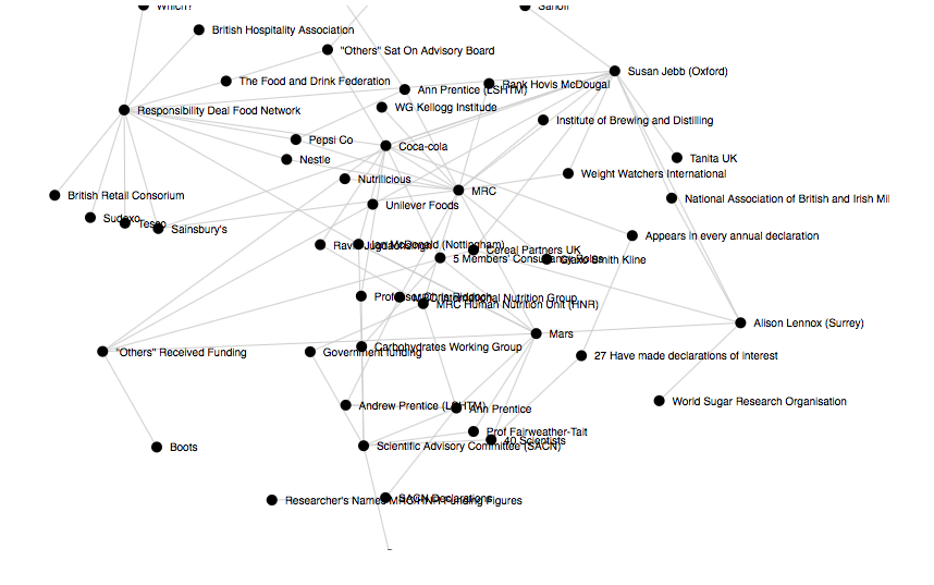
While I was enjoying experimenting with d3, I decided at this point to switch back to the more familiar processing, to make a version that I could work on with the journalist conducting the investigation. The following (very ugly) version was designed to be linked to a Google spreadsheet, so that we could both edit the data in real time and see it reflected in the graphic:
The graphic also recorded the locations of the points, so that we could both work on the position of the points, moving them around until we could see the patterns in the data more clearly. So if you refresh your browser, the points should stay in whatever place you move them to. Now this is available to the world, it’s probably only a matter of time before someone makes a penis shape out of it. So I apologise in advance if you are offended by visiting that link.
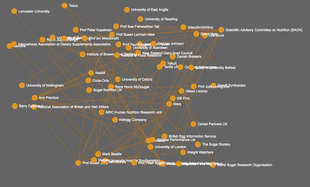
Anyway, we eventually came up with something a bit less spaghetti like (and I added in some colour coding):
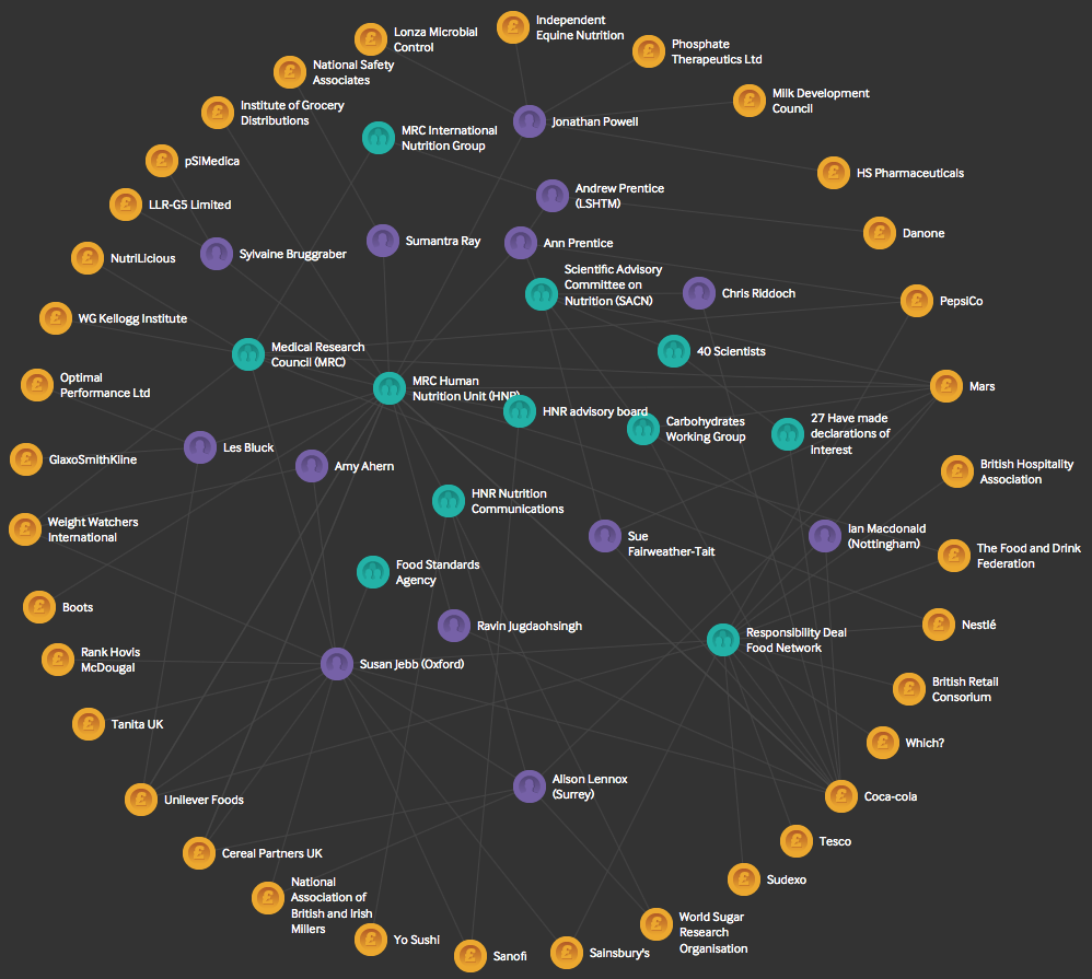
We decided to give some information about the links on rollover, revealing the kind and amounts of funding received.

I’m particularly proud of my code for this, which involves looking at the difference between the mouse position and the two points at the end of each line, and comparing this to the distance between the points. It means the rollover area is a bit wider in the middle of the lines, but it seems to work okay.
From there it was a small step to add in some labelling for the final thing. I also added rollovers to the individual nodes, allowing the viewer to see which things are linked directly together:
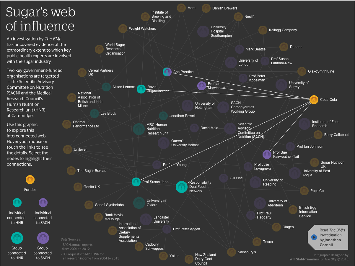
I hope to do more collaborative graphics like this in the future—I particularly like working on the big investigations that our team does, because the graphics can reveal the complexity of these issues in a way that is challenging in text.
I think some of the people in this diagram would be surprised to see the overview of the relationships involved. They may be involved with only a tiny part of the network, receiving what seems like an inconsequential amount of funding in return for valuable research work. But the diagram reveals that the web that these researchers and advisory bodies are caught in is subtle and wide reaching.
Will Stahl-Timmins is interactive data visualisation designer, The BMJ. Twitter: @will_s_t
Competing interests: None declared.