 “Grapheme” is defined in the Oxford English Dictionary as “The class of letters and other visual symbols that represent a phoneme or cluster of phonemes” and “in a given writing system of a given language, a feature of written expression that cannot be analysed into smaller meaningful units.” The dictionary gives an excellent example: the grapheme <f> stands for any one of a range of so called allographs, i.e. grapheme variants—f and F, ff and Ff, ph and Ph, as in femur and Fanconi, paraffinoma and Ffoulkes, phenobarbital and Phenergan—each of which has the sound that is represented by the phoneme /f/. Add to those the allograph gh—which sometimes, but not always (watch this space), represents the /f/ phoneme—and you have the complete set.
The corresponding word for “a sign or character representing a word” is a logogram (literally, from the Greek, a word letter), which also has the more specialised meanings of “a symbol or character used, alone or in combination, as the graphic representation of a whole word as a single letter” and more generally “a symbol, as found in road signs, advertising, &c., designed to represent in simple graphic form an object, concept, or attitude.” The colloquial term for that is a logo.
As the definition suggests, you can’t go anywhere without seeing logos—on road signs, advertising hoardings, buildings, websites, books, clothes, and domestic products of all sorts. Just look under the title of this piece to see Twitter, Facebook, and Google+. You may not remember Apricot computers, but if you see it you are likely to recognise the logo for Apple computers, a stylised apple with a bite taken out. Well, despite being simple and ubiquitous, that logo may not be as familiar to everyone as you might think. In a Los Angeles study, the Apple logo was correctly recalled by only one of 85 participants, and under half correctly identified it.
But the dictionary definition doesn’t really do justice to the complete range of uses of logos. Consider, for instance, the familiar penguin that represents not an object, concept, or attitude, but a publisher’s imprint. The publisher Allen Lane is thought to have chosen the bird as a symbol when a secretary suggested it, perhaps simply because it begins with P for paperback. Lane also commended the bird’s air of dignified flippancy. The Allen Lane stable later expanded when, it is said, Lane heard someone at a station bookshop mistakenly asking for a Pelican book. Fearful that someone else might use the idea, he launched Pelican books himself and later extended the idea to Puffins, Ptarmigans, Peregrines, and Peacocks. Other recognisable publishers’ logos include Jonathan Cape’s bowl of fruit, Longmans’ sailing ship, and Thames and Hudson’s dolphins. But is the representation used by Faber and Faber, ff, an allograph or a logo? It is certainly more than just an abbreviation.
Medical institutions, although not covered by the definition, have logos too. The British Heart Foundation’s is striking: a stylised electrocardiographic tracing interrupted by the classical symbolic shape of a heart, which actually isn’t how the heart is shaped at all. The British Cardiovascular Society takes a similar approach, but uses just two curves in the shape of a stylised heart, one blue the other red, symbolising the venous and arterial sides. For many years, the British Medical Journal, as it was called then, used a logo that was designed by Eric Gill in 1937 along the lines of the Aesculapian snake, as part of Stanley Morison’s design. The snake was dropped in 1996, but the BMA continues to use a different representation of the same symbol.
But many institutions don’t use logos at all, being content either to use their full name, such as the British Geriatrics Society, or to represent themselves simply by their initials. The British Association of Dermatologists, for instance, brands itself acronymically as BAD, writ large on the association’s website. Of course, “bad” is a Janus word and can also mean “good.” I would like to think that when the vitiliginous Michael Jackson called his 1987 album Bad (picture) he had the excellent British dermatologists in mind, even though it has been suggested that he really chose the name because he couldn’t spell “execrable.”
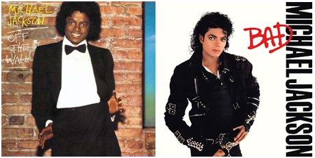
Albums by Michael Jackson: Off the Wall (1979, left) and Bad (1987, right)
Jeffrey Aronson is a clinical pharmacologist, working in the Centre for Evidence Based Medicine in Oxford’s Nuffield Department of Primary Care Health Sciences. He is also president emeritus of the British Pharmacological Society.
Competing interests: None declared.