The media around the world have been desperate to help put the risks of blood clots following a covid-19 vaccination into some sort of context. It’s a familiar issue: every time someone gives consent for treatment, we need to try to communicate risks, sometimes very small ones. So, how can we do it?
Firstly, we need to think about what a “risk” is. As risk communicator Paul Slovic has long pointed out, a “risk” is not a number—a percentage or probability—it’s a subjective feeling.1,2 That feeling is influenced by two major factors: the likelihood of the event happening, and the impact of that event.
The importance of the impact of the event is obvious: you would feel very differently if someone told you there was a 1 in 10 chance that that you might get a headache for a few days than if someone told you there was a 1 in 10 chance that you might die. It’s also clear that these impacts are very personal—the impact of having to self-isolate for 10 days, for example, will vary hugely between people depending on their caring responsibilities and professional circumstances.
If you imagine that the subjective concept of a particular risk is based on the feelings you have about the impact on you if it happened, moderated by the probability of it happening, you perhaps get a different perspective on how to help put a risk in context. The usual rush to look up a series of events with a similar probability—although easy enough to do, makes little sense. How does my feeling about the chances of winning a lottery in any way help me put a chance of death into perspective, just because the probability element is the same? The emotional component, the very heart of the feeling of the risk, is completely different.
Even if the impact is nominally similar—say, you’re comparing different causes of death—then still our psychological responses can be very different. It’s perfectly natural to feel different about dying during an operation compared with dying from cancer or from dying in an accident. There are many factors that are known to affect our feelings about a type of event, such as our perceptions of control, of understanding of the cause, familiarity etc, all adding up to different degrees of concern.2
So, giving people a series of events which feel very different and only have a likelihood in common—often done to “put that risk in context”—seems doomed to be unhelpful. You are giving people apples and oranges to compare. That is not helpful context. Helpful context would be giving people two events that feel the same and differ only by probability. That allows people to compare their feelings about the two and assess the “difference in feeling” caused by the “difference in probability”—i.e. doing the job of translating objective probability to subjective feeling that we are trying to do in risk communication.
The task, then, is to find two events that feel approximately the same to people. And it’s a tricky task, especially given how personal the feeling about an impact can be. My heuristic now, if you want to help people weigh up things—to make a decision—is to think about what would make sense if you were to say “on the one hand…and on the other.”
The ideal scenario is to be able to give meaningful comparisons with exactly the same risk—such as a person’s risk of death from a disease with and without a treatment. This comparison carries a bonus advantage: it is not only helpful in terms of putting the risk in context, it also ticks a second important box of good risk communication: giving people information that is directly related to the decision they are making. It answers the question “what would happen if I choose to have this treatment versus if I choose not to have it?”
An example of using this kind of comparison is a graphic we at the Winton Centre produced for the U.K.’s national broadcast from the government’s scientific advisors about covid-19 vaccinations, where we illustrated the same risk (being hospitalised with covid-19) for people who were either fully vaccinated or not vaccinated (over the same time period of four weeks).
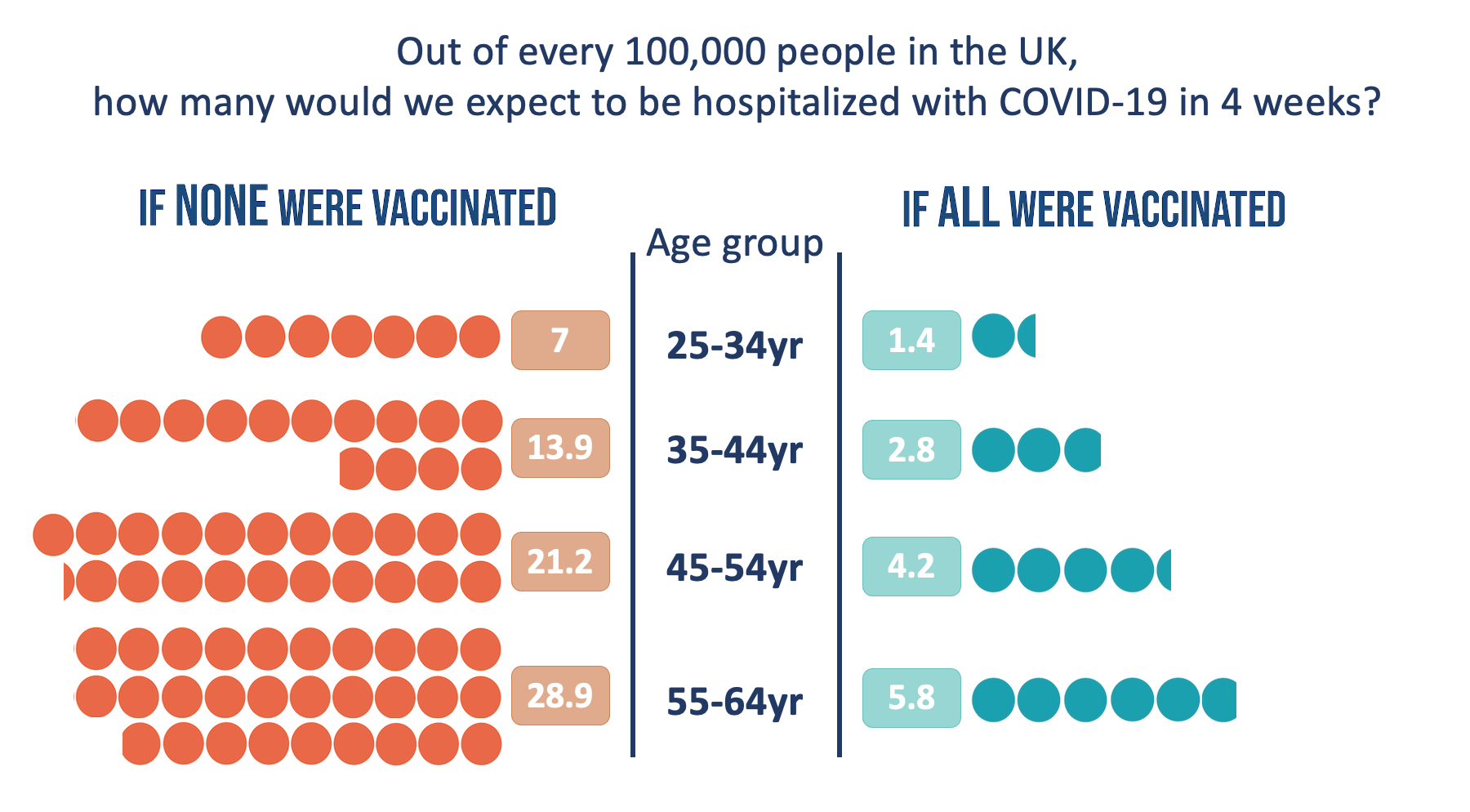
As well as simply giving the numbers, the graphic aims to help people compare them “at a glance” by illustrating them in such a way as to allow an easy visual comparison of one side versus the other.
Not all situations lend themselves to comparing “within the risk” though. For example, when the news broke that a specific kind of blood clot was possibly causally related to the Oxford/Astra-Zeneca vaccine against covid-19, there was a need to illustrate the statistics. The chances of having this very specific kind of blood clot without a triggering event is—as far as I know—essentially zero. So a comparison between the chance of having this event with and without the vaccine is not helpful. On top of this, the decision that people will be making (both individuals and policy-makers) will not be entirely based on the possibility of harm from the vaccine, but a weighing up of the potential harms and the potential benefits.
This scenario, then, leads to a less-ideal solution in terms of finding a useful comparator risk: finding something that “feels close” in terms of impact—something else that would make sense for “on the other hand.” In fact, there was a way of combining a comparator risk that felt equivalent to the harms from blood clots which also answered the issue of illustrating the potential benefits of vaccination.
Using the same visual format to allow at-a-glance weighing-up, we chose to illustrate the potential benefit in terms of “ICU admissions due to covid-19 prevented”—a risk which we felt likely to be equivalent in terms of “feeling” to the risk of the potential harms, shown on the opposite side—the specific blood clots thought to be related to the vaccinations, which can be fatal or cause long-term disability.
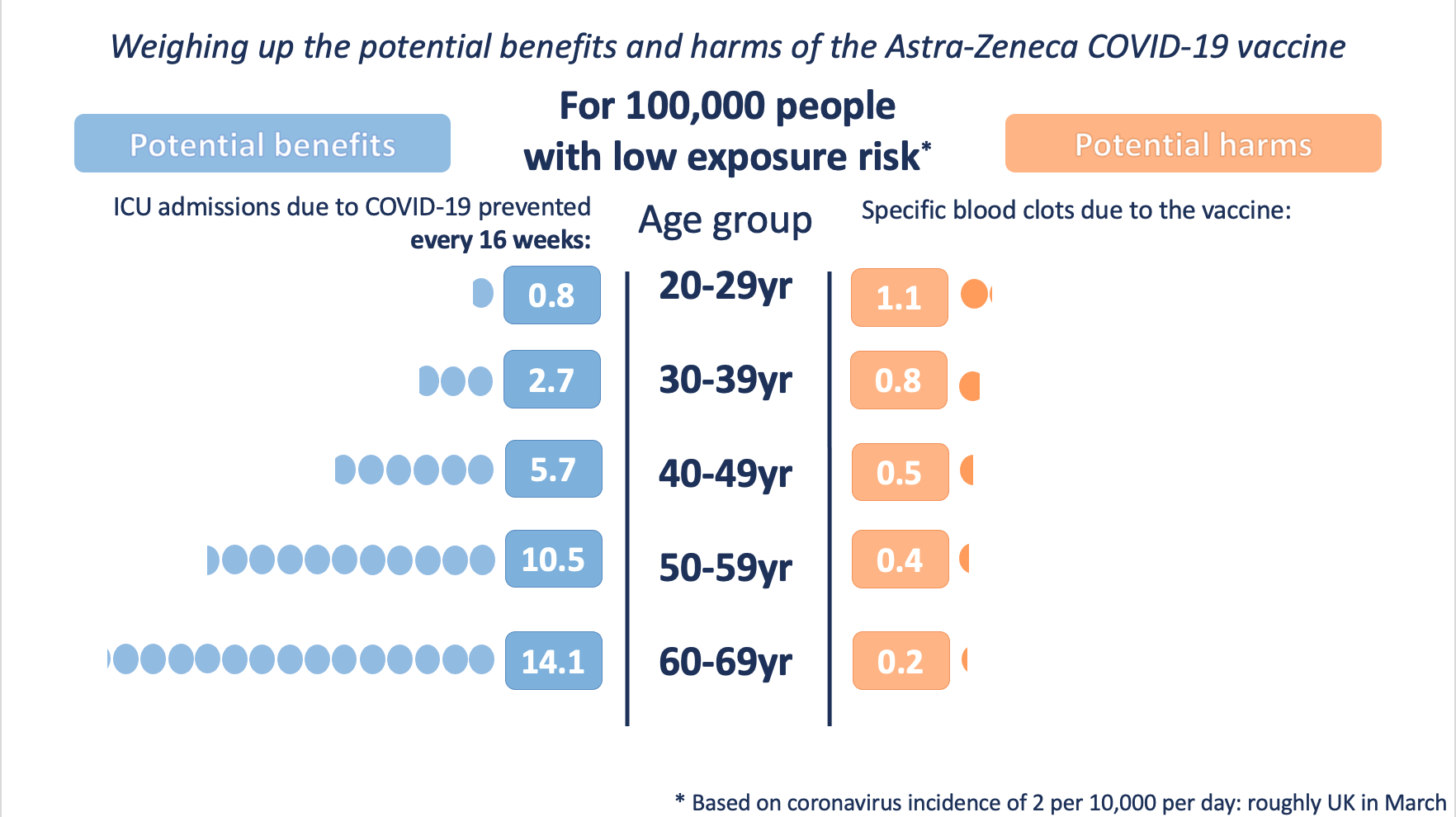
Of course there are subtleties to this graphic—we had to choose a fixed time point (16 weeks) to visualise the potential benefits over, as they continue to accrue over the lifetime of the vaccine’s protection, and we produced three versions illustrating different levels of exposure to the virus, which would affect the level of the potential benefits as well.
On top of that, we had to make clear verbally that the prevention of ICU admissions were far from the only benefits of the vaccine. For every one ICU admission prevented there would be many, many hospital admissions, cases of long covid, and transmissions of the virus to others that had also been prevented in the vaccinated group.
Many people found this choice of comparison (and visualisation) helpful and thought it provided an appropriate context for the numbers.
What about attempts to put the statistics in context in other ways, such as comparing other forms of serious harm with similar probabilities?
There’s no empirical evidence in this specific example (yet), but my suggestion is that they are less useful to the audience in supporting their decision-making. Past attempts to illustrate the chances of a particular event, such as an environmental disaster or a health risk, by comparing to other, perhaps more familiar events with known likelihoods or annual death rates, have often been attempted. Often their intention is to try to persuade people that a risk should be acceptable to them because other risks which are similar in likelihood are. These attempts have often—if not always—failed (for a summary, see chapter 5 of reference 3).
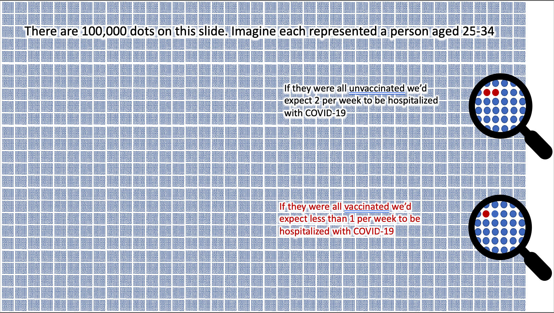
However, there is one other important form of context that is important to bear in mind, and that is making the denominator explicit—making it very obvious that all of the numbers being presented are “out of 100,000.”
It’s well known (and we’ve demonstrated in the context of covid risk specifically4) that presenting a number “out of 100” creates a different impression of the risk from presenting a number “out of 1000”—possibly because of a phenomenon known as “denominator neglect”, whereby it’s very easy for us all to forget the other side of the coin—the number of people who do not suffer a harm or gain a benefit (the opposite “framing”). The classic way to avoid this problem is to use what is known as an “icon array’ which is an array of icons representing the total number in the group being considered, and colouring them differently to represent the likely distribution of different outcomes within that group. With 100,000 in a group, this becomes very difficult to do, but can give a very different perspective on numbers.
Doing this visually helps put numbers into context rather neutrally, avoiding the psychological impacts of introducing another risk as a comparator. In the absence of a visual comparison, a verbal comparator such as “in a football stadium full of people” may be a useful alternative for those familiar with the comparator—although again empirical evidence is scarce.
Generally, then, when we’re trying to help people understand a risk and give it context, the main thing to bear in mind is keeping comparison risks as similar in terms of their ‘feeling’ (impact) as possible – regardless of their likelihood. Predicting what will feel similar to an individual is difficult, of course, which is probably why many jump to match the probability instead.
Where possible, compare a single individual’s risk of the same thing happening under different circumstances (e.g. “the chances of someone like you developing heart disease with and without this intervention”).
If this isn’t possible, compare two different individuals’ risks of the same thing happening (e.g. ‘the chances of someone with the gene alteration that you have developing breast cancer compared to someone of the same age without that gene alteration’).
If this isn’t possible, then try to find a risk that “feels” comparable (e.g. “the chances of someone like you developing this serious blood clot versus the chances of someone like you being admitted to ICU with covid-19”).
And always bear in mind what decisions your audiences might be making, and hence what comparisons are most salient to them. Present the numbers in such a way as to best help them consider “on the one hand” and “on the other” and weigh them up.
- Slovic P, Finucane ML, Peters E, MacGregor DG. 2004 Risk as Analysis and Risk as Feelings: Some Thoughts about Affect, Reason, Risk, and Rationality. Risk Anal. (doi:10.1111/j.0272-4332.2004.00433.x)
- Slovic P, Fischhoff B, Lichtenstein S. 1981 Perceived risk: psychological factors and social implications. Proc. R. Soc. London. A. Math. Phys. Sci. 376, 17–34. (doi:10.1098/rspa.1981.0073)
- Kasperson RE, Stallen PJM. 1991 Communicating risks to the public. 1st Editio. Dordrecht, The Netherlands: Kluwer Academic Publishers. (doi:10.1007/978-94-009-1952-5)
- Freeman ALJ, Kerr J, Recchia G, Schneider CR, Lawrence ACE, Finikarides L, Luoni G, Dryhurst S, Spiegelhalter DJ. 2020 Communicating personalised risks from COVID-19: guidelines from an empirical study. medRxiv (doi:10.1101/2020.10.05.20206961)