What colour is 6d46c4?
It feels a bit of a nonsensical question to most of us. It’s a code for a certain colour in hexadecimal, familiar probably only to web designers. Similarly, print designers are used to working in Pantone colour codes; physicists in nanometres of wavelength. Most of us, though, simply do not think of colours in numerical terms. To us they are a purely qualitative, emotional experience.
The same is true of “risk.” Most people also do not think of risks in numerical terms. When we at the Winton Centre for Risk & Evidence Communication were recently talking to members of the public about risks from covid-19 they did not use numbers at all. Even when we asked them to put a number on the chances of a person dying from covid-19 if they caught the virus, it was like asking them to give the wavelength of green light.
Instead, we found that people tended to have in their minds’ eye a series of “personas” that represented the different levels of risk: a spectrum of risk from the lowest (young, female, ethnically white, no underlying health conditions) to the highest (very old, male, ethnically non-white, multiple underlying health conditions).
Now, numbers are useful things for communicating concepts as they’re a language designed to be precise to those that understand it, exactly as hexadecimal or Pantone colour codes do. But just as 6d46c4 is meaningless to most of us without understanding where it sits on the spectrum and how different 6d46c5 or 7d46c4 might be from it, numbers that we put against health risks only make sense to most people if they are also given a sense of what those numbers mean.
So, what made most sense to people when we were trying to help communicate risk from covid-19 was to make a visual scale, with number labels evenly spaced along it, and also spaced along it the “personas” that they naturally already had in their head—exactly like putting the numerical codes for colours alongside a colour spectrum. Then, when we showed them a particular numerical risk along the scale, they were able to use the scale to translate that number into their mental “persona” of that risk—exactly as you would be able to imagine the colour halfway between red and yellow on a colour spectrum.
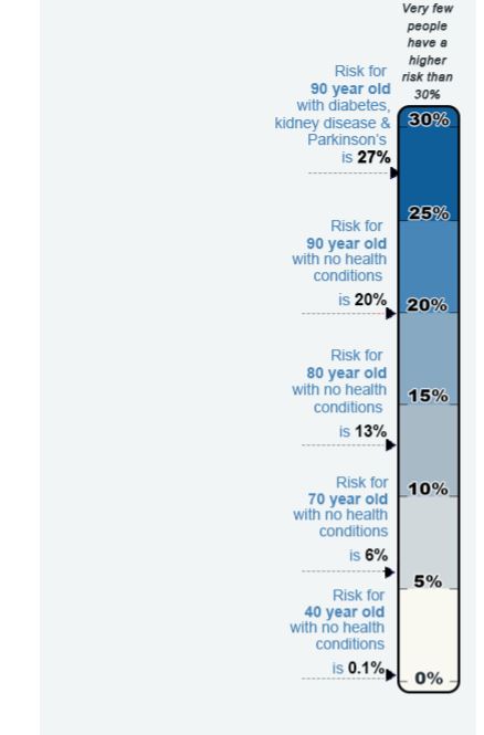
Image (left) illustrating the risk of dying from covid-19 if someone has already caught it (numbers are purely illustrative)
Numbers only ever make sense in a context which we are already familiar with and understand. If we’re talking about money, then most of us are familiar with the concept and have a sense of the value, in our own lives, of—say—£100 (or $100, or €100). And the value of that same amount of money will be very different to two different people (say, a high-earning consultant paediatrician and a 10-year old child considering their pocket-money), and the context (say, for a chocolate bar versus for a laptop).
The same is true of risks in a health context. Just as we can’t say “£100 is a lot of money” because its value entirely relies on its context, we can’t say that “a 1% risk is a high risk”—because the value of that 1% risk, again, relies on its context. Again, colour works as an analogy.
The circle below is the colour represented by the hexadecimal code 6d46c4:
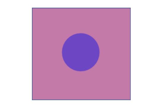
You’ll probably agree that in the context I’ve given you above (the pink background), the colour looks like a darkish, bluish purple.
But in a different context (a blue background), the exact same colour probably looks slightly different to you—paler and pinker:

Of course you also wouldn’t be surprised to hear that that same colour likely looks a little different to different individuals as well, even in the same context. Colour vision is an individual characteristic—and we struggle to describe our subjective experience of it to others. How can I describe my particular perception of “darkish, bluish purple” to you and know if it’s the same as yours?
More importantly it brings home the fact that—just as with risks—there is no “right answer” to what that colour looks like to you.
We can put a number on that colour (such as “6d46c4”), to make sure that we are both objectively looking at the same wavelength of light. But how it looks to each person is shaped by the context they see it in right at that moment, and their own personal perceptions.
So when it comes to communicating risks with patients, perhaps think about it as if you were trying to communicate a colour. Words are not very useful for something needs to be quite precise. “Bluish purple”, “pinkish purple”—they are too vague and culturally-dependent: they conjure up different mental images for different people.
Just using a number on its own, though, is essentially meaningless in such an unfamiliar context. Numbers really only give us a sense of relative difference, just like I can only describe two purplish colours accurately by reference to each other (“it’s a bit darker/bluer than the other one”).
What helps more is to translate the number into the mental imagery that people already use—like showing people the colour. And to understand what mental imagery people use for a particular risk, we need to talk to them, as we did in our work around communicating the covid-19 risk.
Perhaps most important of all, though, is to understand that risk perception is like colour perception in other ways as well: you can influence people’s perception very easily by the context you give it. You can make it look dark or bright, pinker or bluer, by changing what you compare it to. Just like assessing the colour of clothes in a shop, you need to look at them in lots of different lights and against a range of other coloured clothes.
And there is no “right answer” for how it “should” be perceived. Just like the famous internet meme about the colour of a dress, if your patient sees it as dark blue whilst you see it as white—they see a risk as scarily significant whilst you see it as nothing to worry about—that’s fine. Risks are subjective. Our job as communicators is only to try to show them the dress (risk) as clearly as possible and under many different lights (contexts/ways of looking at it) so that they can see it objectively clearly and that their subjective perception is as little skewed as possible by the way we have shown it to them.
Alexandra Freeman, Executive Director, Winton Centre for Risk & Evidence Communication, Centre for Mathematical Sciences, Cambridge.Competing interests: None declared.