One of the most important projects I have worked on this year is the living network meta-analysis of covid-19 treatments, the first version of which was published on bmj.com in July 2020. This continually updated review is starting to provide much needed comparative analysis in these uncertain times. To give an overview of the treatments included and their potential efficacy, I worked with the review authors to produce an interactive network diagram, as shown in Figure 1.
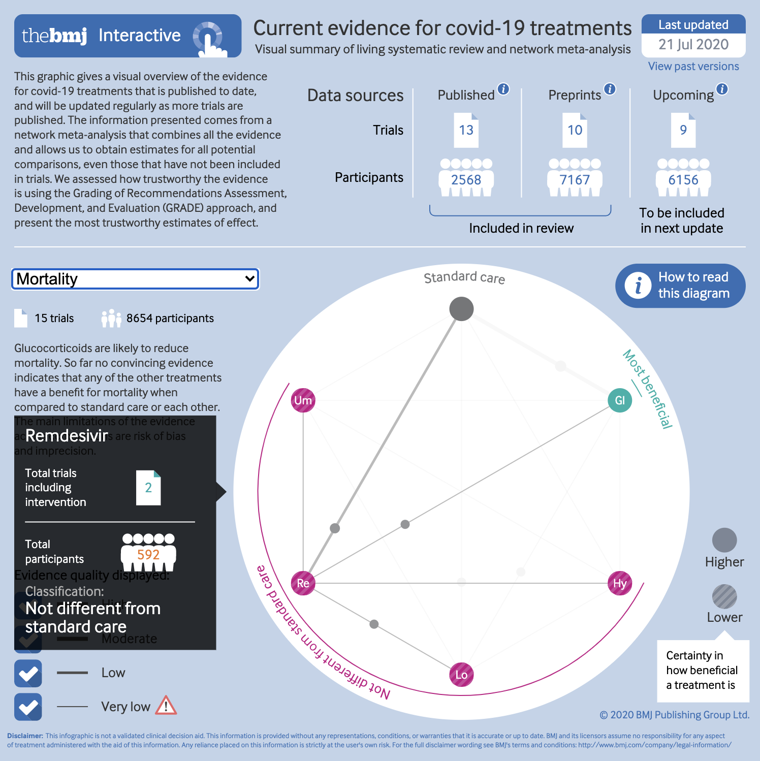
Similar network diagrams are common features of network meta-analyses, but this has several key differences. Traditional network plots have always bothered me. Figure 2 is an example of one published on bmj.com in 2018. I can absolutely see the need to give an overview of all the different interventions compared in a review. Network diagrams do this—to an extent. Each intervention is represented by a circle, or node, arranged around the perimeter of the diagram. The lines show links between these interventions, each one connecting two that were directly compared in the included studies. This is a useful way of showing a reader the number of interventions, and where direct comparisons are made.
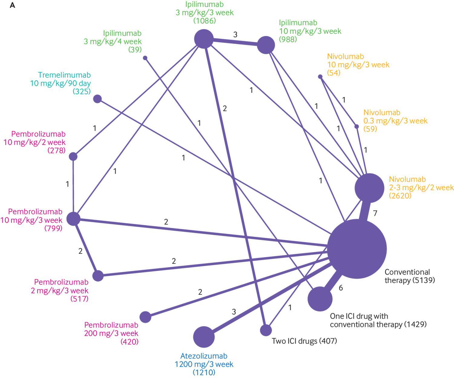
What has always puzzled me is the other two data encodings used here, which are fairly common. The number of studies in each comparison is represented by the thickness of the link lines, and the number of participants included for each intervention is shown by the area of the intervention circles. The opposite way would presumably work just as well—the number of participants in each bivariate comparison shown by width of the link lines, and the number of studies by the area of the circles. Others scale the width of links to the variance of the effect estimate.
Even so, I think that there is more potential in this kind of plot that isn’t being explored with such encodings. They give a summary of the interventions and comparisons, but the number of studies and participants are only two factors that may influence the certainty of the evidence. GRADE ratings for certainty of evidence include such metrics in one component of assessing the trustworthiness of a body of evidence, but the network diagram doesn’t show anything about risk of bias, or inconsistency in results, for example. Some research groups have colour coded the links, or “edges,” according to the risk of bias for each comparison, which brings in one more component of trustworthiness. But why not present the GRADE ratings themselves?
The aim of the covid-19 review was to give a “snapshot” of the currently available evidence, and then update it as new research becomes available. Of course, if people are returning to the review to see the latest evidence, it makes sense to provide some way of them quickly and easily getting an overall sense of both the quality and signal of the current evidence. In other words, an ideal situation for a data visualisation.
Ideation
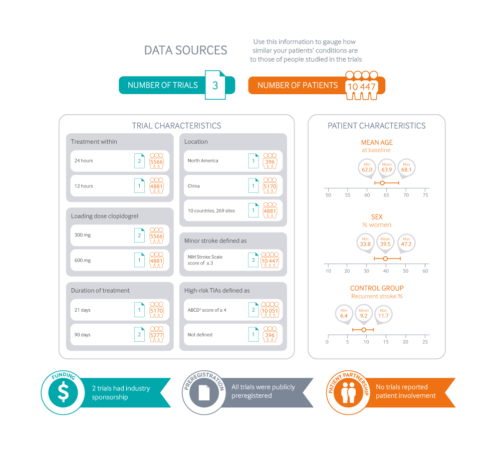
My first stop, as in all graphics, was to come up with a few different ways we might handle the visualisation. I knew the graphic needed to be ready quite quickly, and easy to update. The review was going to support some of our “rapid recommendation” articles. These already carry a graphic that explains what kind of evidence the recommendation is based on, as in Figure 3.
These are really designed for recommendations comparing two interventions, or just a few of these two-way comparisons. They are there to help a reader see whether the patient in front of them is well represented in the research that the recommendation is based on. I wondered if something similar would work here—perhaps including a more traditional network diagram (see Figure 4).
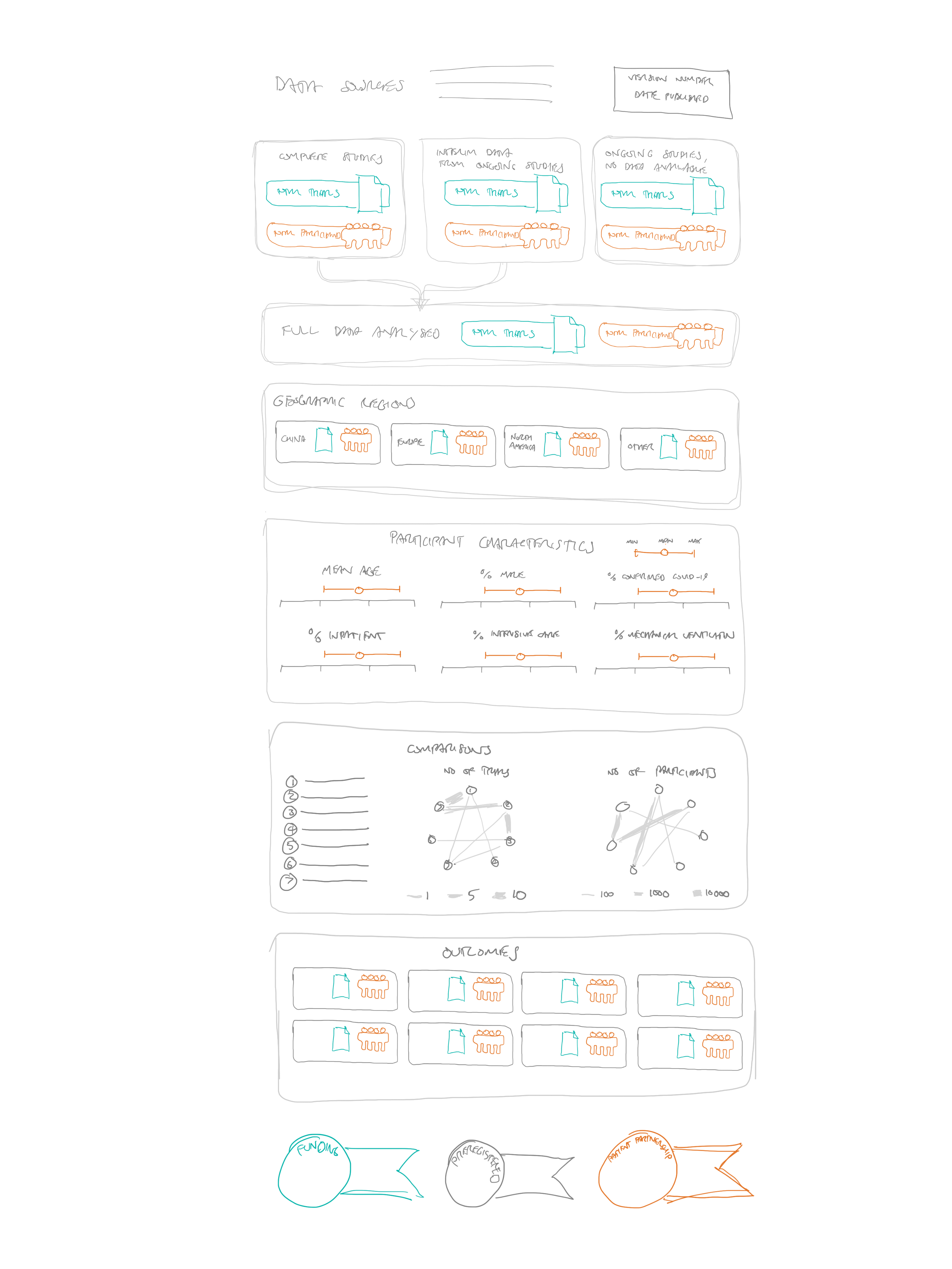
The problem with this approach is that it would really only show the characteristics of the overall evidence, rather than each comparison. The reader wouldn’t really see what kind of patients were included in the remdesivir trials, for example, or which interventions were tested in a particular subgroup or location.
A second idea was to present the network plot at the top of the diagram, and allow people to select individual interventions or comparisons, and then have the characteristics of the trials below update to whatever was selected in the network diagram (see Figure 5).
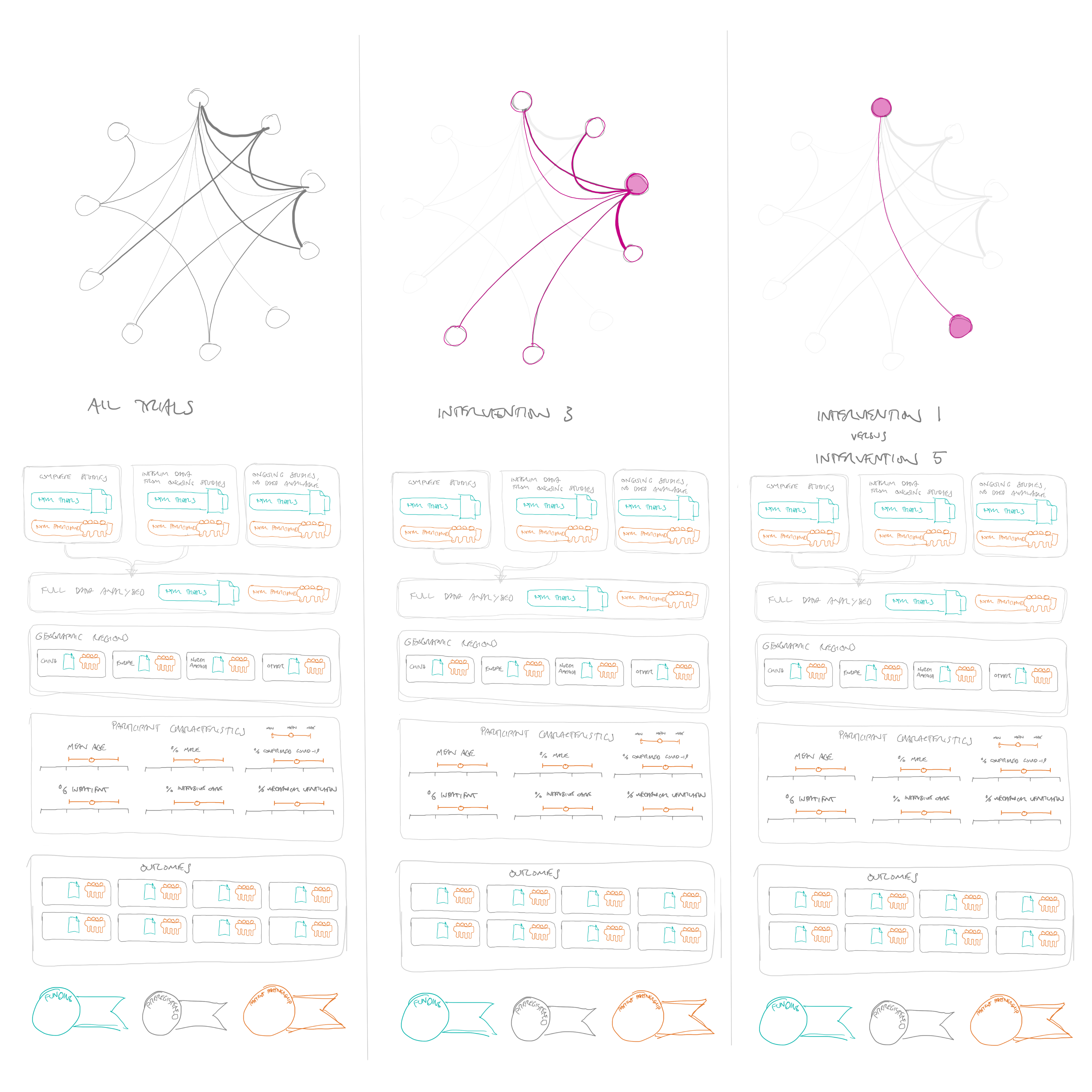
This would fulfil this idea of showing the characteristics of patients in the trials quite well, although could require a lot of clicking to see what you wanted to look at. Also, I still had at the back of my mind that the graphic could do more than this, by also showing a summary of the findings of the trials, not just how they were designed and who was included—in other words, not just whether the trial results should be believed, but also what the trials were showing.
I wondered if it would be possible to rank the treatments from most to least promising for each outcome, and then provide link lines of different thicknesses to show the number of trials or participants in each comparison (see Figure 6).
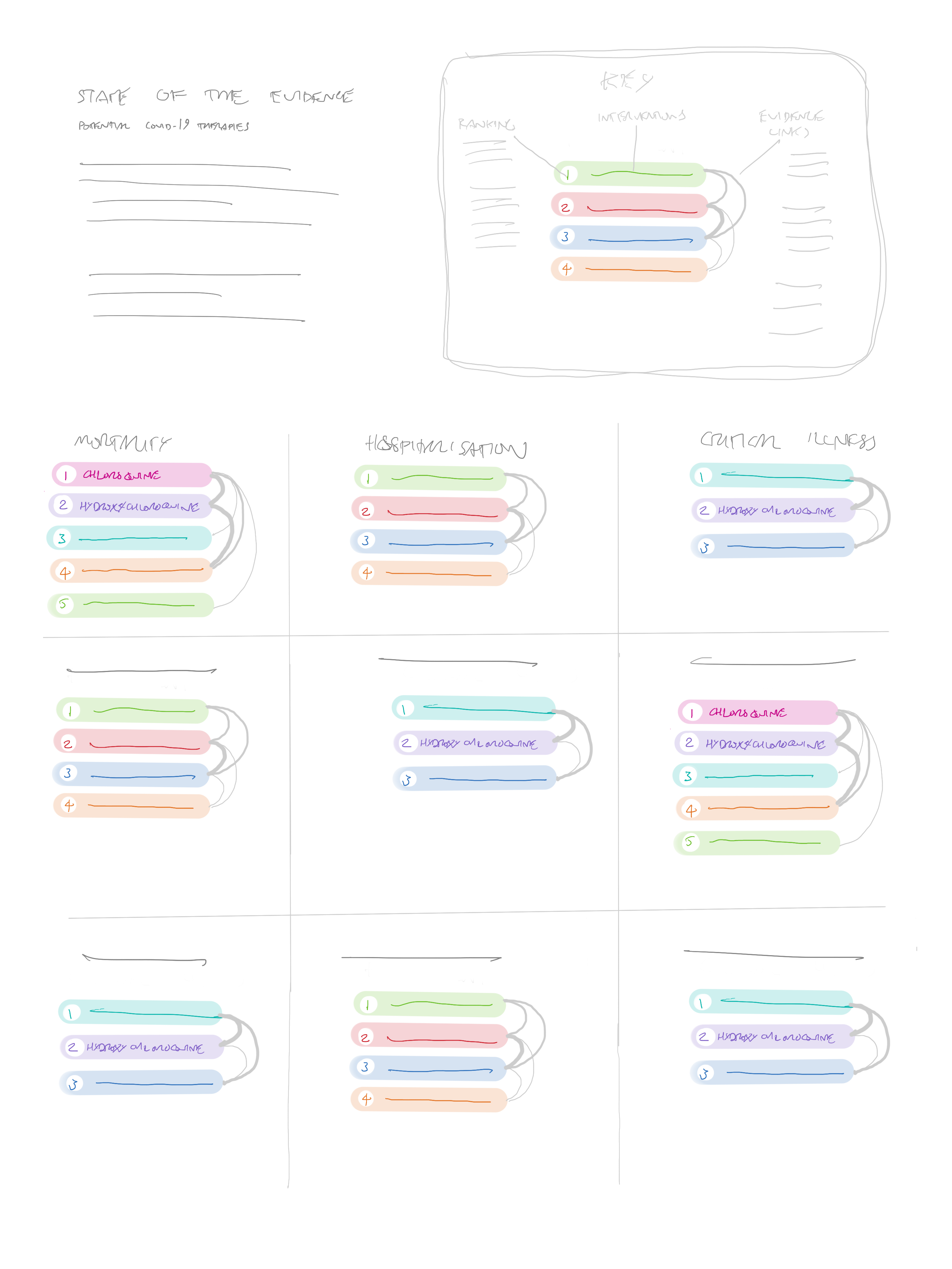
The problem with this approach is that a methodologically appropriate way of “ranking” the treatments must consider both the effects of an intervention and the certainty of the evidence. Because of this, very rarely will one single intervention be better than all others. Also, given that we could eventually have a very large number of interventions, the link lines could become confusing, and potentially very space hungry.
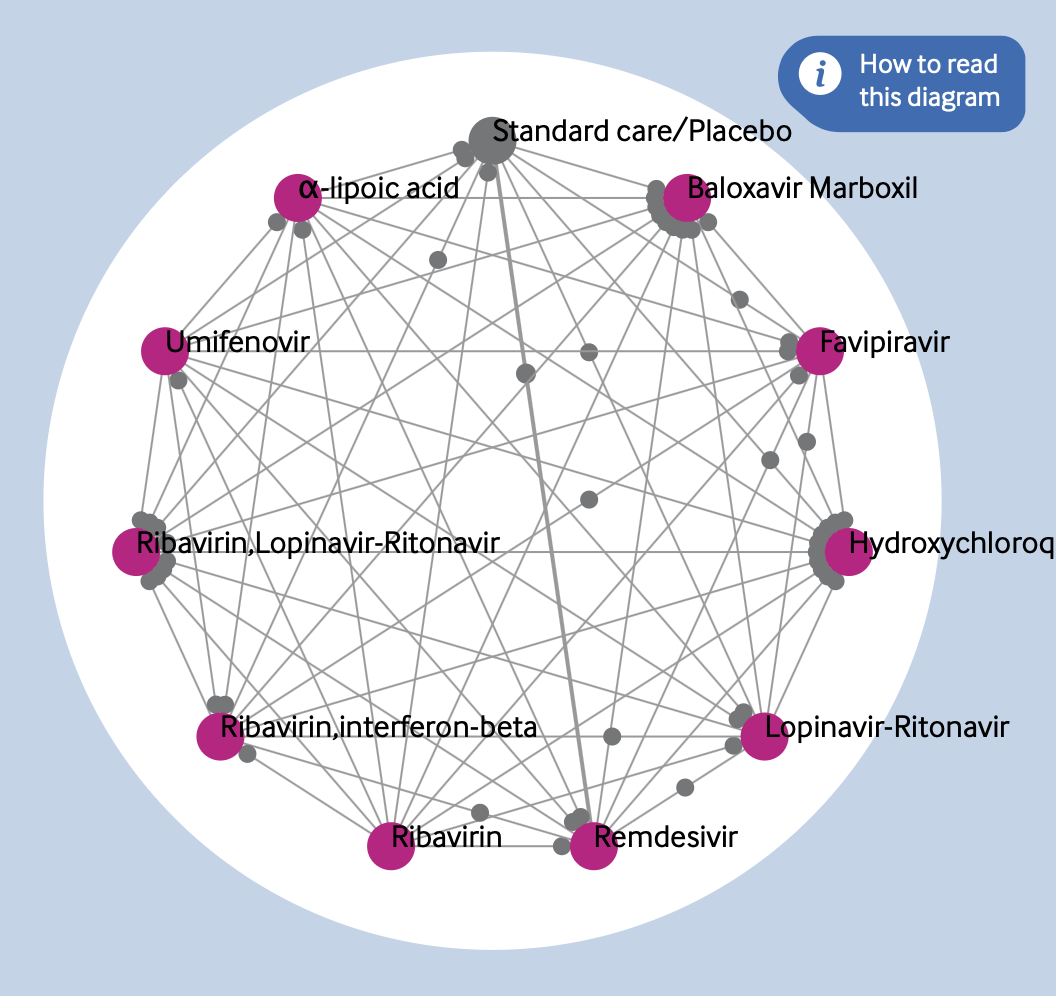
If the review ended up including a very large number of interventions, I wondered if an unordered network would be a better way to show the comparisons—that way the minimum amount of overlapping lines would be needed. Figure 7 shows an example with 22 interventions.
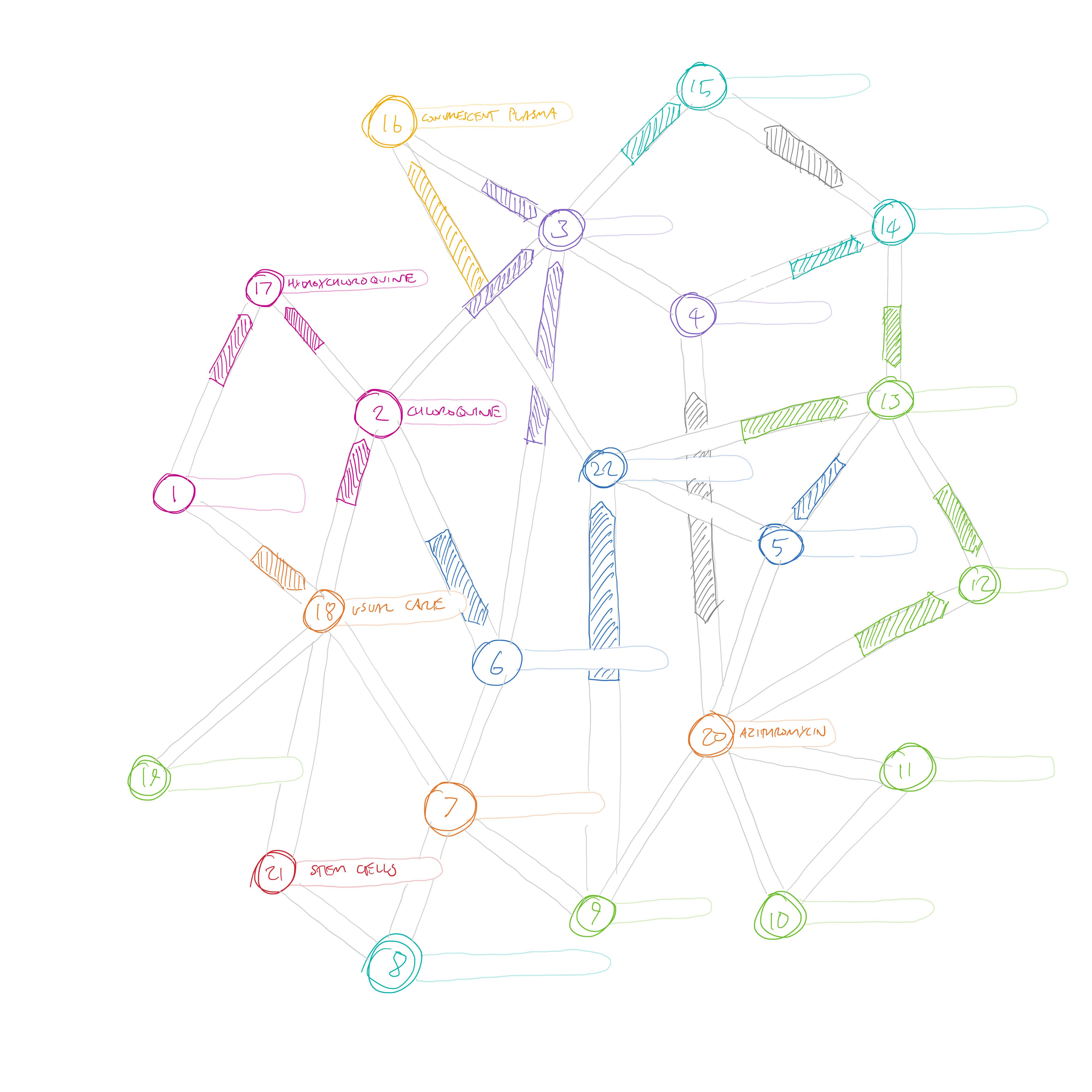
The arrows here are similar to the ones that we present in rapid recommendations—there are only three possible states—favouring one treatment, the other treatment, or “no important difference” (the grey double ended arrows). This idea didn’t quite fit the bill either. One minor problem is that different length link lines would be needed to connect the interventions, so the arrows would be different lengths. I suspect that the reader would automatically think that the arrow length was important somehow. But more importantly, this visualisation only shows the direct comparisons. The main purpose of creating a network meta-analysis is to be able to compare those interventions for which no direct comparison is available. If every node was linked to every other node in this diagram, we would quickly be back to the circle layout as the most efficient way of linking them.
After yet another call with the team, I did a very simple sketch—which essentially became the main focus of my efforts – see Figure 8.
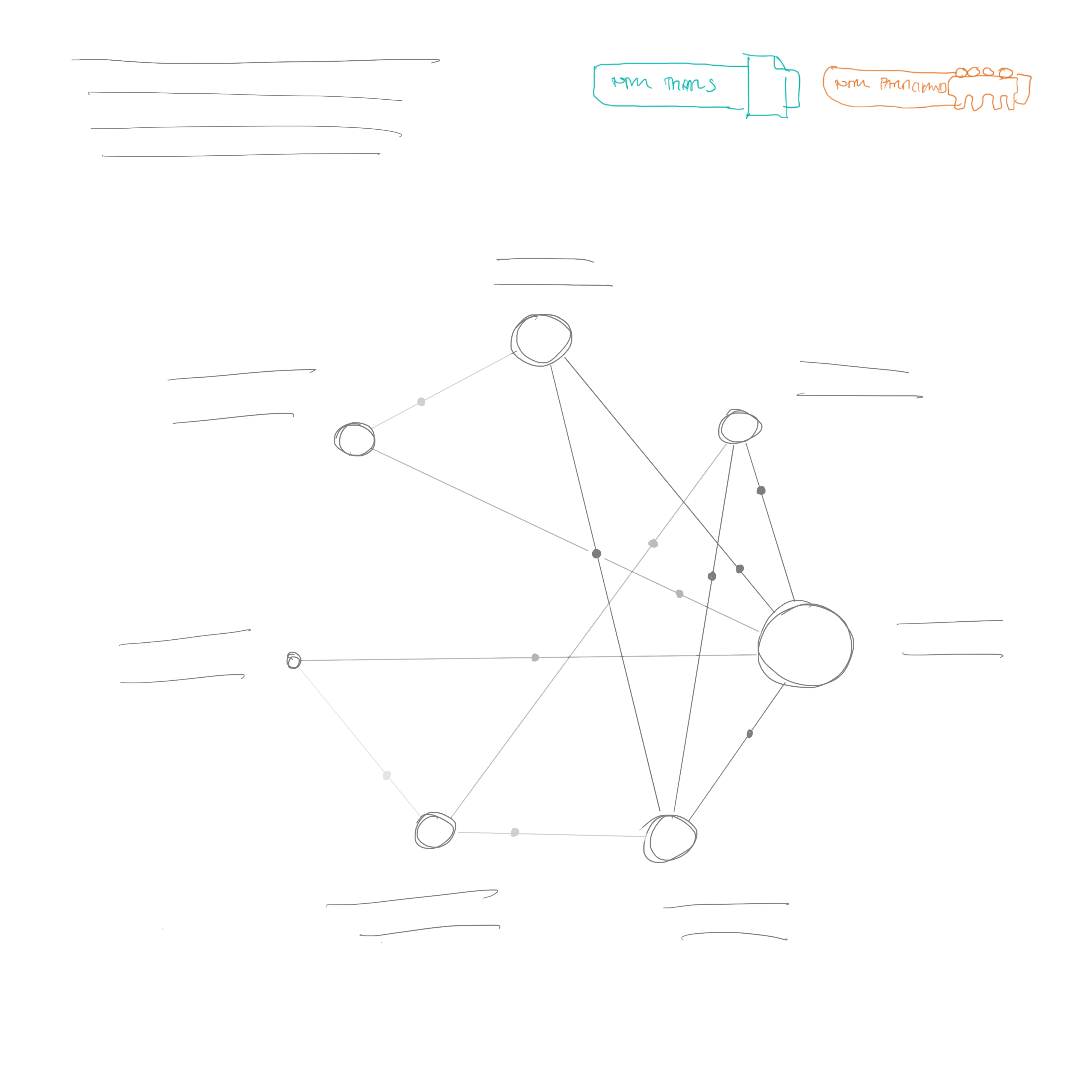
This sketch is obviously close to our final design—even down to the display of the number of trials and participants at the top right, and intro text at the top left. However, it would still take some time to develop this idea. The circles representing the interventions still have a size encoding in this sketch—I believe I was planning to present the number of participants in the same way as a traditional network diagram. But the links are shaded instead of being given a width—I think this is the first time I considered a visual encoding of the GRADE certainty of evidence rating for each comparison (although it may also have featured in Figure 6 – idea 3). This seems to be such a useful way of explaining the certainty of the evidence, and I’d be surprised if it hasn’t been thought of before in a network diagram. In a way it is less specific than including the number of trials and participants, but it encompasses more information, and only needs one visual encoding. I think for the kind of quick visual summary that we were hoping to provide, it works well.
The other key idea that made it to the final diagram was the grey dots on each line. The idea of these dots is to show a quick overview of the comparative efficacy of the interventions. The closer the dots are to an intervention, the more that comparison favours it. I haven’t seen this used in other network diagrams, but it seems to me that it gives a quick visual overview of all the comparators in the network—as long as you don’t have too many interventions (more on that later).
Of course, these comparisons are made per outcome, so we needed to show multiple networks for the different outcomes. We considered some kind of “overall” network, and then smaller versions for each outcome (a technique called “small multiples) – see Figure 9.
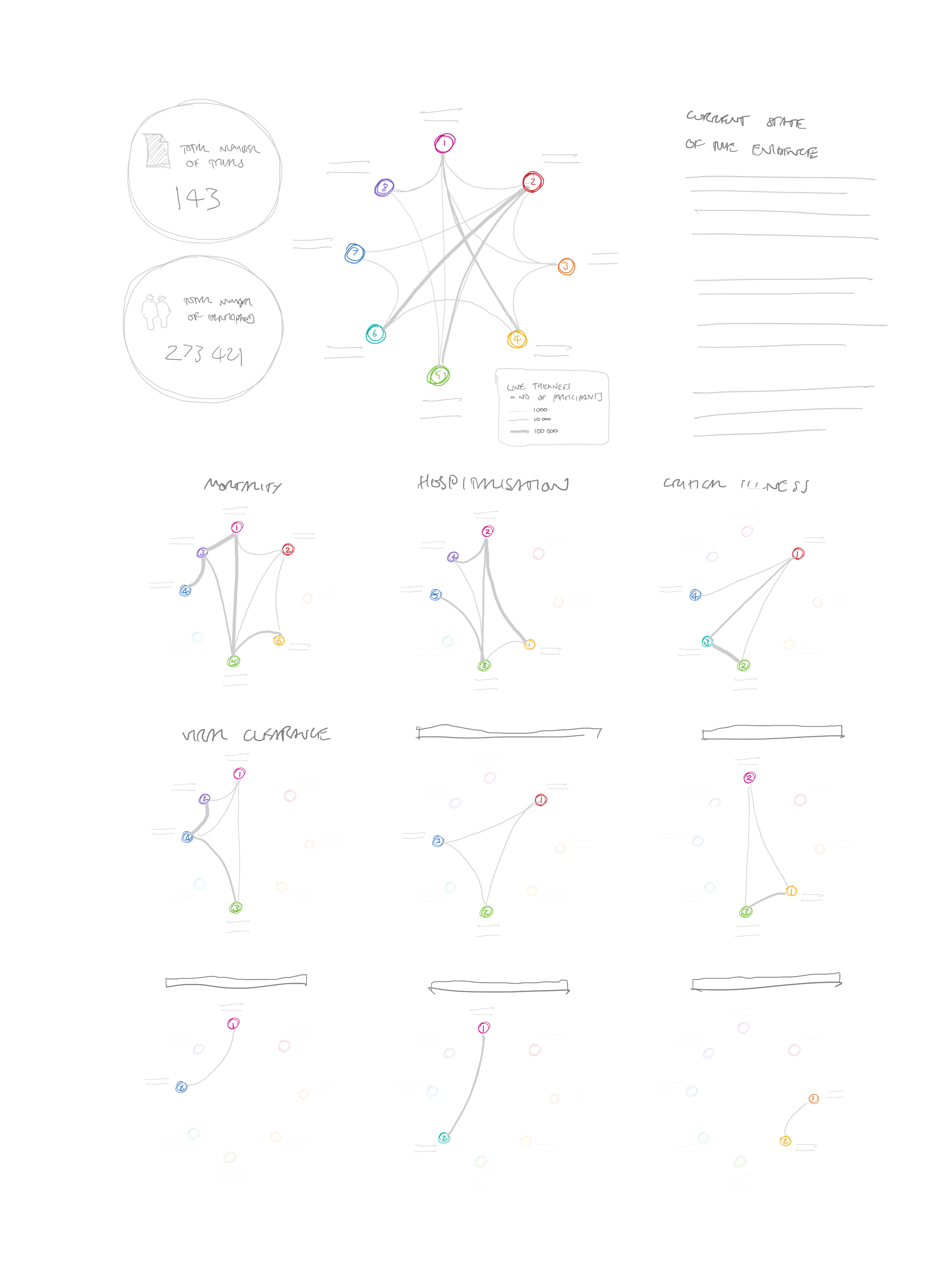
I was keen to keep the interventions constant between diagrams to help the viewer recognise more quickly which interventions were included each time. I still think this would work, but the diagrams might be too small to show a very large number of interventions, and with dots on the lines as well, it would become too cluttered.
To give more space to the diagrams, we also considered making a very tall graphic, with one section for each outcome (see Figure 10)
As well as requiring a lot of scrolling, I felt that this design was awkward at giving people the contextual information they needed. If they wanted to check what was represented by something in the seventh outcome, for example, they would have to scroll all the way back up for the key.
The version in Figure 10 has another feature added in: as well as displaying the relative difference in efficacy (presented by the dots on the lines), I was trying to find some way of displaying the absolute efficacy of each intervention. I attempted to put these in the intervention circles around the perimeter. For this to work, a different efficacy value would have to be provided for each direct comparator. So each intervention here has a number of circles linked with an arc, one for each linked comparator. While technically possible, we quickly decided that this would be overwhelming with a large number of interventions and comparisons.
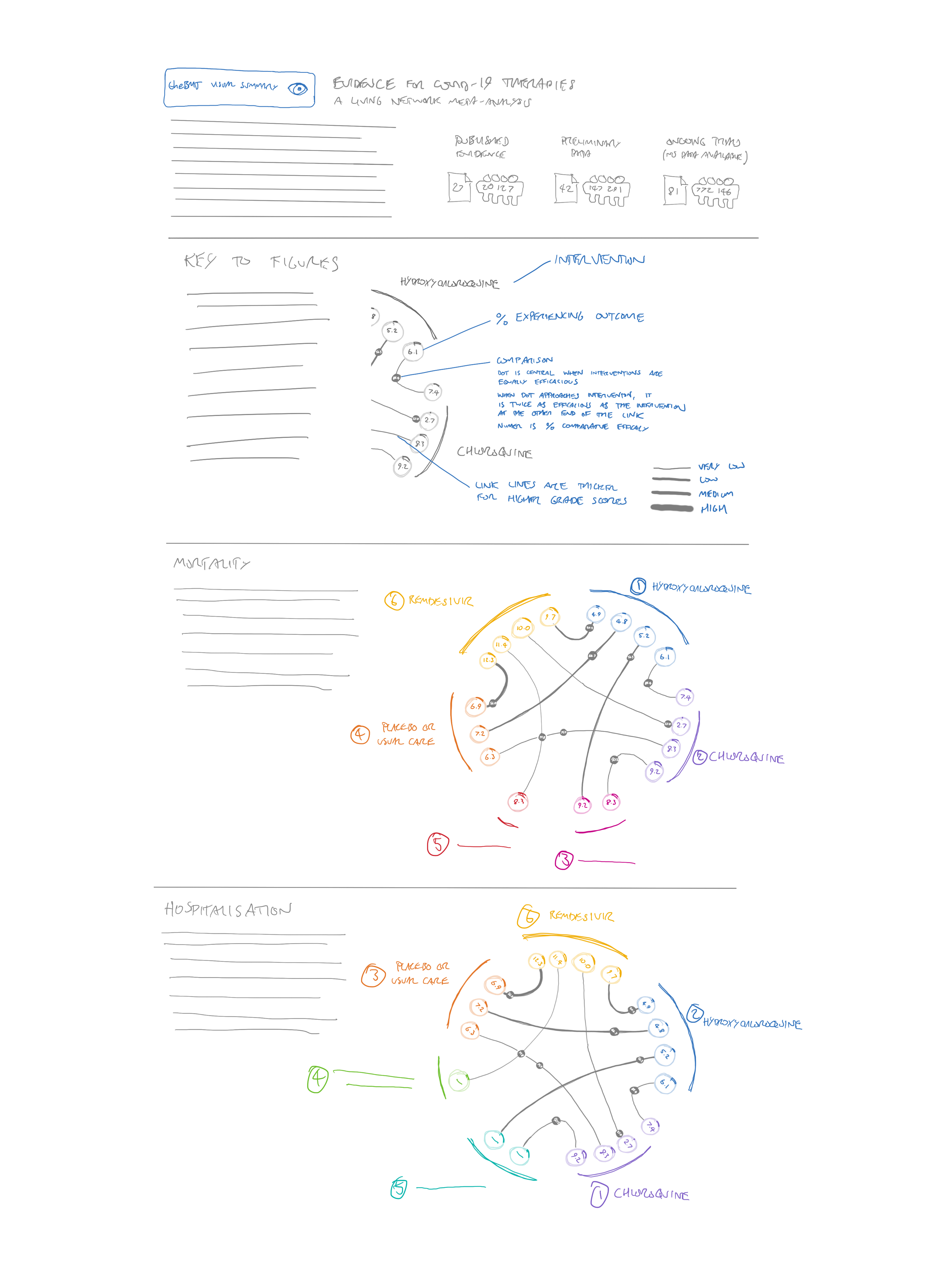
The next version was very close to the final one, although rather than providing one key at the top, we introduced a “how to read this diagram” button for each diagram. We decided, however, that this seemed a bit clunky and repetitive. (see Figure 11).
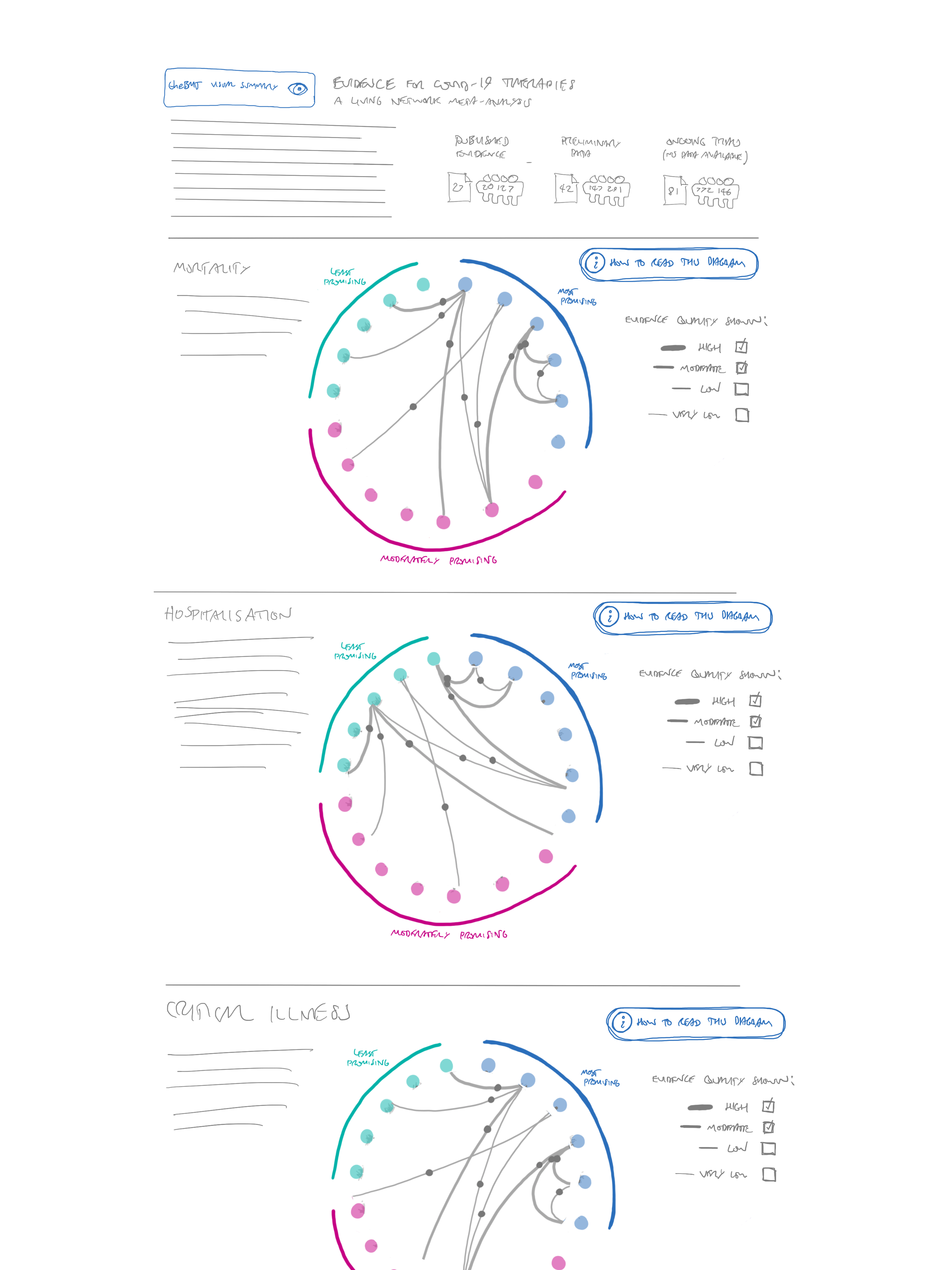
We returned to the idea of one circle per intervention, and grouped them by how promising they appeared. This is methodologically more appropriate than providing an exact ranking, as we can show which treatments we think are most promising, without picking out individual “best” treatments. We were concerned that the large number of links could make the diagram hard to follow—especially as it would be impossible to see which of the overlapping lines the grey “directionality” dots belonged to. Our first part of the solution to this was to only show the most reliable evidence by default, but allow all GRADE ratings from high to very low to be turned on and off. In the end, we had to set this to showing everything but very low certainty evidence in the first version of the diagram, as there were very few “moderate” quality studies and no “high” quality ones at all. We envisage that this default will be changed in future versions once more reliable evidence is available.
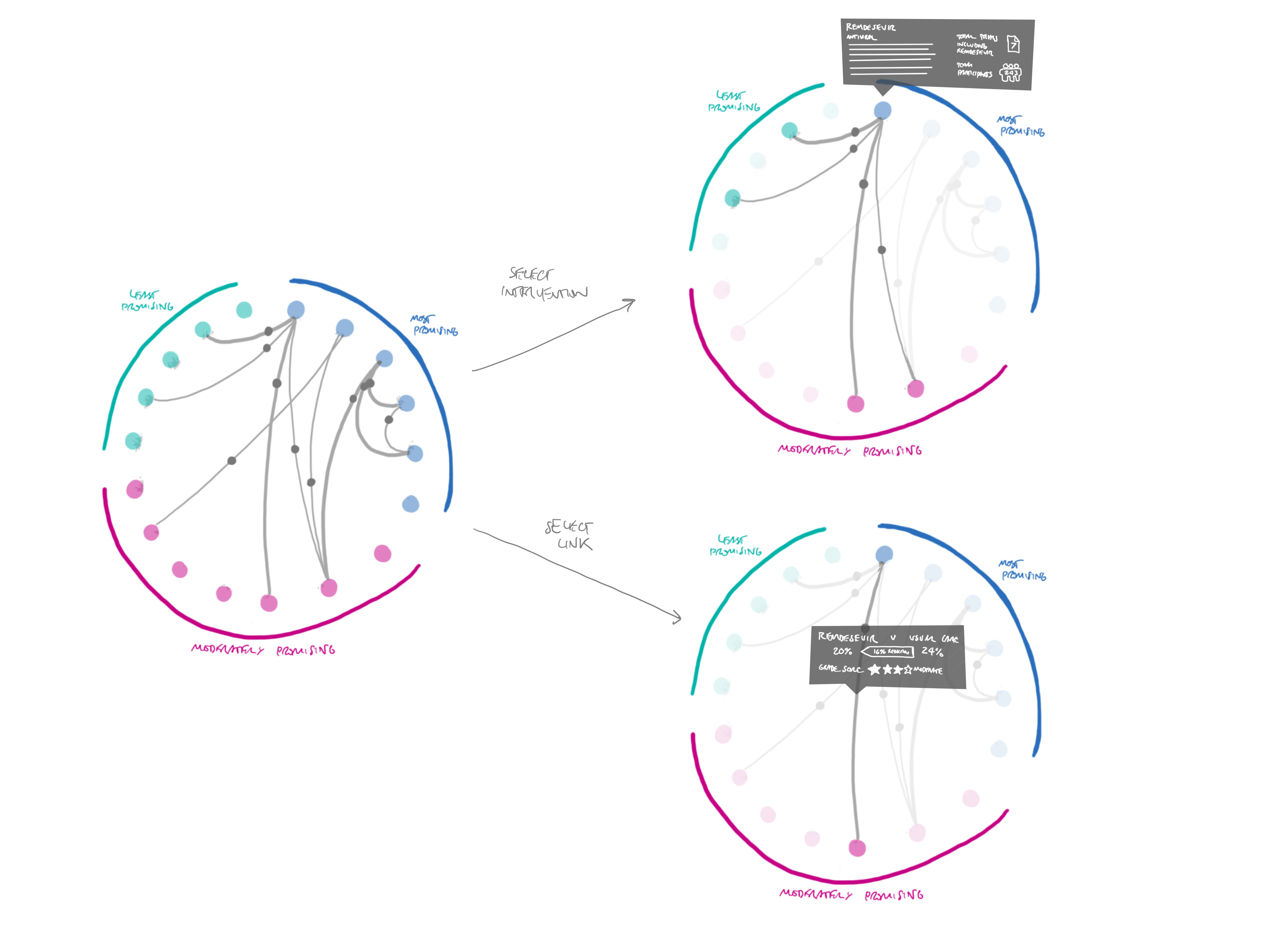
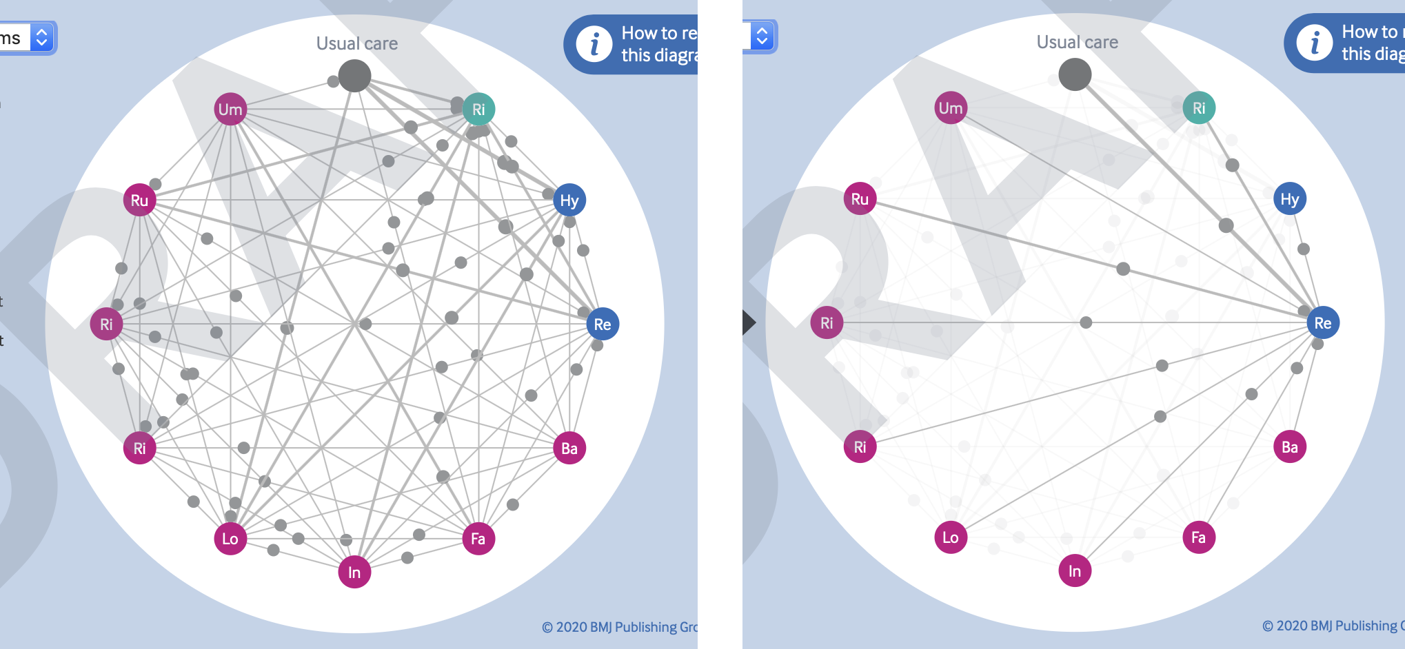
The other way of resolving the problem of overlapping lines and points is through the affordances of interactive diagrams like these. As shown in Figure 12, it is easy enough to allow the viewer to select individual interventions or link lines, to highlight just those connections. This also gives an opportunity to provide more information about that comparison, such as the number of trials and participants.
Lastly, we decided that instead of presenting a long list of all the outcomes, we would just provide a dropdown menu to select different outcomes, updating the network diagram accordingly. This made the overall graphic much smaller, and removed the repetition of the “how to read this diagram” button.
The build
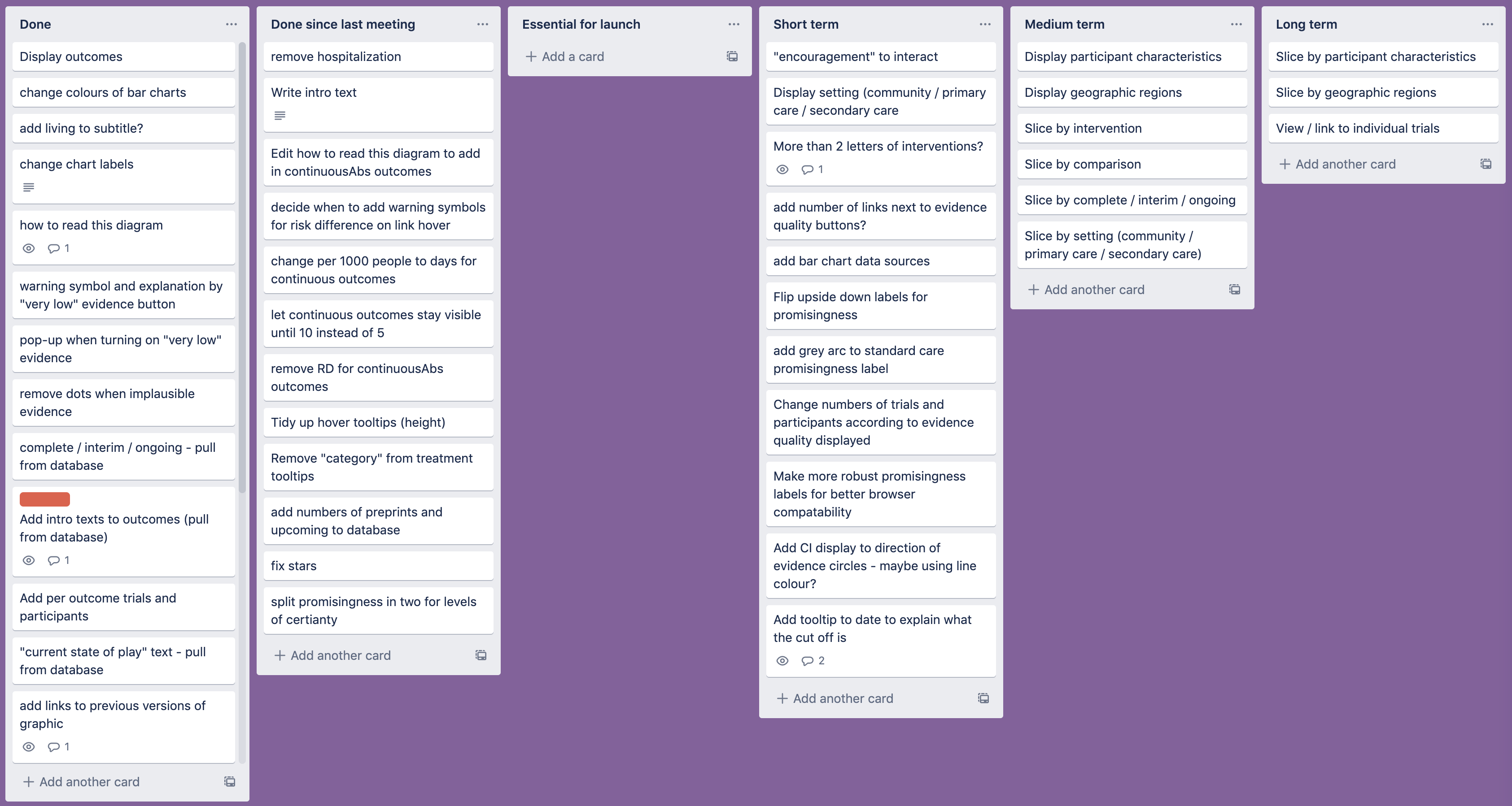
At this point, we were happy enough with the idea to move on to coding up the graphic—as usual, I like to spend at least 50% of the time available thinking of ideas before starting to actually make anything. However, this meant that we had limited time to develop and launch the visualisation, so we had to work quickly and efficiently. At weekly meetings, the review authors and I prioritised the features we would be working on, and kept track of them using a Trello board (see Figure 13).
One problem that we ran into quickly was that of implausible results. We had already decided to calibrate the positions of the dots so that they would effectively “hit” the intervention circles if that intervention was twice as effective as the one it was being compared with—and then stay there no matter how high the difference got. This led to some unlikely looking clusters around the nodes at the perimeter of the diagram (see, for example, the cluster around hydroxychloroquine in Figure 14).
As some results are based on very limited evidence at the moment, some differences were extreme (as much as several million times more effective) but these values were often based on only a handful of people, or a very indirect comparison. In this case, there was a diverse range of qualities within the comparisons rated as “very low” quality. The GRADE ratings didn’t really go low enough to express how uncertain the results were. We really needed “extremely low,” “implausible,” or “ridiculous” ratings.
As time wasn’t on our side for petitioning the GRADE working group to add these in, we came up with a quicker solution. We chose to remove the dots for any interventions that were more than five times as effective as their comparators. We felt that this kind of value was unlikely to be clinically plausible, and thus was probably more confusing than useful. A red pop-up now warns users of this if they try to turn on “very low” quality evidence.
We went through several iterations of ways to display the included published trials, preprints, and forthcoming publications at the top of the diagram. We ended up settling on a very simple version that presented the values numerically, as it was surprisingly difficult to present a more visual version that would be labelled in a robust way that would deal with any values. A few attempts are shown in Figure 15.
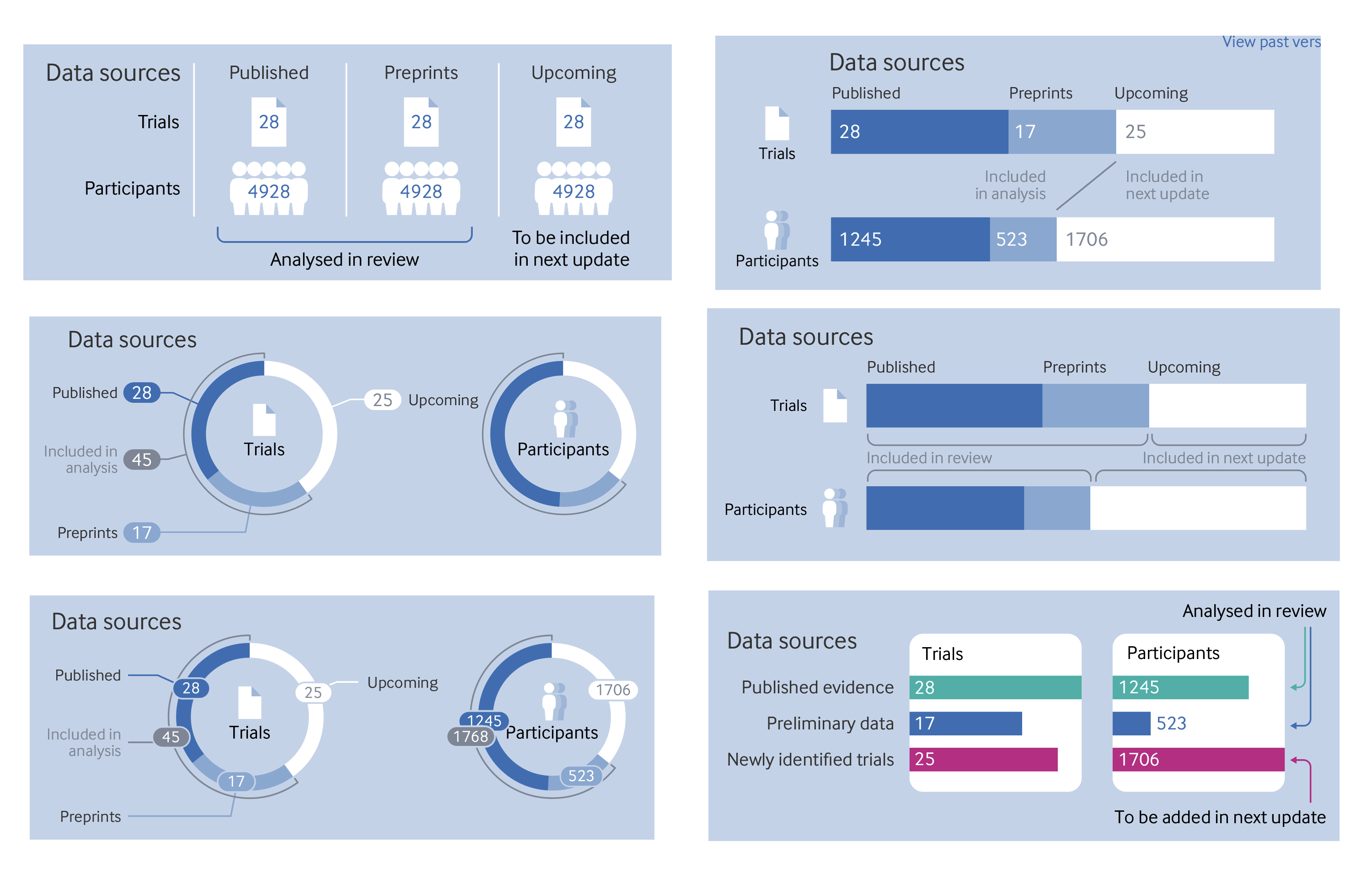
For now, we have stuck with the original version in the top left, partly because of speed and the need to get the review published quickly. We might include something like the display on the top right in future versions. The labelling of the bars won’t work if they are very narrow though, so some tooltips may be needed on hover if the numerical labels have to be hidden.
Early in the development process, the dataset we were using included all interventions identified in the review search, even those with only a handful of people. In the end, it was decided to raise the threshold of inclusion for a treatment so that it had to have at least 100 people across all trials included. However, the early versions with the original dataset give us an idea of how the diagram will look with a very large number of interventions. With all the levels of evidence turned on, the links and dots are too occluded to be of much use, but I think it works quite nicely when hovering over the interventions (see Figure 16)
One difference that may be noticed between my original sketches and the final diagram is that the link lines are straight, whereas I had originally conceived of them as curved. This is another sacrifice we had to make for the sake of speed. It would have been easy enough to make curved lines in a graphic like this with the bézier curves built into the SVG path element. However, I’d have to research the maths behind them to find out how to position the grey dots. As this is a purely cosmetic choice, and the straight lines were considerably quicker to make, I decided to invest my efforts elsewhere. If it becomes necessary to add a much larger number of interventions in future versions, we might need to implement the curved links, to prevent lines from becoming too short between neighbouring interventions.
The future
For now, I think the graphic is a good start. It gives a visual overview of the trials included in the review. It’s certainly not perfect though and, as I’ve mentioned above, I’d like to update it in future. The living review format means that I’m far more likely to be able to return to it and make changes than any of my previous graphics for The BMJ.
One thing that I’d like to address in the next iteration is the way we display a date at the top of the graphic. I put in the date when I was last working on it, but as Hilda Bastian wrote in a rapid response to the article, there are other key dates that we should include. Most notably, the date on which the search for trials was conducted, as it’s important to know exactly which trials were included in the review. It might also be useful to add the date of analysis, and the date of publication.
Some more attention also needs to be paid to the way we label how promising the trials are. It was surprisingly complicated to implement the circular labels in the SVG format. I’m not sure the way I’ve implemented this is particularly robust and cross-browser compatibility isn’t brilliant. It would also be good if the labels flipped vertically if appearing at the bottom of the diagram, instead of the text being upside down. It might also be good to have a clearer display of how certain we are that a trial should be within a particular category of how promising it is.
We considered adding the confidence intervals for the dots—either on the hover tooltips or on the link lines. We haven’t added them until now, because they are incorporated in the GRADE rating, and didn’t want to highlight them twice, but we wonder if readers might still find this a useful extra piece of information. It will have to be managed carefully to make sure that the display doesn’t become too cluttered, but there are ways it could be done if needed.
Lastly, it might be good to build back in some of the information about the trials that was in the first sketch of the graphic—such as where they were conducted, and what kind of patients were included. I’m not quite sure of the best way to show this information at the moment, perhaps a separate section of the diagram is needed, or perhaps it could appear when selecting individual interventions or comparators. Another option might be to add some “filters” to the whole diagram, which would allow people to see, say, just one location, one severity of illness, or one type of patient. Much better quality evidence will be needed though to make any of these “slices” meaningful.
The graphic is, of course, only a digital object at present. It’s hard to see how a static version could be included in the article PDF or our print journal as the interactivity is so key to the way the diagram works. One could make a “small multiple” set of what the graphic looks like for every intervention within each outcome, but that would quickly get cumbersome. The “living” nature of both the graphic and this review means that it probably makes more sense for it to remain an online only tool anyway.
We are open to suggestions on how we might best develop this visualisation further or, indeed, alternative ways of viewing this dataset. We have prioritised the kinds of information that we thought would be most useful for clinicians and researchers who want a high level overview of the evidence, especially as further details that may be needed by methodologists are available in the full paper. Resources, as always, are limited, but we are hoping to continue to improve and update the graphic for some time to come. After all, covid-19 shows no signs that it will disappear any time soon, and research continues on how best to treat the disease. I hope the graphic proves a useful summary of the latest evidence for as long as it is needed.
Thanks to:
The author team who joined our weekly meetings and worked so hard on formatting the data in a way that I could use for the graphic:
Romina Brignardello-Petersen
Ariel Izcovich
Hector Pardo
Tahira Devji
Derek Chu
Reem Mustafa
Reed Siemieniuk
Thomas Agoristas
And as always my colleagues at The BMJ who help with all my graphics by bouncing ideas around, checking my work, getting it online, and promoting it once published. You know who you are.
Will Stahl Timmins, data graphics designer, The BMJ. Twitter @will_s_t