An exhibition of beautiful and significant design work, which asks the wrong question of the wrong people, writes Will Stahl-Timmins
 I was very excited to hear about Can Graphic Design Save Your Life? (CGDSYL?)—a new book from publishers GraphicDesign&, with an accompanying exhibition at the Wellcome Collection in London.
I’m a graphic designer myself, and have been working on visual presentation of health data for the past 10 years. Thus, I was particularly interested in the idea of highlighting some of the amazing work happening at the intersection between design and medicine. Could this inspire more health professionals to consider the power of graphic design, and visual communication in general? Likewise, could this be a chance to enthuse a new generation of graphic designers about the importance of applying their ingenuity and creativity to this vital area of human endeavour? I can’t help feeling that the project will be more successful at the latter objective than the former.
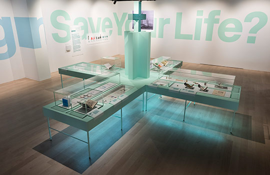
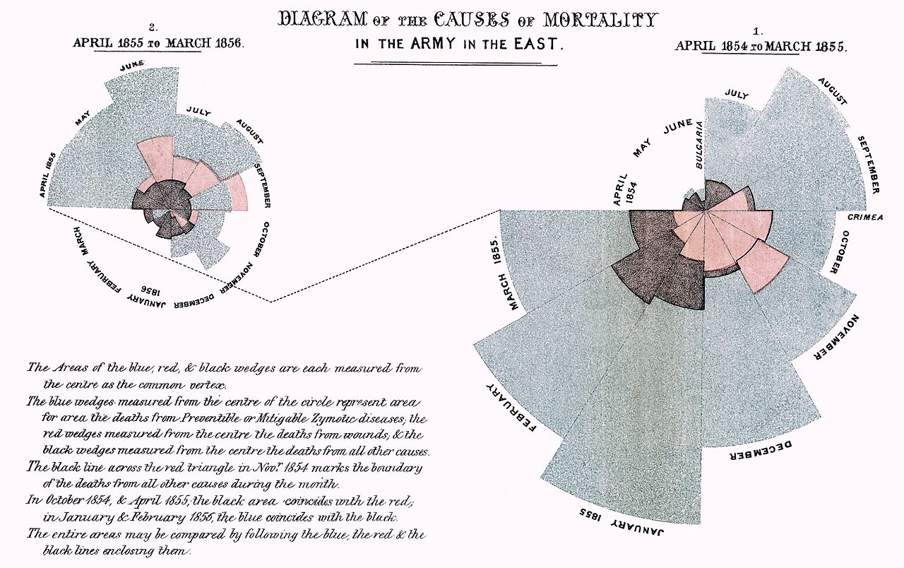
There is much to enjoy in the CGDSYL? exhibition. The pieces on display are thoughtfully categorised and arranged. The brief explanatory texts provided are carefully worded and informative. The curators have included some wonderful examples of seminal historical works: the public information leaflets about leprosy produced by the Isotype Institute in Nigeria; Florence Nightingale’s rose diagram (pictured below); and John Snow’s cholera map, for example.
There are also stunning examples of design that I’d not encountered before: Dan Reisinger’s colour and symbol coded packaging for TEVA pharmaceutical products is a marvellously simple way of preventing mistakes through obvious visual reminders; the Hara Institute’s hospital wayfinding designs have such elegant simplicity; and PillPack, which aims to help people taking multiple medicines by supplying them by mail order in a roll of daily packs, is a fantastic combination of graphic and service design, addressing an important problem.

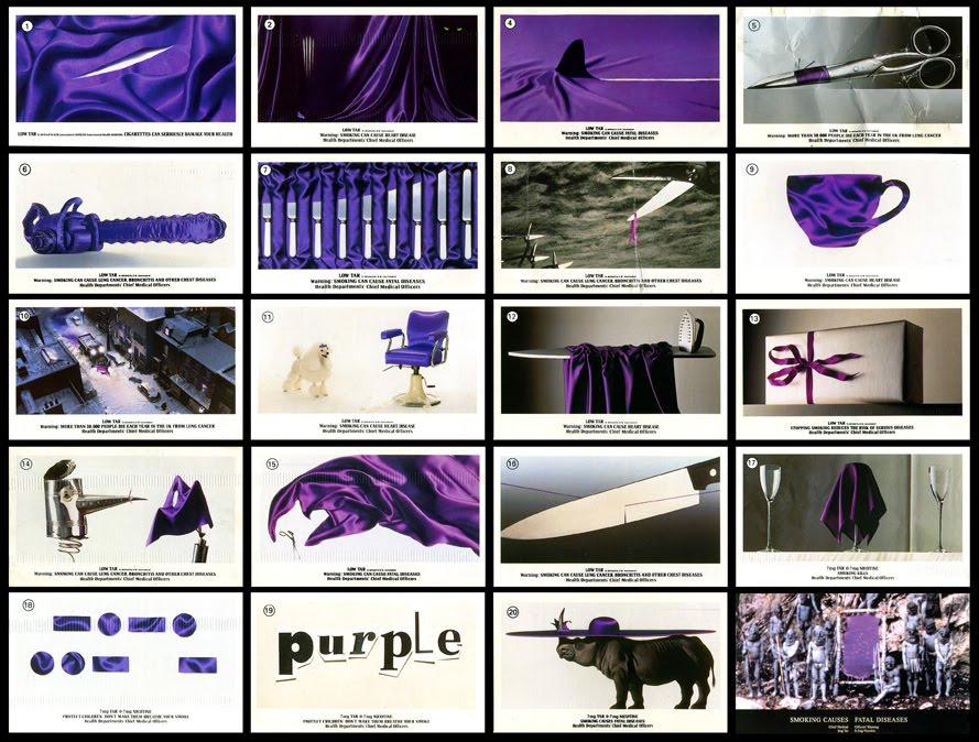
I also particularly appreciated the way that CGDSYL? doesn’t shy away from the darker side of commercial art—such as the role of graphic design in advertising cigarettes. The enticing packages and adverts designed for the tobacco giants in the mid-20th century are presented next to the campaigns that were eventually needed to claw back the control that those glossy packages exerted over smokers. This opens opportunities for valuable debate about how visual communication is currently used to influence consumers, but also doctors and other health workers.
The exhibition is clearly valuable, and I would urge both health professionals and designers in the London area to make a beeline towards the Wellcome Collection at the earliest opportunity. However, I hesitate to recommend the accompanying book to a health professional audience.
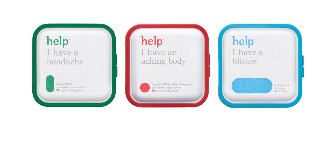
I can gloss over some puzzling omissions from the book. The John Snow map and Florence Nightingale’s rose diagram really need to be appreciated in person I suppose, although it’s harder to explain the absence of the brilliant Help™ Remedies packaging. The real problem is with the accompanying commentaries provided by the designers, who all seem to have been asked the question “Can graphic design save your life?”
Firstly, I feel that some of the language will not be accessible to a health audience. I wonder how many doctors will be interested to learn—in a passage about the ubiquitous New Rail Alphabet font—that: “[designer] Kubel introduced an extended range of weights, along with italics and a variety of glyphs that included non-ranging figures.”
Perhaps more importantly, the commentaries are almost all maddening non-answers to the question. “Yes but no,” they whimper. Many of the responses run along the lines of “I suppose it could if . . . but I’m not sure.” I think I may have surprised my fellow passengers on the train with a loud “YES!!” upon reaching page 160, on which Jeremy Myerson begins with “Of course it can.” Finally! As the authors note in their introduction, the designers they asked “did not find this an easy question to address [‘we are not doctors,’ they said].” I found myself wanting to hear the voices of the doctors who have used the designs, and perhaps even more importantly, of the patients whose lives have been touched—often very significantly, one can imagine.
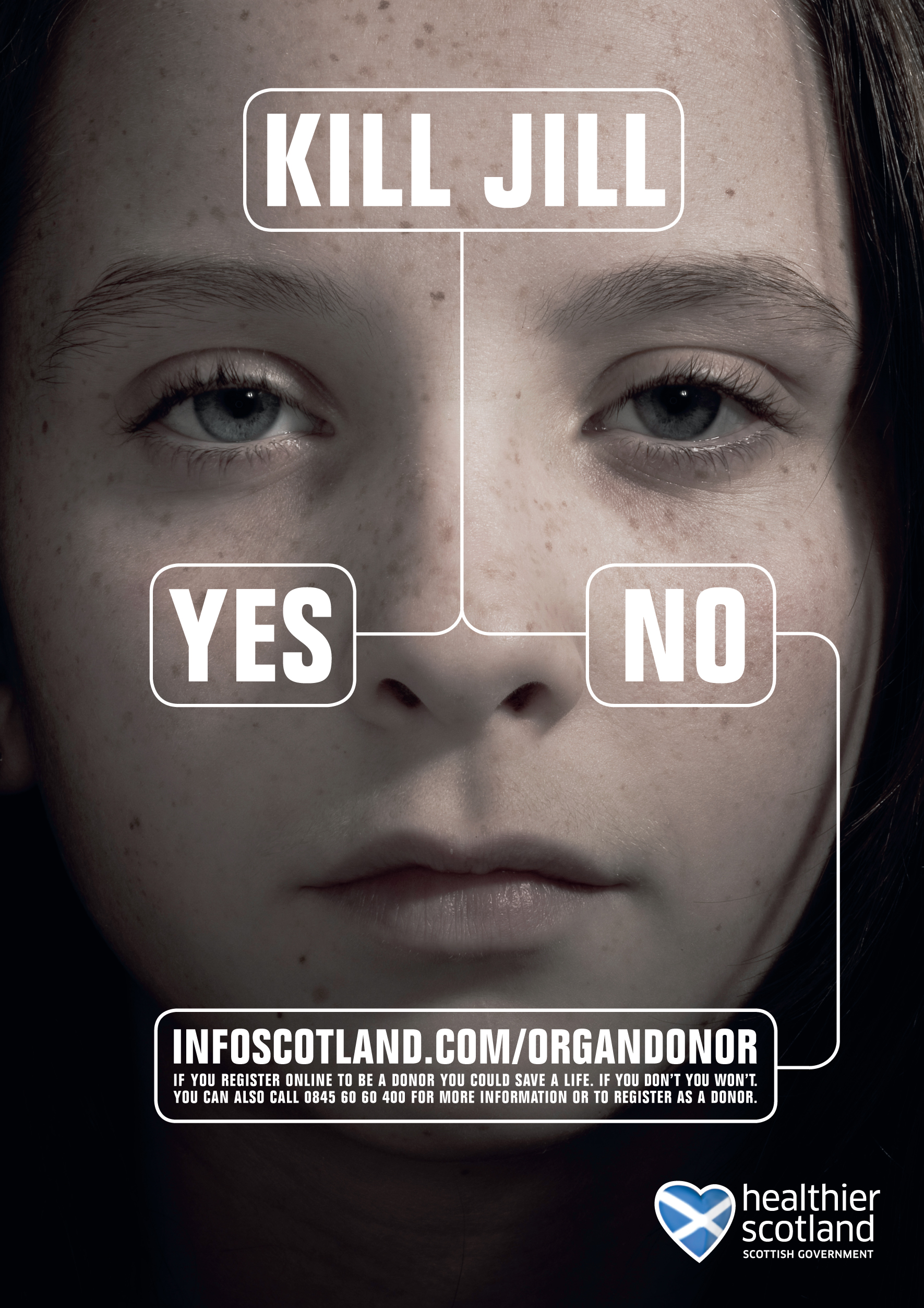
This is a particularly significant omission, given that almost all of the exhibits are projects designed for use by patients—with the possible (telling) exception of the “persuasion” section. As Eric Kindel points out on page 173: “Did it work? We don’t actually know.” For the historical exhibits this is understandable, but I find it hard to believe that so little research has been carried out on the effectiveness of some of the public health work on display. The explanation label for the controversial “Kill Jill” campaign notes that it led to a 242% increase in registered organ donors. I feel that more of this kind of evaluation of the impact would have given a health professional something more concrete to appreciate, alongside the obvious beauty of the exhibits.
To be fair, it’s always hard to find sophisticated evaluation of public health campaigns. Frustratingly, graphic design clearly has immense power when it comes to selling cigarettes and pharmaceutical products—evidenced by the staggering sums that companies are prepared to pay for a new logo or an advertising campaign. However, the enormous resources demanded by evaluation of a new pharmaceutical product or device never seem to be as easy to find when developing an information based public health intervention.
I also wonder if “can graphic design save your life?” is the most useful question that could have been asked. A lot of the designers asked seemed to want to talk more about how design has the power to make lives easier, more pleasurable, and more fulfilling. I am no doctor, but I have a feeling that much of the less glamorous, but sometimes more impactful work in medicine is not about saving lives, but allowing people to live the lives they have in greater comfort and dignity—enabling people to live the kind of lives they want to. Some of the exhibits, like Rai Pinto’s animals playing hide and seek in Hospital Sant Joan de Déu in Barcelona, certainly have that power. And sometimes making a life worth living could be more important than saving one that is not.

I’m certain that graphic design can save and otherwise improve many lives by getting information to the public, doctors, and other health professionals—especially as our health service/industry becomes increasingly data driven. I think this exhibition could be a significant stride towards bringing together graphic designers and health professionals to work together on this. And the graphic designer in such a collaboration might learn a lot from the accompanying book. If you’re a health professional who’s going to be anywhere near London between now and the end of the year though, I’d recommend going along to the Wellcome Collection in person instead.
Can graphic design save your life? The Wellcome Collection, London. 7 September 2017 – 14 January 2018
Will Stahl-Timmins, interactive data graphics designer, The BMJ.