![]() The editor emailed me this to seek my views about how to make her weekly Editor’s Choice more relevant to the journal’s online readers.
The editor emailed me this to seek my views about how to make her weekly Editor’s Choice more relevant to the journal’s online readers.
The article gets posted on bmj.com every Wednesday and appears in print two days later (all BMJ articles appear online ahead of print). Editor’s Choice helps busy print readers navigate that week’s issue, pointing out articles that have caught her eye as editor.
Editor’s Choice will continue to appear in print, so one challenge will be to ensure it remains relevant to those readers who seldom if ever see the online journal, or its iPad and Tablet apps. There are some readers, of course, who see the BMJ in all formats, switching between them depending on where they are and what they are doing.
For me this presents an example of how something originally intended as a print article is changing because of the web.
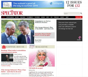
Peter Robins, production editor at the Spectator, is currently researching a history of Fleet Street (the home of UK national newspapers until the arrival of new technology in the early 1980s). He reminds us in a Spectator article that print has been affected by the internet as it was by the arrival of television. This often gets forgotten, he says, as editors focus on getting their titles on new technical platforms (Amazon’s Kindle, and iPad), and working out new business models.
TV, says Robins, taught newspapers “to specialise in things that television finds difficult, and to use its strengths to their benefit. In the case of broadsheets, that means a relentless pursuit of depth and analysis.”
Print, he adds, has similar advantages over the web. Print design enables readers to skim news more easily. Because print presents a finite amount of stories, readers are reassured that they are properly briefed.
But he makes a bolder claim, that the 2 June 1953 issue of The Times offered a true glimpse of the newspaper of the future.
I see what Robins means. Its main news page (page 6) contained 13 bite sized news stories. This sounds eerily like a modern website homepage. On that page readers learned about a trade fair in Barcelona, the US reorganising its foreign aid budget, but also coverage of the Queen’s Coronation, and one of the century’s great scoops, Edmund Hillary and Tenzing Norgay conquering Everest.
It seems amazing today that a story of such global significance should be relegated to page 6. The Times was not alone. When King George V died in February 1952, the story appeared on page 4 of The Guardian. Later that year it ditched classified advertising on its front page and started providing front page news, as did The Times.
Nowadays the front page of the world’s newspapers would be cleared to cover a monarch’s death or coronation, and a successful climb of the world’s highest mountain.
But most news website homepages, in comparison, never “hold the front page” in this way. Instead they follow the bite-sized format. There is often a top story, linking through to the full version, but it co-exists with other stories in the way The Times did in 1953 on its main news page.
In the case of bmj.com, we highlight three homepage stories using a slideshow or carousel. Lots of others do this too, including The Spectator.
We did once try to use the homepage like a modern newspaper’s front page, when we populated the entire slideshow with articles linked to a BMJ investigation. Our editor suggested that in future we allocate just one of these slots to give other articles (news, comment, research, or education) their 15 minutes of homepage fame.
Will newspapers return do what The Times did in 1953? Perhaps. Robins points to the success of publications like Metro and the Independent’s I newspaper (Dennis Publishing’s The Week (strapline “Read Less, Know More”, also springs to mind), offering condensed news to upmarket readers whose browsing habits have been influenced by online reading.
I think print newspaper readers still very much value what Robins calls terms “depth and analysis.” What is more satisfying than a lazy Saturday or Sunday reading the papers? The print BMJ arrives in time for the weekend, so its readers really look to it to fulfil a similar function. Although its online version is where to find full research papers, web-only commentaries, longer obituaries, and full reference lists). Admittedly, many of these will be printed off as pdfs for offline reading.
There is also a satisfaction, and sense of accomplishment after devouring a printed newspaper or magazine almost cover to cover (I confess I never read the sports section, and many Saturday and Sunday supplements go straight to recycling), what Robins has calling being “propertly briefed.”
But here I wonder if one of the “new kids on the block” might reach the parts that print cannot reach. Getting Robins’ Spectator on the Kindle each week, without the distraction of ads, photos, graphics, and cartoons, has made it a stripped-down joy to read, and I often find myself reading every article.
Perhaps that is the true newspaper of the future?
David Payne is editor, bmj.com
