A (while ago) we published an explanatory page about ROC plots in the Education and Practice journal. There are a few great reasons why we should replicate it here:
1. So people can read it more easily
2. Because it fits into the stuttering series on diagnostics
3. It saves me having to write the same thing in different words.
But what is a ROC plot? It’s a graph which uses the ‘receiver operating characteristic’ space — that is, how the sensitivity of a dichotomous test varies with the specificity — to produce an overview of one, or more, diagnostic test accuracy studies.
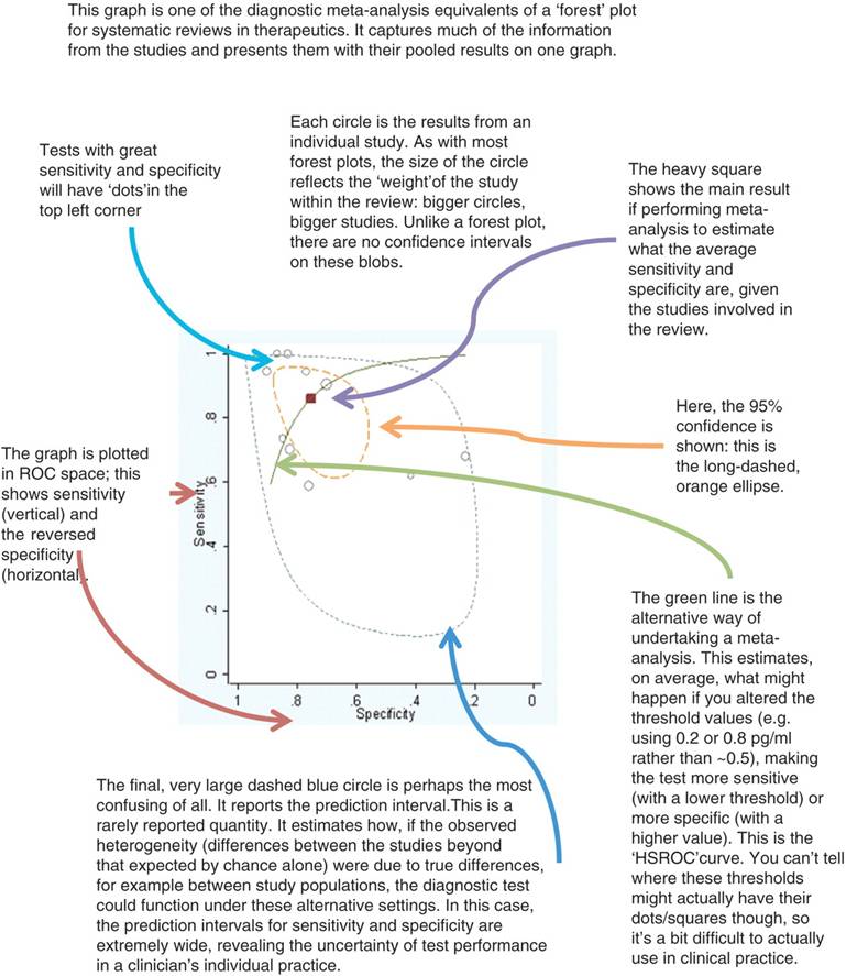
The following should explain it …
.. but if its doesn’t, why not leave a comment of tweet a question to @ADC_BMJ and we’ll try to answer, annotate and acknowledge* your contribution!
– Archi
(* Do you think anyone can tell I’ve been on a rhetoricician’s training day? **)
(** You don’t have to answer that.)