Provocation by Han Yu
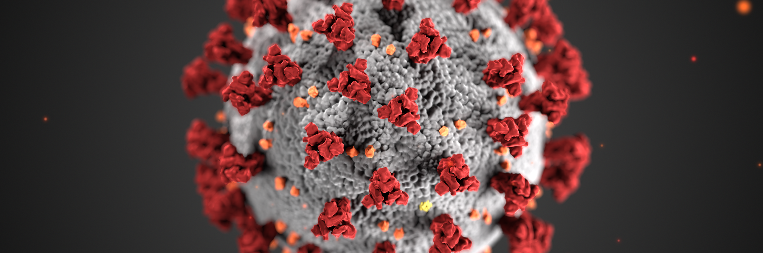
In a provocation dated April 21, 2020, Bivens and Moeller argue that the Centers for Disease Control and Prevention (CDC)’s SARS-CoV-2 virus illustration, “while scientifically accurate and visually pleasing,” fails to convey “the exigency of the current pandemic…and the human toll” and doesn’t provoke publics to adopt behaviors (such as handwashing and social distancing) that help curb the pandemic. Drawing upon Sam Dragga and Dan Voss’s article and CDC’s publication on sexually transmitted diseases, Bivens and Moeller suggest that we make COVID-19 images “gross,” “graphic,” and “grotesque” by depicting infected human bodies, possibly their lifeless lungs.
I applaud Bivens and Moeller’s provocation, especially their reminder that the virus is indiscriminate and that each of us is responsible for stopping its ravage. At the same time, I can’t help thinking that there is more to the issue.
Like Bivens and Moeller, I admire Dragga and Voss’ insight that conventional technical visuals often lack human elements, and I agree that the human, the affective is important, if not essential, in visual communication. Elsewhere, I have drawn upon such arguments to propose comics-style technical communication and to critique the visualization of genetics in popular science magazines.
But, COVID-19, at this time and place, is different: it is an ongoing, out of control, economically and politically charged crisis. Because exposure to COVID-19 is not voluntary, controllable, or familiar—like driving and exposing ourselves to the risk of driving is[1]—the risk we confer to COVID-19 is inherently high. Add to this mass media’s tendency to selectively report the shocking and the extraordinary, and many members of the public are already fearful (as they should be) of the virus. Indeed, driven by fear and to control that fear, some resorted to hoarding food, bottled water, cleaning products, even toilet paper. When that’s not enough, some took their fear (and anger) out on fellow members of the society who committed no wrongs than being of Asian descent.
Given this context, I fear the consequences of making COVID-19 visuals gross. While fear appeals have been used in behavioral and health campaigns to “scare people straight,” studies show that such appeals backfire when they are not accompanied by strong efficacy messages.[2] In other words, if people are scared about a risk but are not given highly effective means to control that risk (or do not believe such means), then that fear turns into counterproductive actions such as denial (“I’m not at risk for this.”), avoidance (“This is too scary. I’ll not think about it.”), or reactance (“This is just a hoax. I won’t listen to it.”). Fear appeals also create anger and anxiety,[3] which may feed back into reactions such as hoarding, racism, and xenophobia. These negative effects can be heightened in visual communication because the effect of visuals, compared to that of texts, is immediate, unbalanced, and visceral.[4]
Given these considerations, I think CDC’s SARS-CoV-2 illustration does a commendable job of capturing the appearance of the virus as shown by electron microscopy, while exercising appropriate creative license to make the transparent, insubstantial virus realistic and eye-catching. Yes, without textual explanations/callouts, public viewers may not fully understand the function of the “spikes” or other parts of the virus. But, as far as the illustration itself is concerned, it shows what it intends to show (good semantics) and shows it clearly (good syntactics). The question, then, is its pragmatic effect, its social and behavioral impact, or the lack thereof as Bivens and Moeller suggest.
According to one of the illustration’s creators, Alissa Eckert, people are already haunted by her illustration as is. True, not all members of the public take COVID-19 as seriously, but I’m not sure gross images alone would make a difference, for reasons mentioned above. Still, should we desire more visual gravity, we may opt to make the same illustration drearier by adjusting its color scheme. More productively, we can create diagrams that demonstrate how the virus spreads, how it enters our bodies, how it damages cells and organs, and how/where we can intervene by actions such as social distancing. These images, rather than grotesque visuals of dying humans, stand a better chance to be emphatic, sobering, and, above all, informative as the world tries to find its way through the pandemic.
Han Yu studies science communication and visual communication. Her most recent work is Mind Thief, a popular science book telling the messy stories of how we attempt to unravel Alzheimer’s disease.
[1] Candice Walhausen, “Visualizing Science: Using Grounded Theory to Critically Evaluate Data Visualizations,” Scientific Communication: Practices, Theories, and Pedagogies, ed. H. Yu & K. Northcut (New York: Routledge), 82-106).
[2] Kim Witte and Mike Allen, “A Meta-Analysis of Fear Appeals: Implications for Effective Public Health Campaigns,” Health Education & Behavior 27, no. 5 (2000): 591-615.
[3] Kim Witte and Mike Allen, “A meta-analysis of Fear Appeals,” 605.
[4] Kathryn Northcut, “Images as Facilitators of Public Participation in Science,” Journal of Visual Literacy 26, no. 1 (2006): 1-14; Derek G. Ross, “The Role of Ethics, Culture, and Artistry in Scientific Illustration,” Technical Communication Quarterly 26, no. 2 (2017): 145-72.