Blog by Annamaria Carusi
Images of COVID19 are powerful in their own right and subtly or not so subtly inform how we relate to this pandemic. There are, of course, many COVID19 images, which will no doubt yield rich analyses in good time. I offer here just a quick impression of two kinds of images that I find striking in the way they show the pandemic under different, even opposed lights, one showing it to us under the aspect of individual things, and the other under the aspect of aggregated trends across groups.
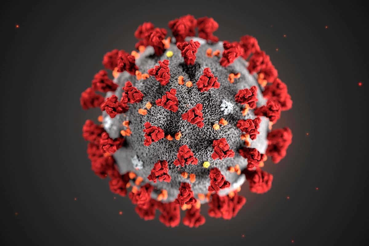
Take this image of COVID-19:
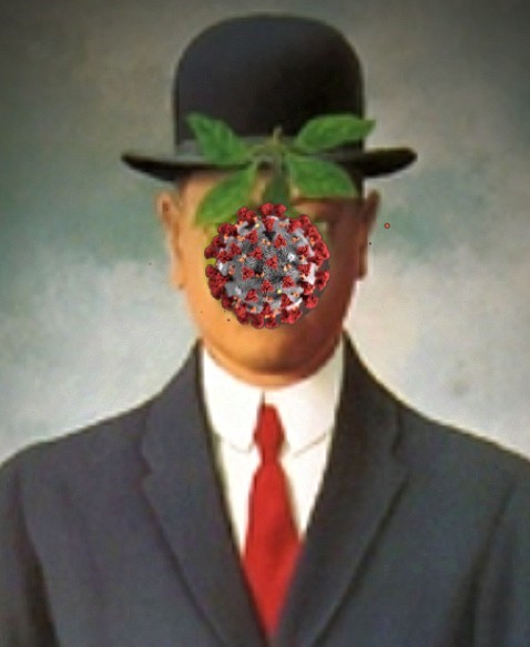
 Like all the different graphic renderings of the virus, this image is more like a diagram than like a microscopy image. These renderings have a great deal of freedom in how they represent their object, and that is where a number of cultural associations will come into play, evoking different associations, myths, and archetypes. In an admittedly entirely unscientific poll among friends and acquaintances in social media and many a Zoom dinner, asking what it evoked for people, there were two dominant tropes: something alien, inter-galactic or cosmic; and something edible, usually ‘sweet’, like a novelty candy. The image below, by a friend, plays on its association with the apple, an archetype that needs no introduction.

These two different sets of associations see us working through the strange biology of this entity. Being a virus, it is already of dubious biology – and anyone who didn’t know this fact about viruses in the pre-COVID-19 days, now surely does. So, it is not ‘of us’: it is even biologically alien. It appears possibly as an alien invader from ‘out-there’, outer space. This is also marked in its name, which Brigitte Nerlich has traced back to one of those inspired metaphors common in science, drawing out its similarity to the solar corona. Aesthetically appealing but deadly dangerous and absolutely other, a combination that viewers of series like Star Trek would be very familiar with.
By contrast with alien-ness there is the domesticity of an edible treat: the apple, for all generations since we have been telling stories about ourselves, iconic of things that are attractive and lethal; a curiously shaped candy for more recent generations of manufactured candy-eaters. The colourings will no doubt also play their role, the almost cheerful blues and reds so unlike the blackness of the Black Death, as Smiljana Antonijevič pointed out. Sweet, innocent-looking infiltrators.
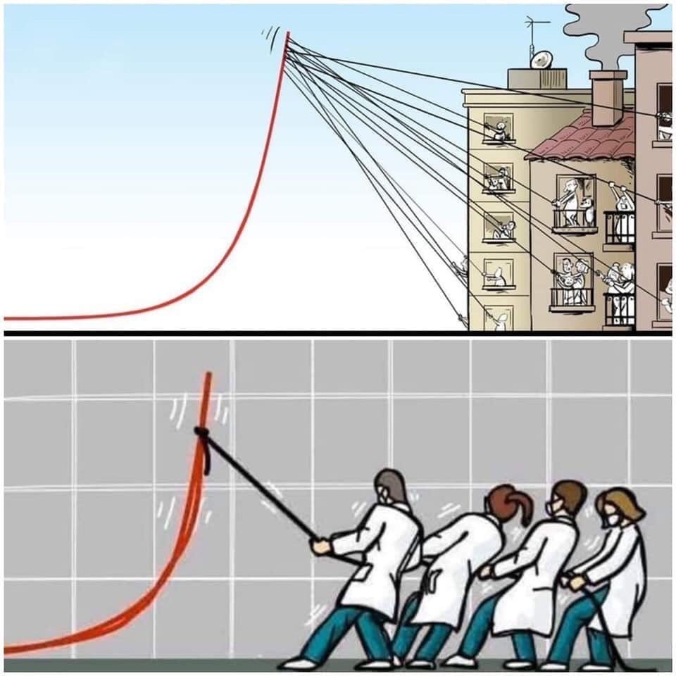
What it looks like taps into different associations that we have, but they have in common that they are renderings of a thing, an entity that makes its way into our bodies to wreak its havoc there. This plays into a way that we commonly think about disease: as something that happens to bodies, other discrete entities, individual things. The biomedical model that dominates medicine ‘thing-ifies’ (the well-known effects of reification and its many variants), and pits one kind of thing against other kinds of things. No wonder it is so easily turned into war metaphors. The images of COVID-19 give the cultural imaginary a clearly visible thing to be afraid of, and a clearly visible thing to ‘fight’, which has dominated the rhetoric on the pandemic. This image perfectly demonstrates how the visual rhetoric of the virus as thing, and the ‘fight’ rhetoric fit together (thanks to Julie Light for pointing me to this image).
 The fight is ultimately through the entire armature of biomedical means: treatments, apparatus, vaccines.
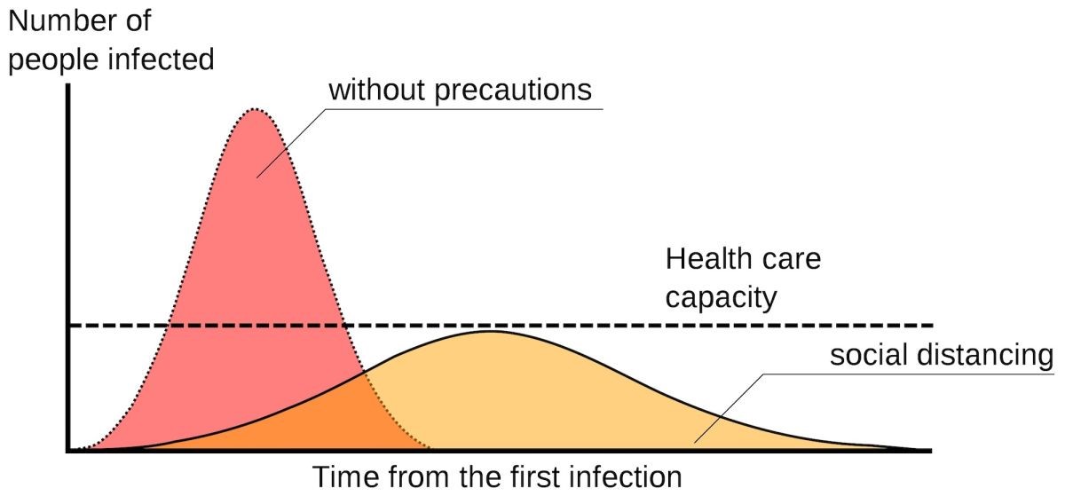
On the other end of the spectrum, charts of all kinds have also flooded into the media. Charts tracing cases, deaths, hospital admissions, tests, ages, comorbidities, survivors, beds, ventilators, you name it, almost anything that can be counted has been tracked and traced, predicted and visually rendered. These are very different kinds of images, because they are of trends that average out things, in which no single thing appears. Many an armchair epidemiologist has been born in the last few weeks. Most famous is the two peak chart, shown in this article:

Which comes with ideas about interventions too:

These charts are the public health face of the pandemic, the population level. They tend to emphasise the communal aspect of this disease, its inter-relatedness with so many different aspects of our social relations, of our lives. They are being deployed to convey messages of large-scale state or national intervention, communal action, of social solidarity, as we see in this cartoon from the Spanish newspaper El Paîs.

The kind of collective action that is invoked here can also be starkly contrasted with images of collective and disindividuated dying, as in this image of the procession of military trucks taking the dead away from Bergamo.
Images of things that cause disease in individual bodies, and images of trends across large groups of inter-related people have a great deal of hidden scientific and policy baggage. Deployed in the media we are all immersed in, they invite questions, positionings, repositionings. Where am I? Where am I in this we? Which we? And then depending on which – often fleeting and unstable – answer we give ourselves, we might act: wash our hands once more, stay in – for ourselves, for others, which others? These images now mediate the intensely personal and social space of medicine as it spills out into every aspect of life and death. They are rhetorically powerful and demand critical engagement.
Annamaria Carusi is a freelance researcher and consultant on social and cultural aspects of biomedicine, and an Honorary Research Associate in the Department of Science and Technology Studies, University College London.