 David McCandless’s talk at the Royal Statistical Society
David McCandless is perhaps the best known information graphic designer of our time. He exploded onto the design stage a few years ago with the coffee table book Information is Beautiful, based on the corresponding blog website of the same name. The website now also hosts the Information is Beautiful Awards, which has just announced its third set of winners. He has recently released a second book, Knowledge is Beautiful, and has been giving a number of talks to showcase the new work contained within this colourful tome.
As The BMJ’s resident data graphics designer, I dutifully booked myself a seat at his talk at the Royal Statistical Society to see what health related graphics he might be presenting.
McCandless started on familiar ground for me, with some graphics from his older book.
Mountains out of molehills
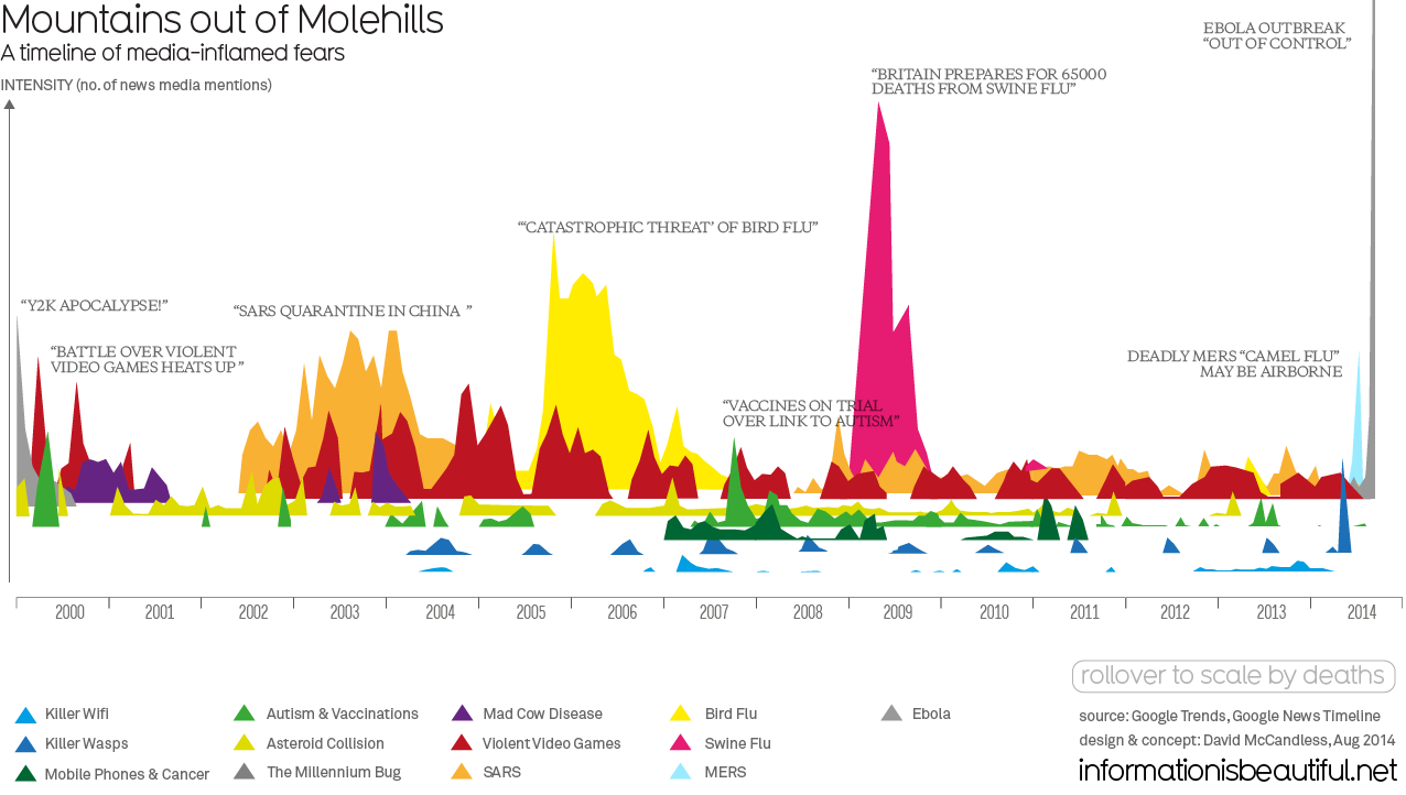
But he did revisit some with updated data. I have a fond memory of seeing him describe his Mountains out of molehills graphic, which shows Google trends data connected to various different media scares.
When I first saw it, I dismissed it as “only” a line graph with a slightly odd baseline shift. But seeing him explain the patterns revealed to me his main talent: selecting data that tells a story. There are patterns in this data that this simple visualisation picks out nicely. The repeating “killer wasps” peaks every summer. The short term but large impacts of the different infectious disease scares.
One pattern that he brought our attention to was the red spikes for “violent video games” that have a biannual peak. His theory about those is that one is in November, as Christmas video games go on sale. He suggests that the second peak, in April, could be linked to the anniversary of the 1999 Columbine High School shootings. He feels these have been linked (rather unfairly) in the media to violent video games.
It was extremely interesting to see that he had updated the graphic since I last saw it, and added in the huge spike for Ebola. It goes far off the top of this graph. It seems that the potential for viral messages to reach a wide audience has increased exponentially through the 21st century (probably far beyond the viruses themselves…)
Having said that, it should be noted that another graphic that he presented suggests that infectious diseases were in fact one of the biggest killers of the 20th century, so perhaps our fears are based on historical experience after all.
20th century death
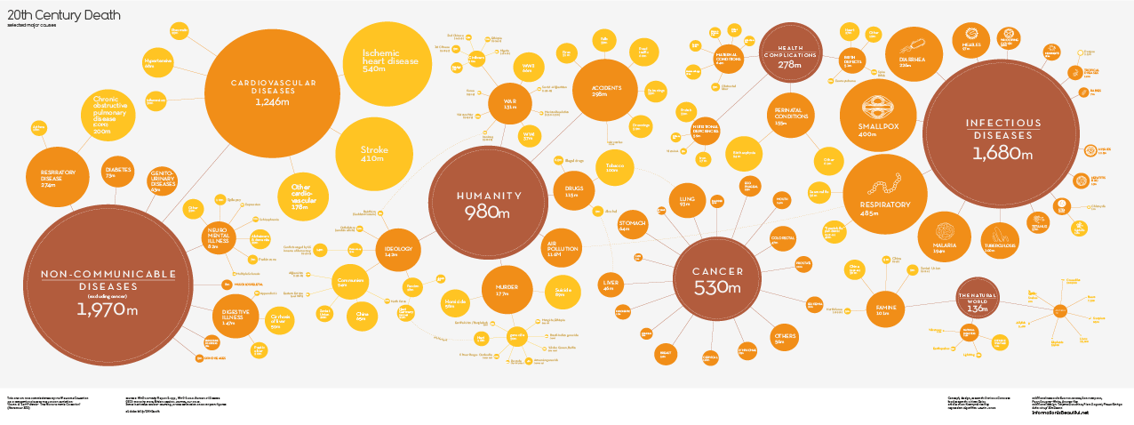
I particularly like the way that this graphic splits each major cause of death into subcategories (and in some cases, subsubcategories). While circle area is sometimes dismissed as “too hard to judge” for use in infographics, I think it’s justified in this case. It allows you to compare quantities in different directions. If all these data points were presented as bars, they would be too far apart to compare easily.
As well as showcasing these graphics, the talk also included a theoretical section. One of the underpinning themes of his talk was the distinction between data, information, and knowledge. I do get the sense that his focus has shifted in the last few years from information for its own sake into the provision of understanding. I completely agree with him that information visualisation can be a great way of drawing comparisons, finding and showing patterns, and generally making information more “available” than long texts.
His new book starts with a model of information graphic design (visualised, naturally). The six part model starts with “data,” and moves through “structured data,” “information,” “linked information,” and “knowledge,” finishing with “interconnected knowledge.”
Under these headings, he has provided a description of the underlying processes. So, under “data” it lists “mine, gather, measure,” and under “knowledge” it lists “evaluate, understand, explain”. This reminds me strongly of another design guru Ben Fry’s model of interactive visualisation (Aquire > Parse > Filter > Mine > Represent >Refine > Interact ).
Fry is known for his involvement in designing the processing language for interactive visualisation (which I use for all of The BMJ’s interactive graphics). It is interesting to see McCandless’s design process laid bare in this way, and I think it reveals why the graphics on his website are more and more appearing in interactive form.
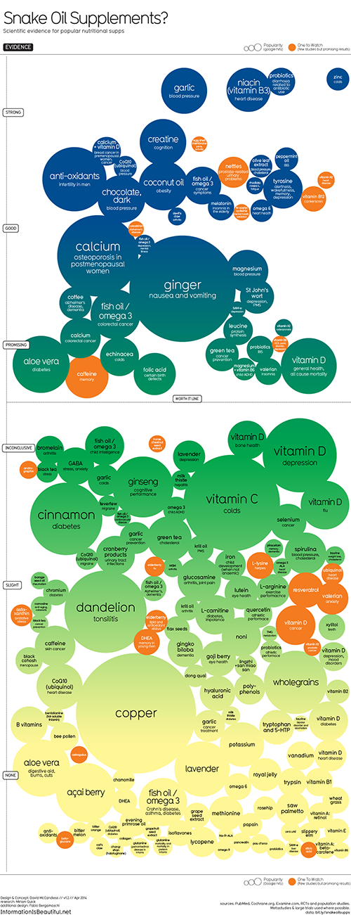
For example, the Snake Oil graphic he presented benefits greatly from filtering the complex data set.
Snake oil
McCandless has been accused in the past of trivialising the noble art of information visualisation. It is a certainly a criticism faced by many people working in the area of data graphics, and perhaps graphic design more widely. It is fuelled, to some extent, by the inexorable rise of the “bad tower graphic” in which some poor designer is given a few hours to illustrate a few numbers, and comes up with a long, thin graphic with very little useful data visualisation. Good information graphics (particularly interactives) take time, and an unusual combination of visual / statistical /coding skills. The sheer volume of these pieces does show how widely information visualisation has captured the public imagination, however.
Some of his graphics do tend towards the trivial, such as the Best in Show graphic, which compares dog breeds based on public popularity and a “dog breed data score,” combining “intelligence,” “longevity,” “ailments,” etc. However, this is part of the genius of his graphics. They are designed to be shared, and pick up on the things that matter to people. Whether they are lighthearted or deadly serious, they can be relied upon to give an engaging, and visually appealing “nugget” of information. In my opinion, he carefully treads the line between trivial and insightful, and more often than not these days, I find him firmly on the right side of that line.
For example, my favourite piece of his so far was a collaboration with Wired magazine, in which he reimagines diagnostic test results in a way that a patient could read much more easily:
Blood tests
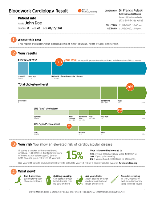
I’m aware that the project has drawn criticism for potentially worrying patients, since a test at a single time point isn’t necessarily 100% accurate. However, I can’t help feeling that the alternative giving them a sheet of incomprehensible numbers that requires expert judgment to decipher is likely to be more worrying. Perhaps we need to start putting some of this kind of visualisation to the test in practice before we dismiss it, particularly if we want people to take more responsibility for managing their own health.
All of The BMJ’s interactive data visualisations are freely available at thebmj.com/infographics
Will Stahl-Timmins is interactive data visualisation designer, The BMJ.
Competing interests: None declared.