![]() Each year the BMJ runs an online reader survey. The survey is mainly multiple choice but there is also a free text question where we ask readers: “What single improvement to bmj.com would make the most difference to you?” Every year the most popular response is “Make it free.” There are other recurring responses to the survey. In 2012 there were lots of requests for a simpler navigation and less clutter, a better search engine, and clearer access to article pdfs.
Each year the BMJ runs an online reader survey. The survey is mainly multiple choice but there is also a free text question where we ask readers: “What single improvement to bmj.com would make the most difference to you?” Every year the most popular response is “Make it free.” There are other recurring responses to the survey. In 2012 there were lots of requests for a simpler navigation and less clutter, a better search engine, and clearer access to article pdfs.
Let’s start with the “free” question. Like all other publications, the BMJ incurs costs. There are salaries to pay and the journal needs to develop, so removing the paywall is unfortunately not currently an option (although there is a lot of free content on the site, including open access research, blogs, podcasts, and articles we decide to make free for a fixed period, including ones linked to press releases.)
This very valuable reader feedback is very much in our minds just now as we embark on the next stage of the website’s development. The site needs to work better on mobile devices. Of the 1.5m visits to bmj.com in the last 30 days more than 250,000 were from mobile devices, including tablet computers. The number is rising all the time.
Later this year we hope to launch a “responsively designed” BMJ website with pages that adapt to desktop, laptop, and mobile computer screens, including smart phones and tablets. This provides an opportunity to remove some of the aforementioned clutter—maybe some house ads advertising BMJ events, some content feeds that aren’t getting many clicks etc. We removed some in December 2012. We can and will do more with a responsively designed site.
Our designer is currently mocking up some pages. It’s early days yet, but they look good so far—article pages in particular look very clean and simple, which is a challenge with a full text research article with tables and supplements to signpost.
Our last redesign was not that long ago—in November 2011. The BMJ website is the most visited of all the company’s websites, so colleagues on sister products value having a space on our pages to promote their content or services. Currently we have feeds from doc2doc, research from our specialty journals, links to learning modules and masterclasses, and to BMJ portfolio, where doctors track and record CME/CPD credits.
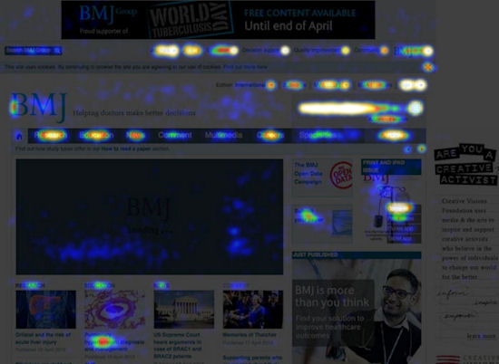
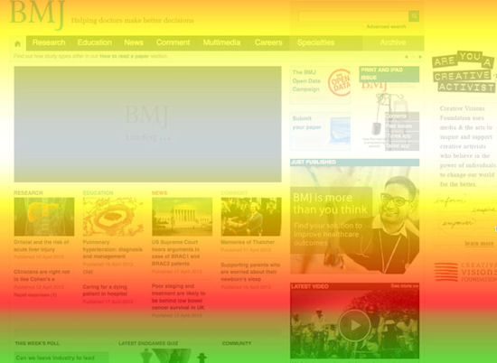
We have just added a tool called crazyegg, which generates a “heat map” showing where site visitors have clicked. We realise that many of these links to sister products get very few clicks, so we will be using these heatmaps to prioritise what gets displayed where, if at all.
The brighter colours on the two images below show the homepage hotspots. The first, for example, shows that the research, education, and careers sections generate the most heat. The search box also fares well, as do some of the top links to sister products (journals and jobs). The second image demonstrates how our eye gravitates to the centre of the screen, clearly at the expense of the section immediately below, which contains a feed of latest Endgames articles and forum discussions on doc2doc.
Finally, another important change to communicate is the company’s name change. Two weeks ago we stopped being BMJ Group and simply became BMJ. The flagship journal becomes The BMJ. We will need a new url as the company website will have bmj.com as is its web address. We are still working out what this will be, but the company site bmj.com will feature the journal in a prominent slot. We also hope readers will bookmark the journal website with its new url when it goes live.
David Payne is editor, bmj.com, and readers’ editor.