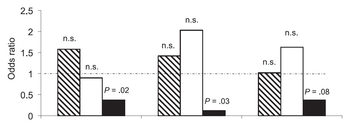
Can you spot anything wrong with this graph?
It’s from a paper in a major paediatric journal. I’ve removed it from context, because for me it was a helpful lesson in spotting something important. I’ve removed the labelling from the X axis, because I’m going to be a bit unkind about the paper, but in short it compares three different risk behaviours – the hatched box is the main behaviour (for example, cycling), and then the clear and black white boxes represent mutually exclusive subsets of that behaviour (for example, wearing lycra and not wearing lycra). Then the three different clusters represent three possible outcomes, so the first group might be being struck by a car, the second might be caffeine consumption, and so on.)
What happened was this. The person who was supposed to be teaching us didn’t turn up, and so I led a short “hot journal club” session instead. I recalled an interesting paper that I’d read, printed out a couple of copies, pulled up on the projector one of a series of templates I’ve got from the JAMA series of old on how to read a paper, and we began to discuss the paper.
The graph above came under scrutiny after we’d got quite a way along; we were trying to answer the question: “What measures of occurrence were reported”.
The more we looked at this graph, the more we could understand what it was that the authors wanted us to see, but the less we could understand why it was that it had been allowed.
Traditionally we’re used to seeing odds ratios presented on the X axis of a graph, as in a classic forest plot. (If you want to know a bit more about relative vs absolute measures, have a look at a previous post.) The ratio is presented as a dot, and then the confidence interval is presented as whiskers. An example of this would be here:

Obviously this compares different trials, as part of a meta-analysis. But what the authors are doing in our original paper is comparing different outcomes for three different risk factors, so it’s not an unfair wish to have things presented similarly, is it?
But is this mere pedantry – am I annoyed about the axes being flipped? Only insofar as it takes a minute or two to spot what else they’ve done. They’ve presented this so that it looks like a simple, old fashioned histogram. Visually, the reader finds him or herself scanning for the least amount of black and inferring that the less black there is, the “better” the test. But simple consideration of what the shaded areas mean reveals that this is highly arbitrary shading. The histogram seems to be rooted at zero. What does this mean? It means absolutely no risk. Is this implied at all in the data? No it isn’t. Put this another way; it would be equally arbitrary – or equally valid – to invert the risk – have it as a relative protection rather than relative risk. If this were so, we’d see these columns going upwards to infinity; you get perfect protection from the intervention.
I can’t understand why they’ve presented this day like this, and why the editorial and peer review process has allowed it. I can only come up with two possible explanations. The first is that they didn’t understand the stats and were excited by a nice graph which showed the data in a positive light. The second is that they were intentionally spinning their presentation of their data to persuade people that it was more positive than it actually is. Either way, it’s pretty disappointing for a paper which provoked enough interest to get mentioned on a number of feed services.